Tabs
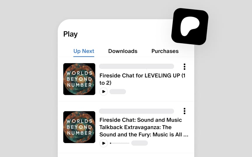
Android uses tabs to categorize related content into distinct, easily accessible groups. The system supports two tab types: primary tabs for main content destinations below the top app bar, and secondary tabs for organizing subcontent within a specific section.
Tabs maintain a peer relationship, appearing side-by-side to show equal hierarchy level. While the interface can accommodate multiple tabs through horizontal scrolling, each tab should represent a distinct content category rather than sequential content. For example, music genres, product categories, or filter options work well as tabs.
Tab design focuses on clarity and scannability. Labels can combine icons and text, but should remain concise to maintain readability. When designing tab layouts, avoid using them for step-by-step content that requires a specific viewing order — instead, use appropriate typography and spacing to create content hierarchy.[1]

