Visual communication principles
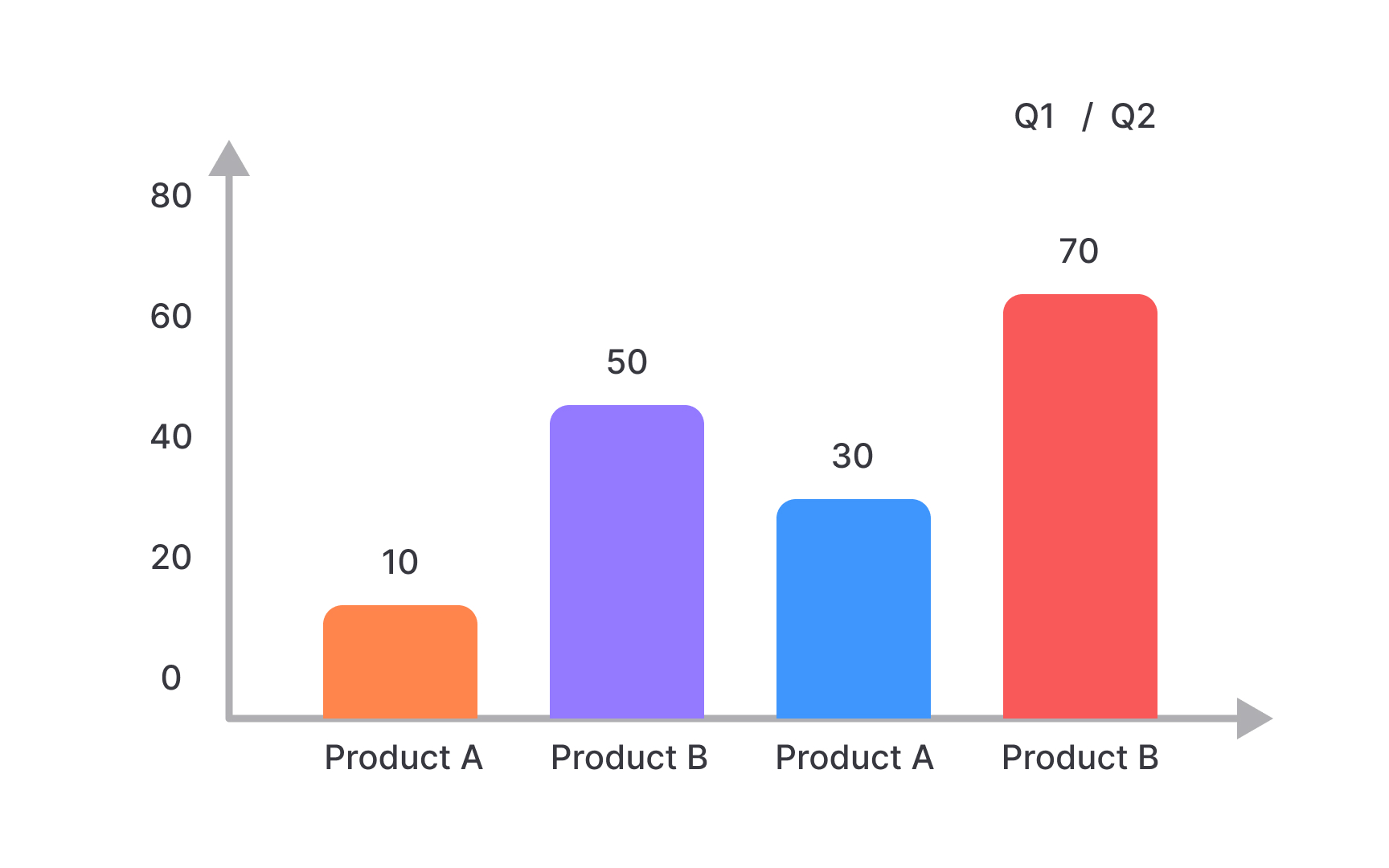
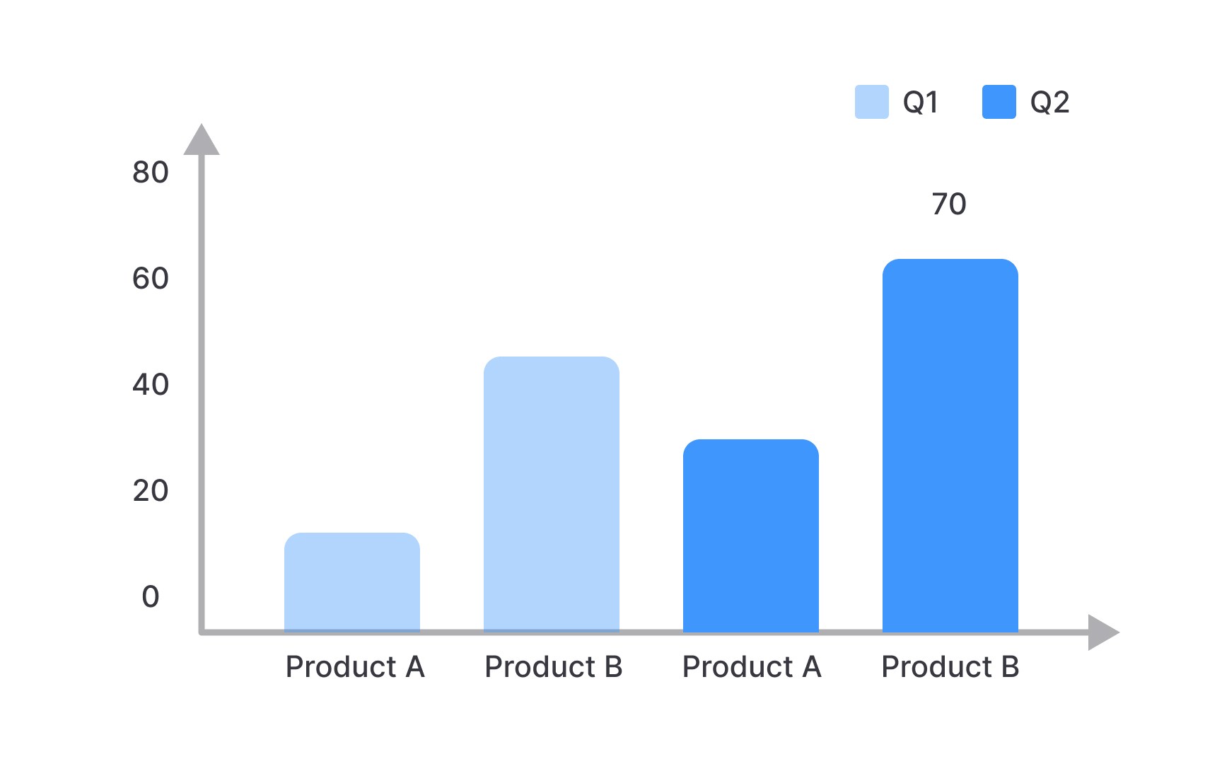
Visual representation significantly impacts how metrics are understood and acted upon. Choose visualization types that match your data's purpose: bar charts for comparisons, line charts for trends, scatter plots for relationships, and pie charts for composition when there are few categories.
Reduce cognitive load by eliminating chart junk and decorative elements that don't convey information. Ensure your visuals have clear titles that state the main insight rather than just describing the chart content.
Use consistent color schemes and formats across related metrics to help audiences quickly identify patterns and relationships. Color should enhance understanding, not just decorate. Use it to highlight key points, show categories, or indicate performance against targets.
Pro Tip: Test your visualizations by asking someone unfamiliar with your data to explain what they see in five seconds. If they can't identify the main point quickly, simplify your design.
