Hamburger menus
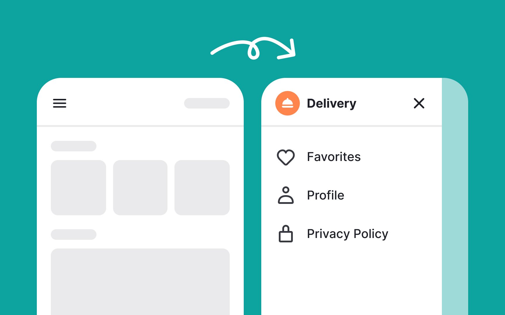
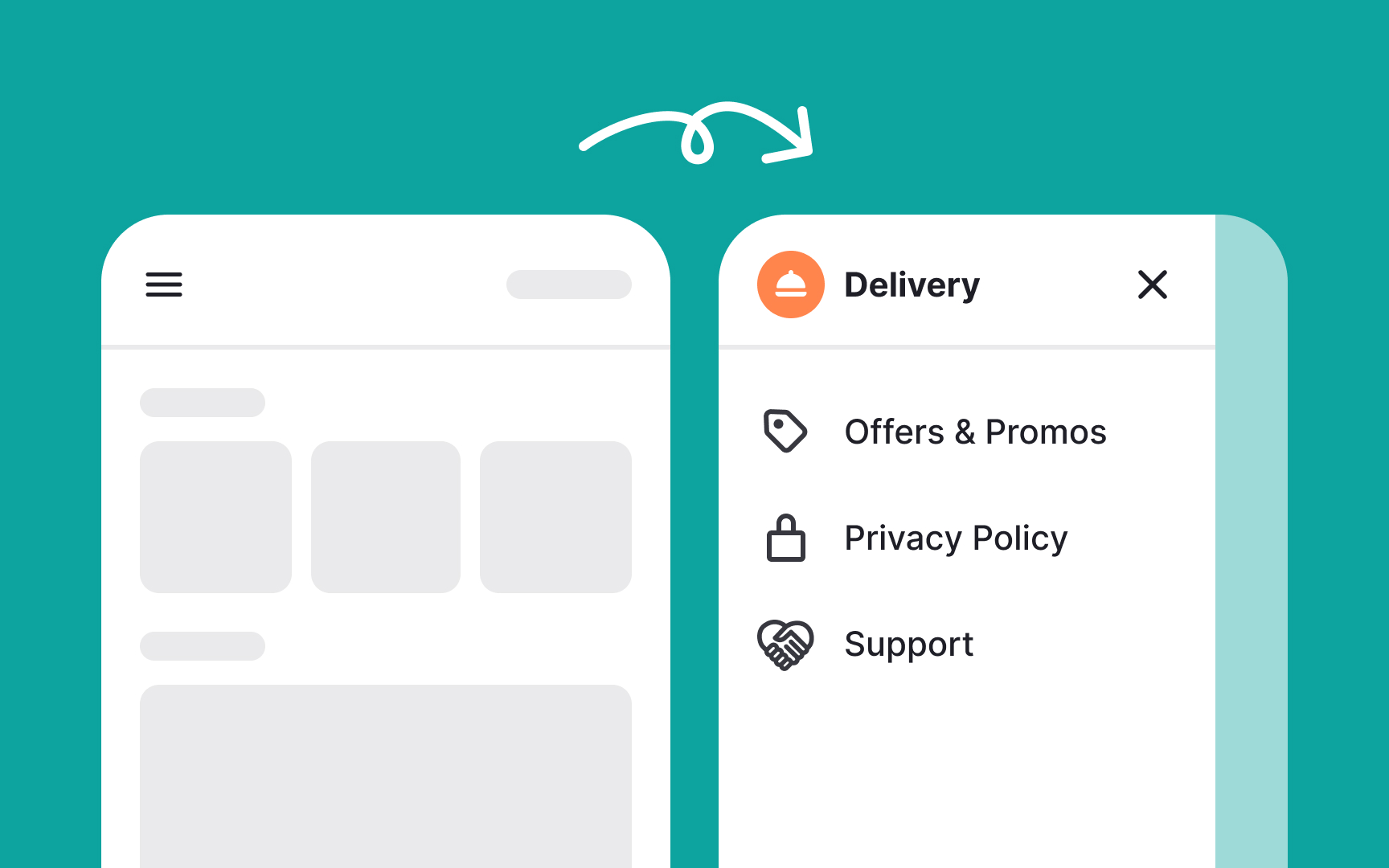
A hamburger menu is a button icon featuring three parallel horizontal lines, resembling a hamburger. It's commonly used on websites and applications, especially in mobile environments, to save screen space and declutter interfaces.
When to use hamburger menus:
- Hiding secondary features: If your website or app's core elements are already visible, and you have secondary options that aren't crucial to user goals, you can hide these behind a hamburger menu.
- Saving screen real estate: Even if there is enough space to display secondary features, you might not want to clutter the screen. A cleaner interface reduces cognitive load on users.
When not to use hamburger menus:
- Hiding core features: Avoid using hamburger menus for options or settings that are central to the user experience. Important features should be directly accessible, not hidden. For example, on an e-commerce site, categories like "Shop" and "Cart" should be visible rather than tucked away in a menu.
- Interaction-heavy websites: If your site already requires multiple interactions, adding a hamburger menu can increase the interaction cost.[1]
References
Top contributors