Dropdown menus
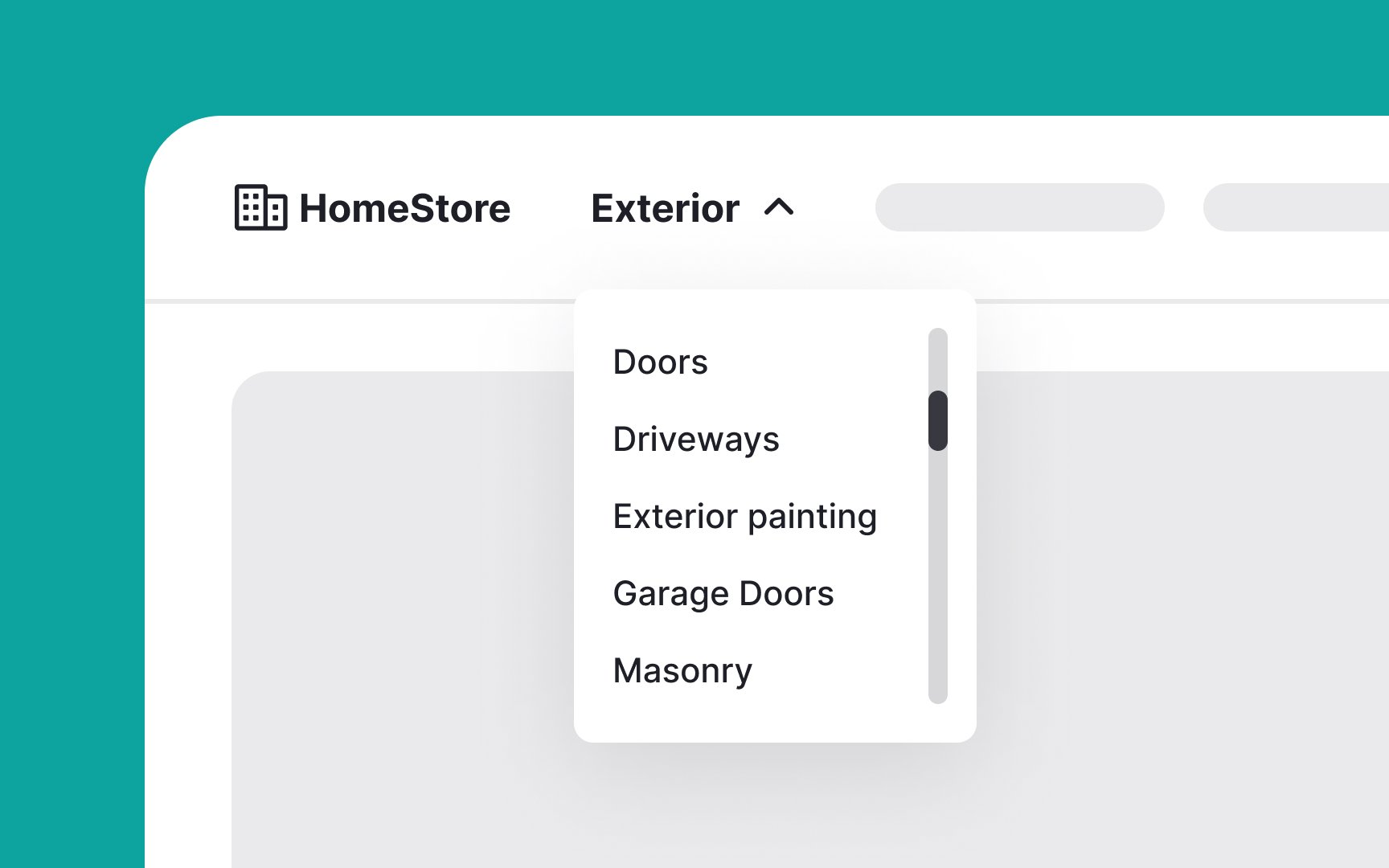
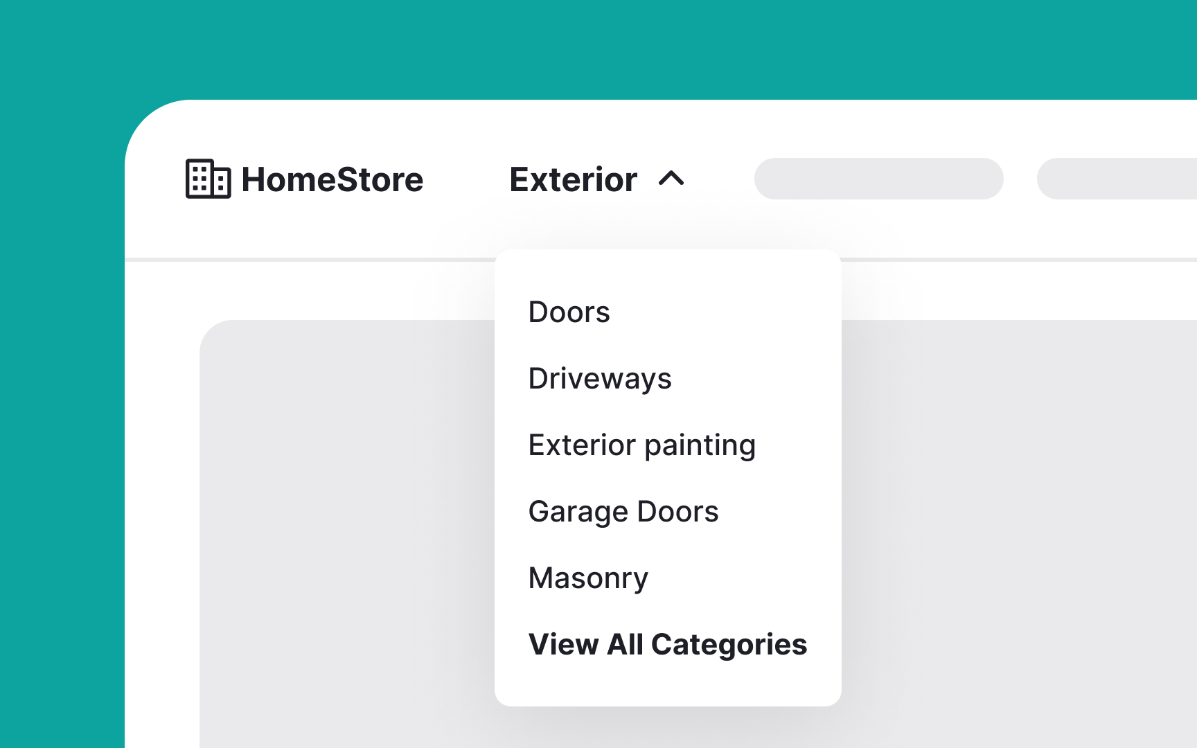
Dropdown menus are UI controls that present a list of options from which users can select one at a time. Once a selection is made, the menu closes. There are two types: command menus, which trigger an action based on the selection, and navigation menus, which direct users to a new location.
Here are some best practices for dropdown menus:
- Gray out unavailable options: Keep all options visible, even if some are unavailable. Gray out these options instead of removing them. For extra user experience points, consider adding a tooltip that appears when users hover over a grayed-out option, explaining why it’s disabled and how to enable it.
- Avoid overloading with options: Resist the urge to include too many items in a dropdown menu. If you have many options, consider alternative presentations like mega menus.
- Keep global navigation out of dropdowns on desktop: Top-level navigation categories should be easily accessible. Burying them in dropdown menus can hinder user success.
- Support keyboard input: Ensure dropdown menus support keyboard navigation in addition to mouse input. This improves accessibility and user experience.[1]
