Data Analysis Fundamentals
Master the statistical basics that turn product metrics into confident decisions
Data analysis fundamentals equip product managers with the quantitative skills needed to make informed decisions. Beyond basic metrics and reports, effective analysis reveals patterns in user behavior, validates product hypotheses, and measures true impact. The challenge lies not in collecting data but in asking the right questions and interpreting results correctly. Statistical literacy prevents common pitfalls like confusing correlation with causation or drawing conclusions from biased samples. Visual storytelling transforms complex datasets into compelling narratives that drive stakeholder alignment. Quality analysis balances thoroughness with practicality, focusing on insights that actually influence product direction. These foundational skills bridge the gap between intuition and evidence, enabling PMs to build products grounded in reality rather than assumptions.
Product managers encounter statistics daily through user metrics, conversion rates, and performance indicators. Key statistical concepts help separate signal from noise in product data:
- Mean, median, and mode: Mean is the average of all values, median is the middle value when sorted, and mode is the most frequent value. Each tells a different story about your data
- Standard deviation: Measures how spread out data points are from the average. Low deviation means consistent behavior, high deviation indicates unpredictable patterns
- Confidence intervals: A range where the true value likely falls. A 95% confidence interval for a 20% conversion rate might be 18-22%, showing your uncertainty
- P-values: The probability your results happened by chance. P-value of 0.03 means only 3% chance the results are random, suggesting real impact
- Sample size: The number of data points collected. Larger samples provide more reliable results and reduce the impact of random variations[1]
Understanding these fundamentals and how they apply to your product and data can help prevent celebrating false wins or killing successful features based on incomplete data.
Correlation means two variables move together, either in the same direction (both increase or decrease) or in opposite directions (one goes up while the other goes down). Causation means one directly causes the other. Ice cream sales correlate with drowning deaths because both increase in summer, but ice cream doesn't cause drowning. This distinction prevents costly product mistakes based on false assumptions.
Product metrics often show misleading correlations. Users who engage with premium features have higher retention, but forcing all users into premium features won't magically improve retention. These power users were already more engaged. The feature usage reflects their commitment, not the cause of it.
Testing causation requires controlled experiments. A/B tests isolate variables to establish true cause-and-effect relationships.[2] Time delays matter too. For example, a marketing campaign might show immediate traffic spikes but revenue impact appears weeks later. Always question whether correlation implies causation before making product decisions.
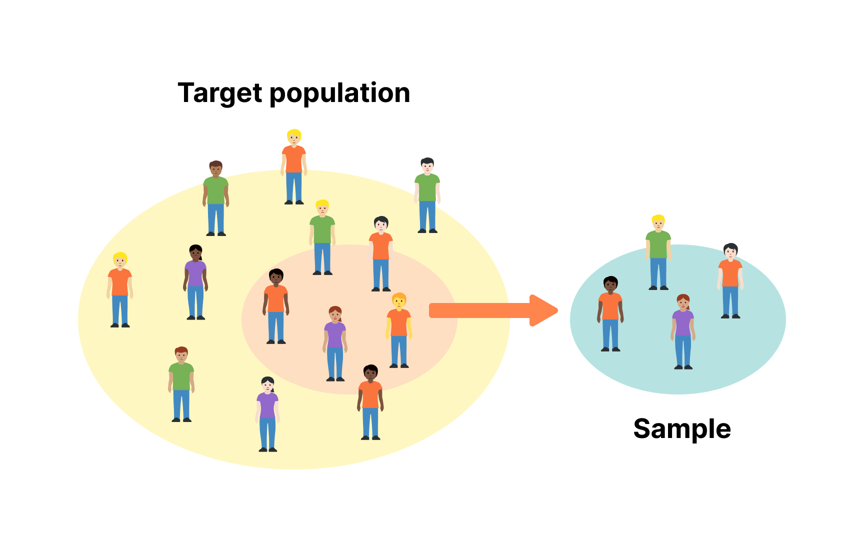
Sampling determines whose behavior represents your entire user base. A perfectly random sample captures diverse perspectives, but most product data contains hidden biases. Early adopters differ from mainstream users, mobile users behave differently than desktop users, and voluntary feedback overrepresents extreme opinions.
Selection bias appears when your sample systematically excludes certain groups. Surveying only active users misses why others churned. Testing features with power users ignores casual user needs. Geographic bias emerges when you only analyze data from specific regions. Time-based bias occurs when you measure behavior during unusual periods like holidays.
To mitigate sampling bias, implement deliberate diversity in your research approach:
- Stratified sampling divides your user population into distinct subgroups (strata) based on characteristics like usage frequency, demographics, or subscription tier, then randomly samples from each group to ensure proportional representation.[3]
- Random sampling gives every user an equal chance of selection, preventing the tendency to cherry-pick favorable data points that confirm existing beliefs.
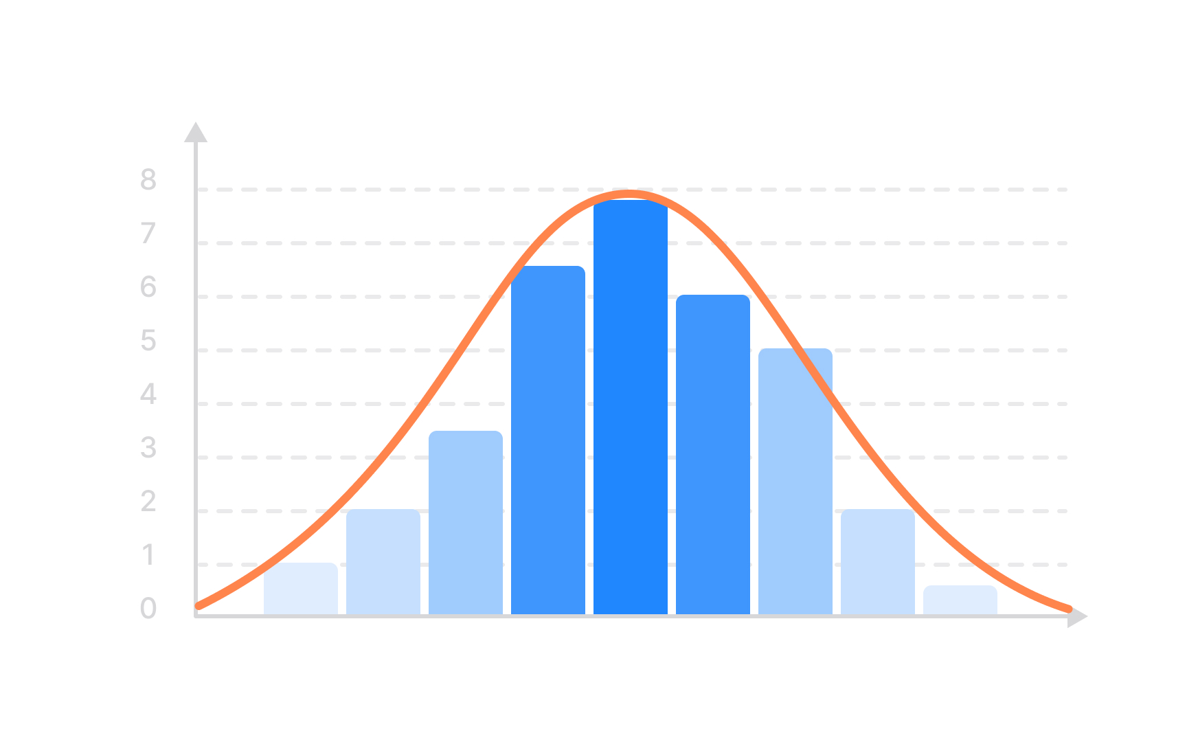
Exploratory data analysis helps you understand your data before any formal hypothesis testing. Start by examining basic distributions to see how values are spread and to identify outliers, which could signal errors or interesting edge cases. Simple visualizations like histograms and box plots often reveal user behavior more clearly than complex models applied to poorly understood data.
Segmenting data uncovers patterns that averages hide. Different user groups can behave in opposite ways: new users may struggle with features that experienced users enjoy, and usage can vary between mobile and desktop or across geographies. Breaking data into meaningful segments often explains trends that aggregate analysis misses.
Time-based exploration is also crucial. Metrics plotted over different time scales can reveal trends hidden by daily fluctuations, while seasonal patterns, day-of-week, and hour-of-day effects show when users actually engage. Understanding these rhythms is important before labeling features as successful or unsuccessful.
Garbage in, garbage out; bad data leads to bad decisions. Data quality issues hide everywhere: missing values, duplicate entries, inconsistent formats, and measurement
Common quality problems have telltale signs. Sudden metric spikes often indicate tracking bugs rather than user behavior changes. Perfectly round numbers suggest manual entry or estimation. Missing data patterns reveal collection blind spots: mobile events dropping during app updates, or certain browsers failing to fire analytics.
To prevent this, build quality checks into your workflow:
- Set reasonable bounds for metrics. For example,
conversion rates shouldn't exceed 100% or go negative - Compare multiple data sources to catch discrepancies
- Document data lineage so you know where numbers originate
Data insights die in poorly crafted presentations. Start with the "so what?" Why should your audience care? Lead with conclusions, then support with evidence. Executive summaries aren't just shorter; they focus on decisions and actions rather than methodology. Your deepest analysis means nothing if stakeholders can't understand or act on it.
Story structure beats data dumps. Present insights as narrative: situation, complication, resolution. "Users abandon carts" sets context. "67% leave at shipping costs" identifies the problem. "Free shipping over $50 increased
Match complexity to your audience. Engineers appreciate technical details and statistical rigor. Executives need business impact and clear recommendations. Designers respond to user journey visualizations. Sales teams want customer segments and conversion drivers. One size fits none, so customize your message while keeping core insights consistent.
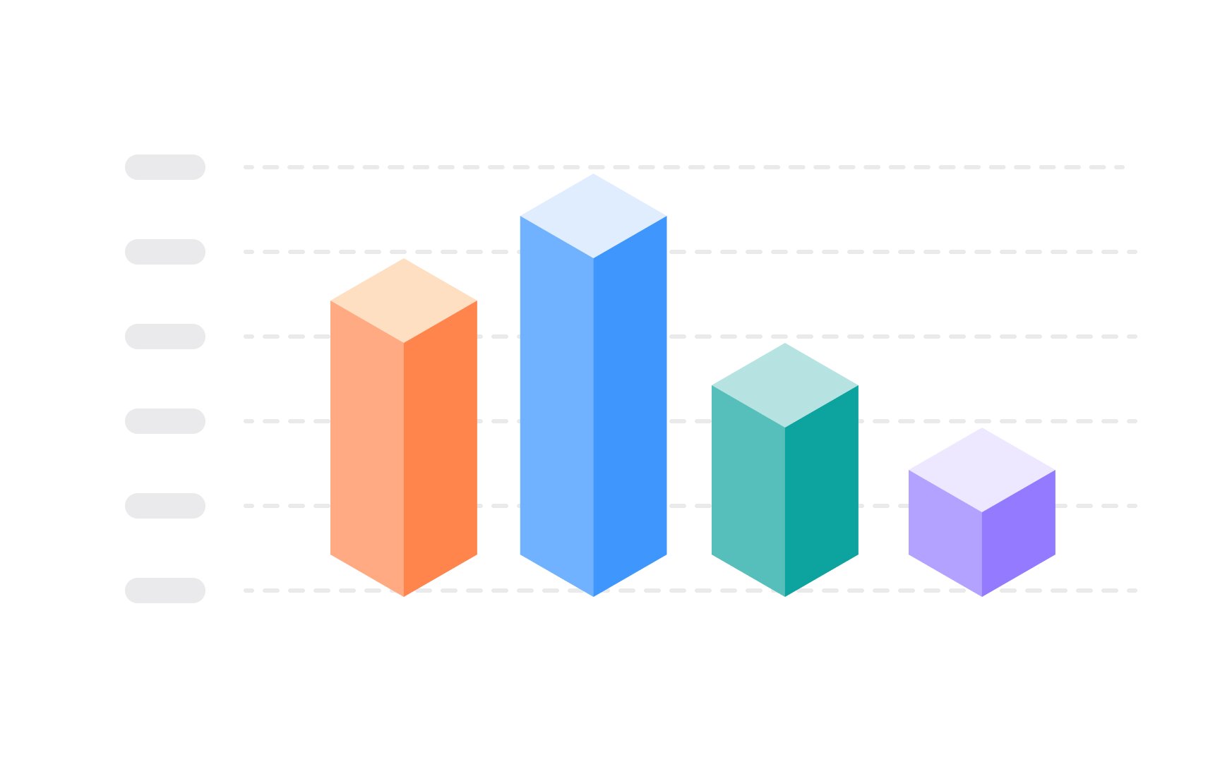
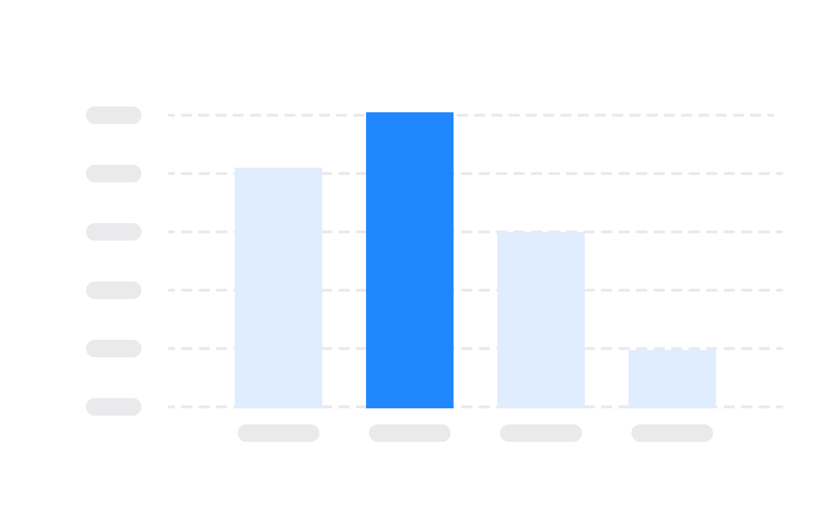
Effective data visualization transforms complex numbers into instant understanding. The right chart type depends on your story: line graphs show trends over time, bar charts compare categories, and scatter plots reveal relationships between variables. Poor visualization choices obscure insights and mislead stakeholders.
Color serves function, not decoration. Use consistent palettes where similar colors group related data. Limit yourself to 5-7 colors maximum. High contrast ensures readability, while color blindness considerations make charts accessible to all viewers. Gray backgrounds help colored data pop without overwhelming viewers.
Less is more in data visualization. Remove gridlines, borders, and 3D effects that add visual noise without information. Start Y-axes at zero for bar charts to avoid exaggerating differences. Label data directly on charts when possible, eliminating the need for complex legends that force eye movement.
References
- How Stratified Random Sampling Works, With Examples | Investopedia
Topics
From Course

Share


