Building a modular type scale
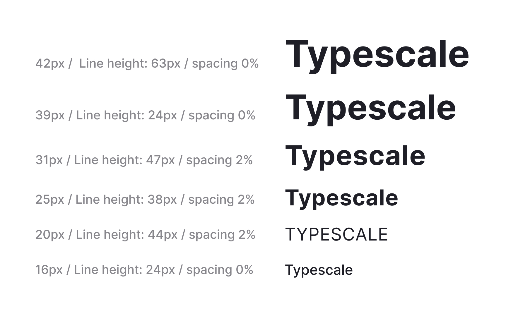
A modular type scale creates predictable steps between text sizes. Instead of choosing values one by one, designers define a ratio and generate sizes from a shared base. This keeps hierarchy consistent across layouts. Ratios like Major Third (1.25) or Minor Third (1.2) offer clear visual differences between steps. When the ratio increases too quickly, the headings become impractically large. When the ratio is too small, the differences become subtle and harder to use in complex interfaces. Some systems, such as Material 3, apply the Major Second ratio of 1.125 to create a balanced progression that stays usable across many device sizes .
A scale becomes more effective when its values align with spacing systems. Rounding sizes to multiples of 4 or 8 helps the typography sit neatly on a baseline grid. This creates a steady vertical rhythm and makes spacing easier to maintain in dense layouts. For example, the final scale could use values like 40, 32, 24, 20, 16, 13, 11, and 8 pixels.
Tools like Typescale help compare ratios during early exploration. Seeing multiple scales side by side makes it easier to evaluate how quickly sizes grow and whether each step remains usable for headings, body text, or captions on both web and native interfaces.
Pro Tip: Pick a ratio that creates visible steps, then round to grid friendly values to keep the system easier to maintain.
