Managing internal and external spacing
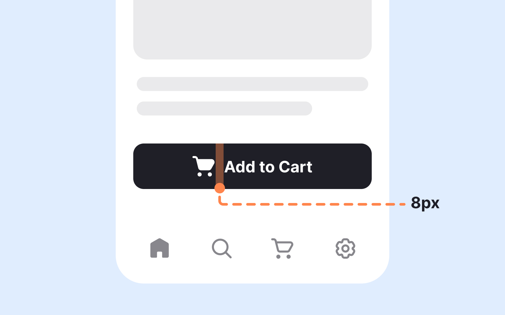
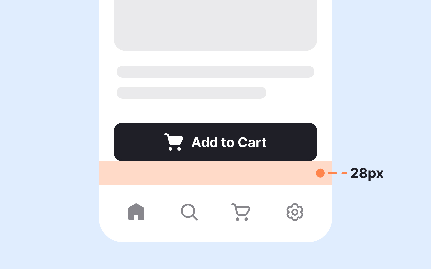
Internal spacing creates room inside a component, while external spacing separates it from surrounding elements. Keeping these two types of spacing in balance makes layouts feel clearer and more structured. A useful guideline is that external spacing should be equal to or larger than the internal spacing. This helps prevent components from visually merging and supports clear grouping based on proximity. When the outer space is too small, elements that are not related may appear connected, which makes scanning more difficult.
Internal spacing shapes how content sits inside cards, buttons, inputs, or containers. Comfortable padding keeps text from feeling cramped, especially when a component holds multiple elements. External spacing, on the other hand, defines how components relate to each other across a page. Larger external gaps signal transitions between sections or distinct content blocks. These relationships help users understand what belongs together and what marks a shift to a new action or idea.
