Understanding the interface inventory
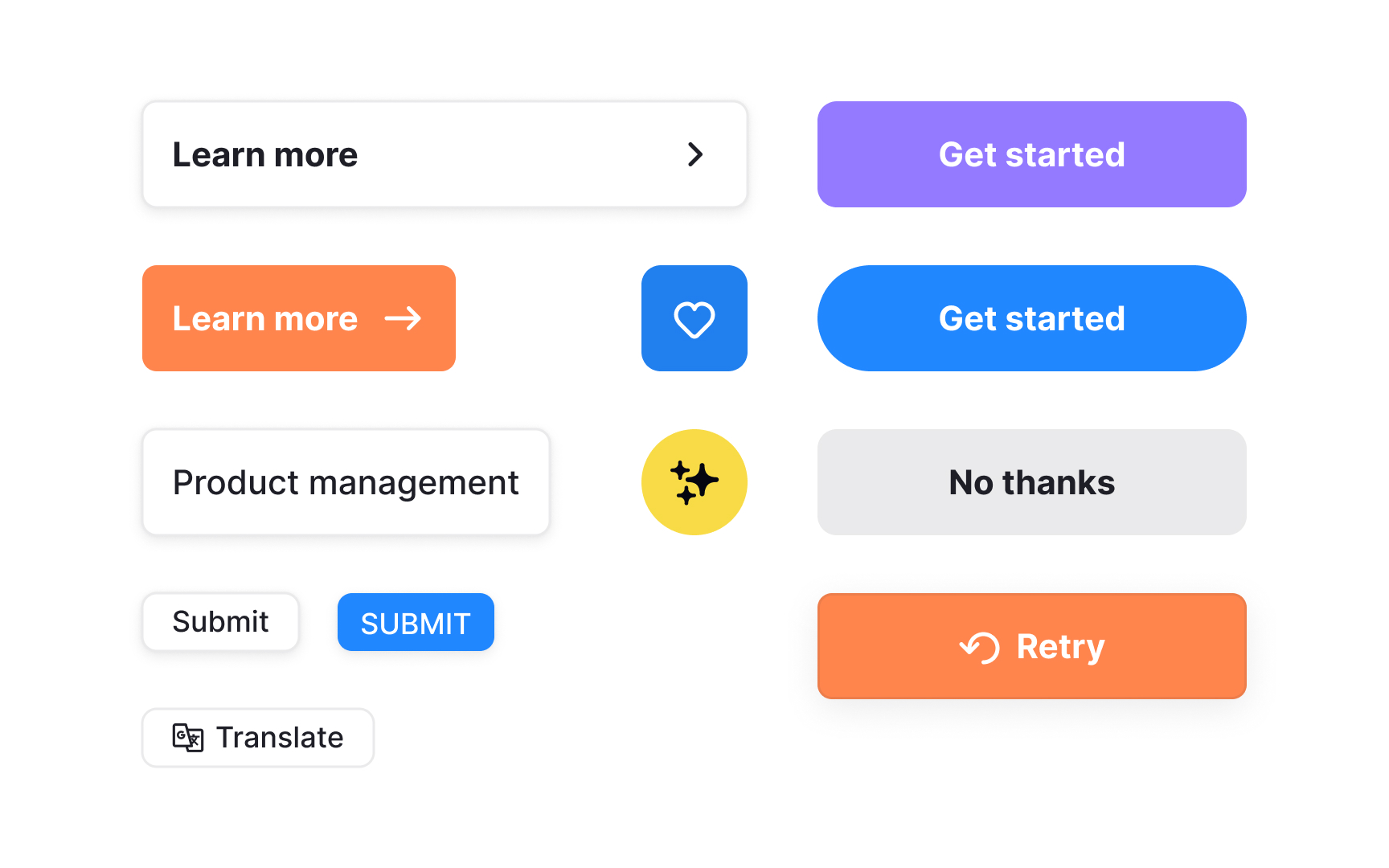
An interface inventory is a complete overview of the UI elements actually used across a product. It includes buttons, text styles, form fields, icons, and other components that appear throughout the interface. Traditionally, teams created this inventory by collecting screenshots of screens and components to see how the product is built today, not how it is assumed to be built.
Seeing these elements side by side reveals how many variations exist. Small differences in color, spacing, structure, or behavior become visible only when everything is grouped in one place. This helps teams spot patterns that need cleanup or consolidation, as well as outdated or duplicated components.
In modern products, an interface inventory goes beyond screenshots. It is built by reviewing rendered UI, design libraries such as Figma styles and variables, and existing code. This approach captures both design intent and real implementation, giving teams a shared and factual starting point before defining tokens, components, or system rules.[1]
Pro Tip: When mapping UI elements, focus on distinct variations rather than every instance. This keeps the inventory manageable and more useful.
