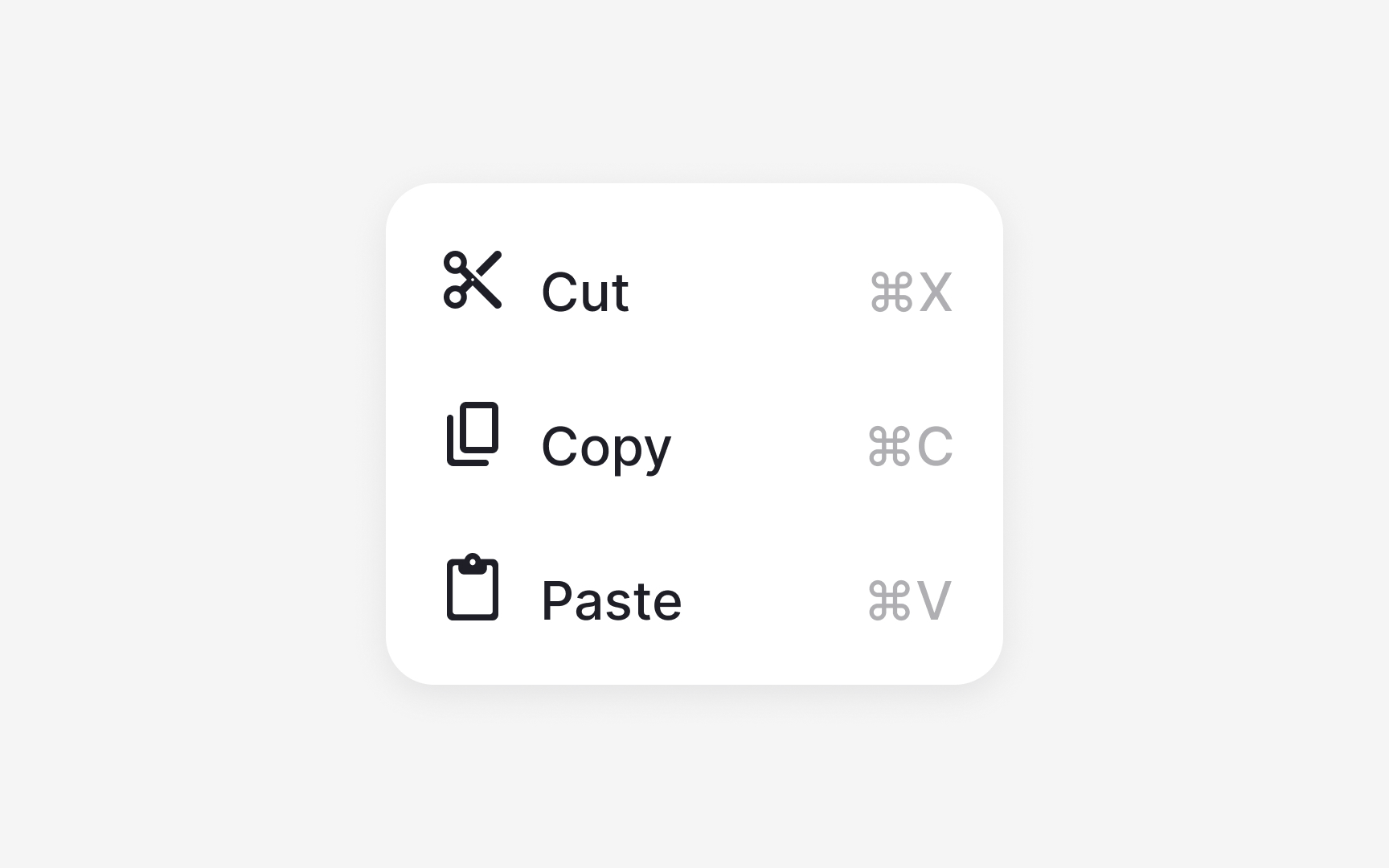
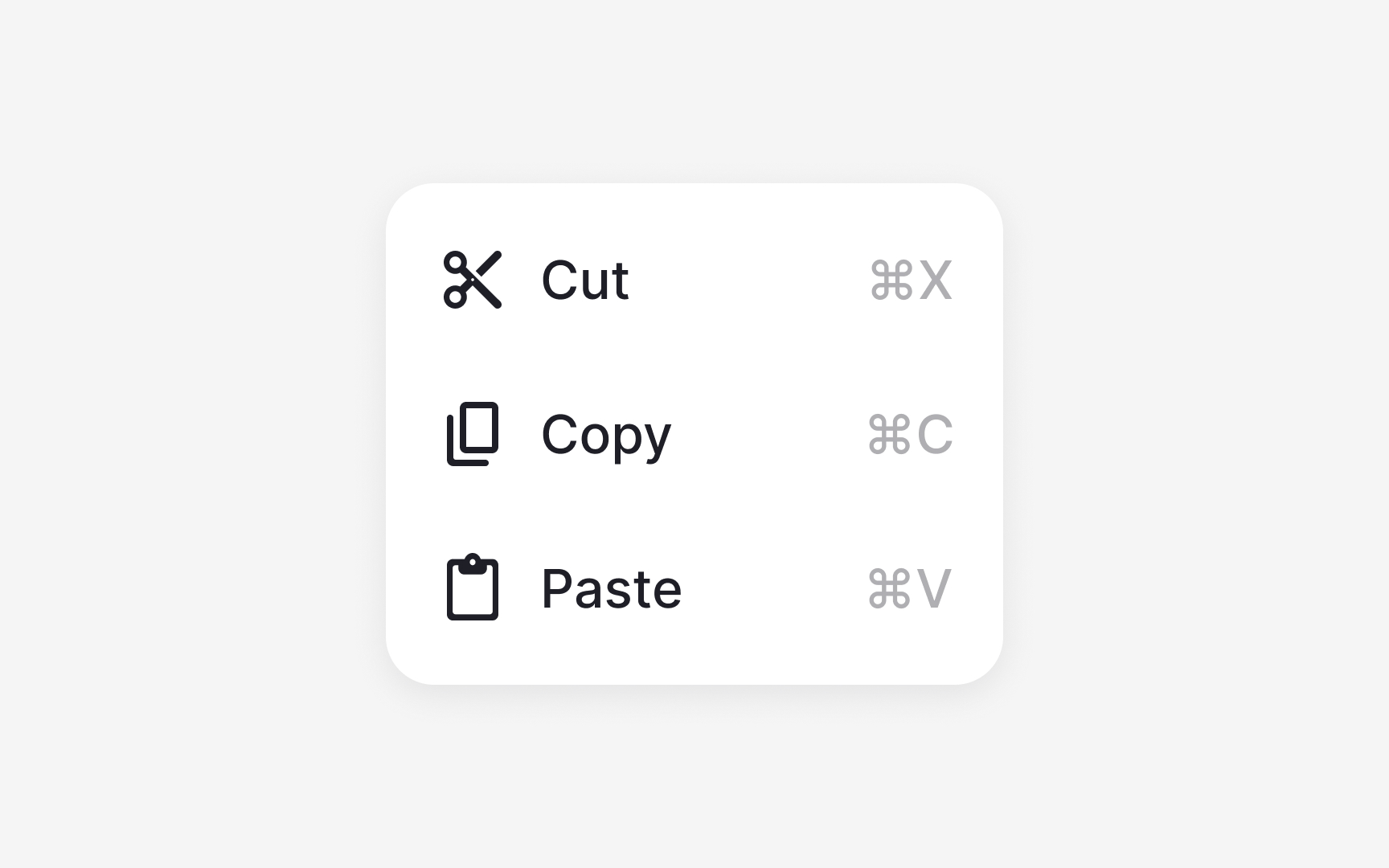
Using icons together with text
When icons appear next to text, alignment and spacing determine how readable the interface feels. Icons should follow their default size, such as 16 or 12 pixels, so they sit comfortably within text-based components. Smaller icons help maintain visual balance because large icons can draw too much attention and disrupt the reading flow.
There is no single correct alignment approach. Some systems align icons to the text baseline, while others use optical centering, where the icon is visually centered relative to the text block rather than mathematically aligned to the baseline. Optical centering often produces more balanced results, especially when icons have irregular shapes or different visual weights. The key is consistency within the system, not strict adherence to one method.
Clear spacing between the icon and the text improves recognition. Many design systems place icons inside a container or use a spacing token so the gap stays consistent across components. This prevents icons from crowding the label or creating unexpected visual gaps. When spacing and alignment are consistent, labels remain easy to scan, and icons support meaning without overpowering it.
Pro Tip: Use semantic color tokens for icons so they adapt reliably across light and dark themes.
