Creating icon components
Before an icon becomes part of the shared library, it must be prepared as a component. This ensures that every icon behaves the same way when reused, updated, or replaced.
This step should happen only after the icon has been fully reviewed and approved. Once the designer is confident that the shape, proportions, and alignment are final, the icon can be readied for production use.
At this stage, the final drawing is flattened into a single clean vector layer. Flattening removes hidden paths, effects, and strokes that could cause issues later. It also ensures the icon has a predictable internal structure that matches the rest of the set and behaves consistently when reused, updated, or replaced.
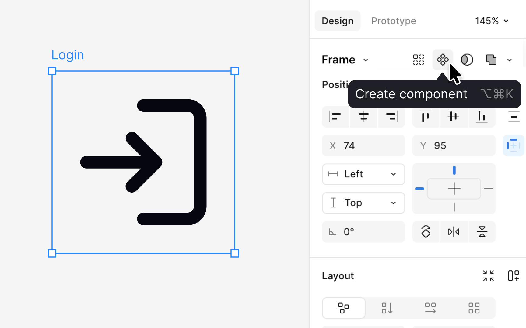
After flattening, designers apply a color token such as content primary. This token keeps the icon responsive to theme changes. Once the color is applied, the icon is placed inside a frame that matches its intended size, for example, 16 or 24 pixels. The frame becomes the outer boundary of the component. Naming the component consistently, such as icon/action/edit or icon/status/warning, helps teams browse and maintain the library.
Pro Tip: Always flatten the icon before creating a component. It prevents broken overrides later.
