Creating a tonal scale using opacity
After defining the key primary colors, the next step is to build the tones that sit above and below them. These tones can be chosen by personal preference or created through a more controlled process. A tonal scale makes the palette easier to use because every shade stays connected to the original color. Tonal palettes also help keep the interface balanced and accessible.
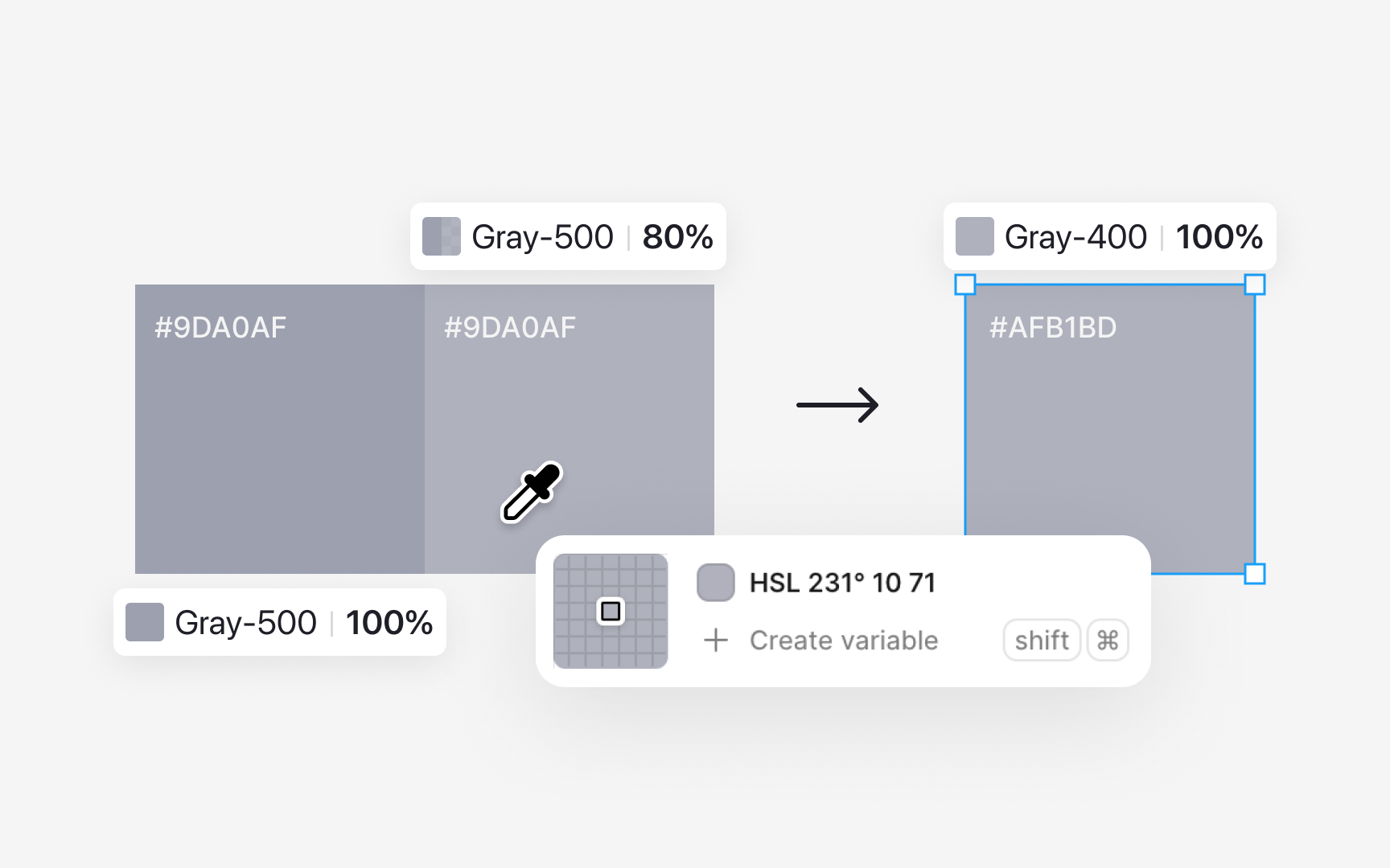
To create lighter tones:
- Start with the base color, for example gray 500.
- Draw a rectangle filled with this color and lower its opacity to around 80%.
- Duplicate the rectangle and use the color picker to sample the new visible color. This becomes gray 400.
- Repeat the process by lowering opacity further, such as to 60%, and sample again to create gray 300.
Saving each sampled tone as its own value keeps the scale consistent.
For darker tones, place the base color rectangle on a black or very dark background. Adjust the opacity until the color looks slightly deeper. Once the shade feels right for the next step, use the color picker to sample it and save that color as gray 600. Continue this process for darker values, such as gray 700. Each sample becomes a stable color in the palette instead of relying on live opacity changes.
