Designing for localization and global audiences

Localization adds another layer to accessible content. When products reach new regions, text needs to work in different languages, writing systems, and cultural contexts. If this is not considered early, translations can overflow components, lose meaning, or feel unnatural to people who read in another language. Design systems that include localization notes help teams prepare for these differences from the start.
Localization-friendly design often includes choices like:
- Avoiding idioms that do not translate well. For example, “Hit the ground running” does not make sense in many languages, so a clearer phrase like “Start quickly” works better.
- Planning for languages that expand when translated. German or Finnish text often becomes much longer, so components need flexible space to support this growth.
- Supporting right to left languages when needed. Arabic or Hebrew interfaces require mirrored layouts that affect alignment, navigation, and icons.
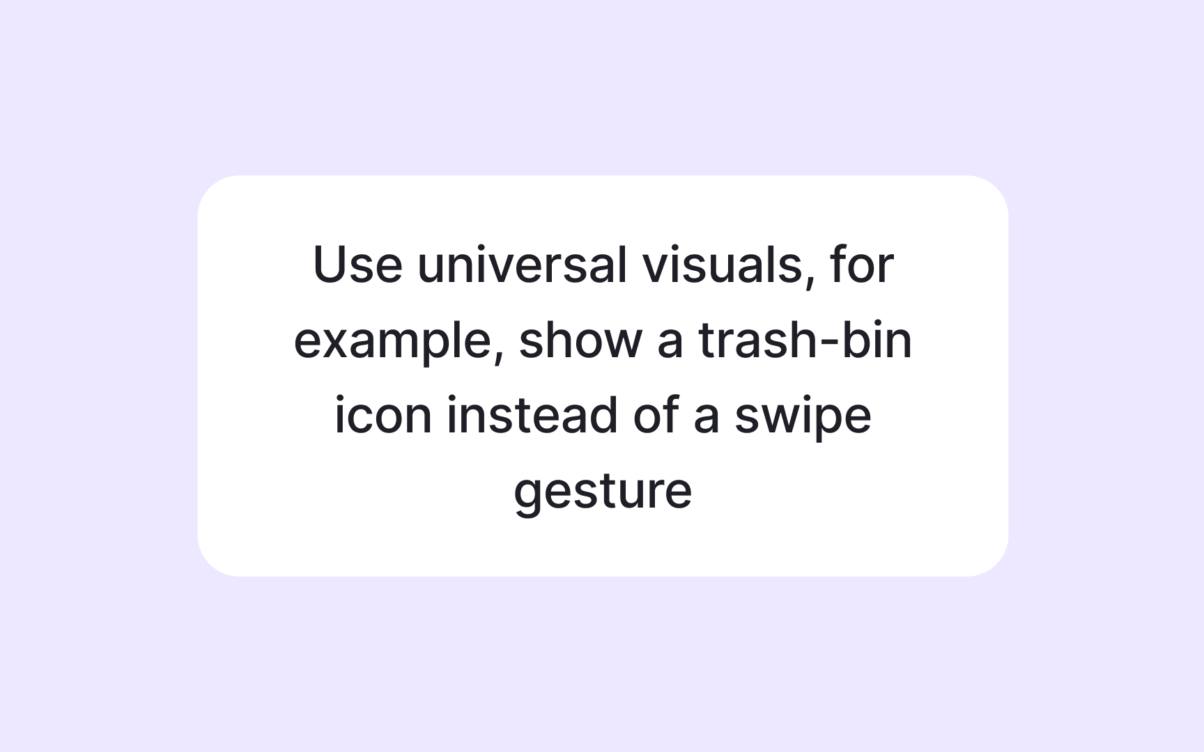
- Using neutral visuals that do not rely on local cultural symbols. For example, you may consider replacing hand gestures with simple icons that feel universal.
Planning for these differences helps the interface stay readable, natural, and respectful across cultures. It also reduces redesign later because the system already supports global use.
