Adaptive design
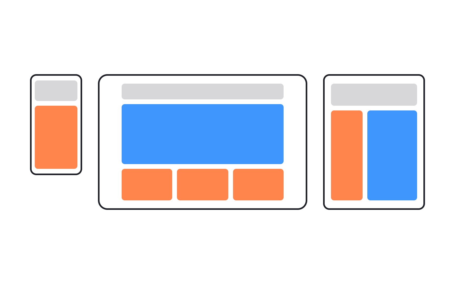
Adaptive design is a web design approach that involves creating multiple versions of a website, each tailored to specific device types or screen sizes. When a user accesses a website, the server detects the device's characteristics and serves the corresponding version of the site. This ensures a tailored and optimized user experience.
Adaptive design usually handles the 6 most common screen widths: 320px, 480px, 760px, 960px, 1200px, or 1600px.
