Component styling consistency
When users interact with your product, they gradually build a mental map of how things work. Inconsistently styled components force users to learn multiple patterns for the same interaction, creating unnecessary cognitive load.
Component styling consistency goes beyond matching colors or shapes. It's about creating predictable patterns:
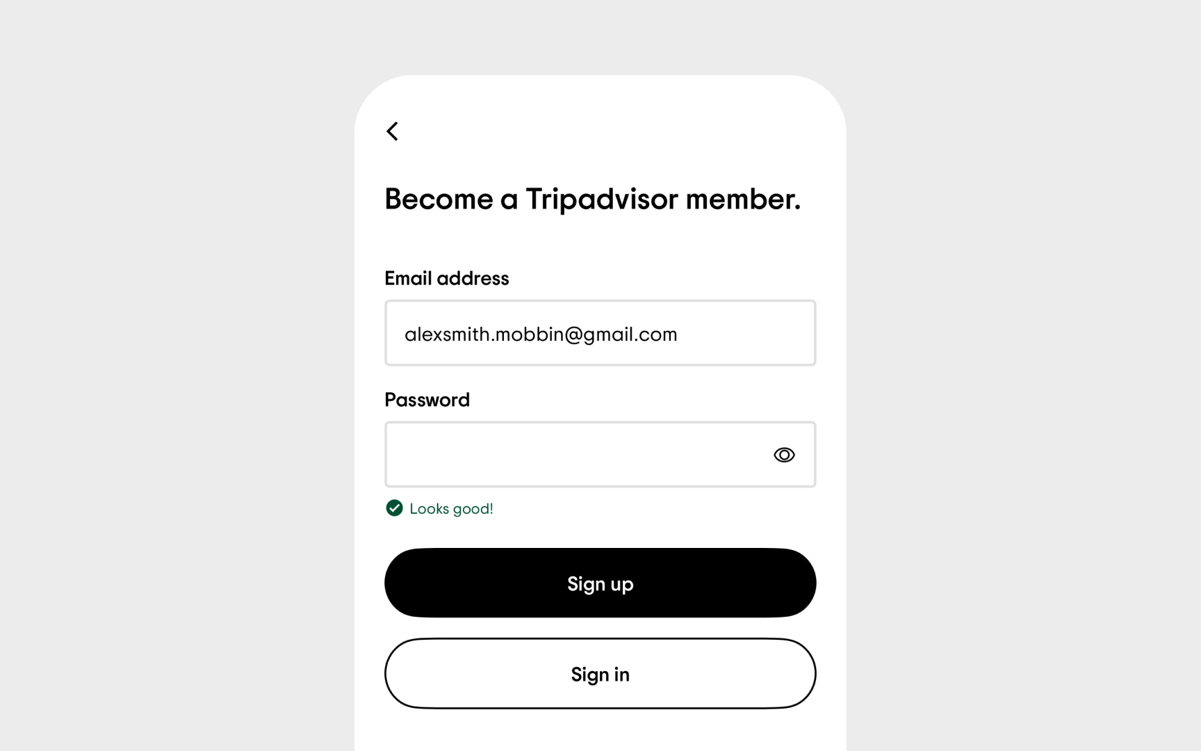
- Input fields should maintain consistent styling across the entire product
- Buttons with similar importance should share visual characteristics
- Alert messages need a uniform structure regardless of where they appear
- Interactive states (hover, focus, active) should follow consistent patterns
The audit process involves comparing instances of the same component across different contexts. Document variations and determine whether they represent necessary adaptations or unintentional inconsistencies.
Don't forget edge cases — components in modals, sidebars, or specialized workflows often drift from the main design system over time.
