Color palette consistency check
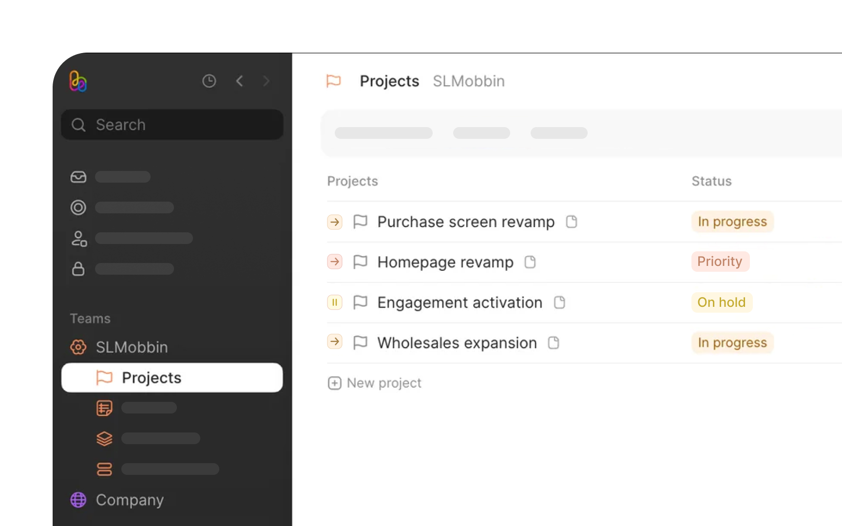
A product's color system is like its visual DNA. When colors appear randomly or inconsistently, they create visual noise that confuses users. Each shade should have a clear purpose, whether it's guiding attention to important actions or providing subtle feedback during interactions.
Start by mapping every color in your interface. Look for surprising variations: Is that gray actually a different tone than your system color? Are there three different blues where there should be one? Document these findings systematically.
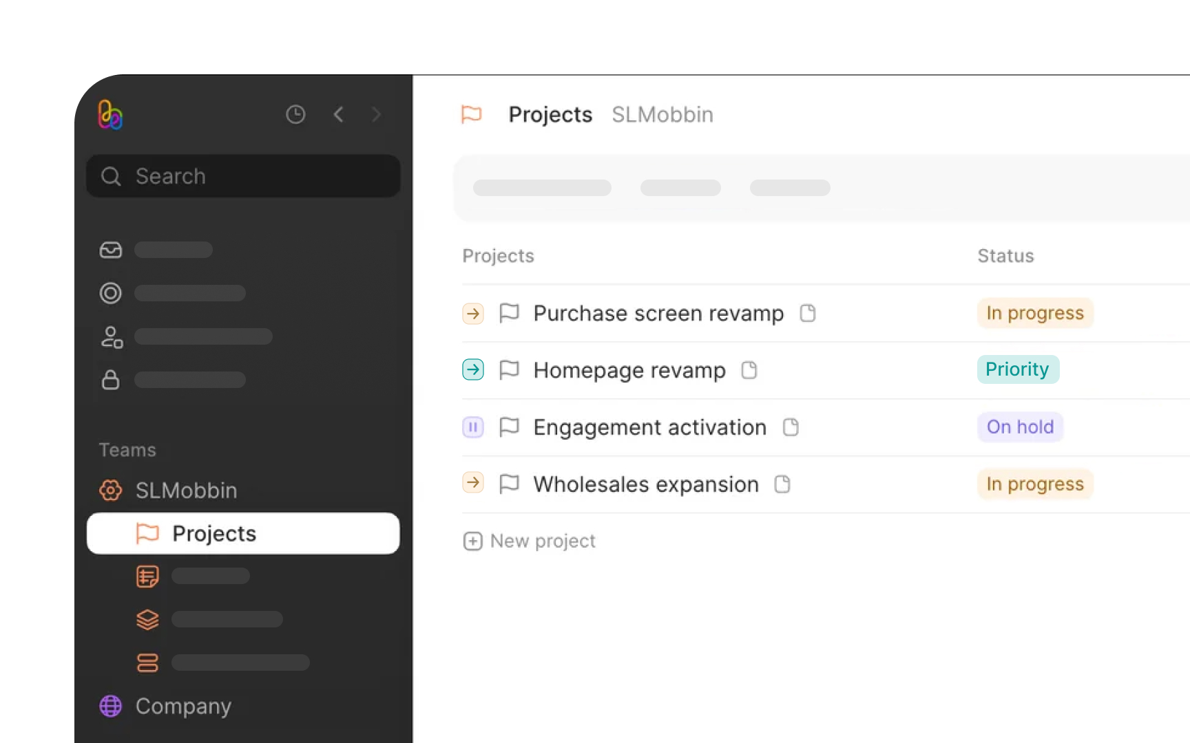
Next, examine how colors behave in context:
- Do interactive elements maintain consistent colors across all states?
- How do background colors affect the visibility of UI elements?
- Are there enough color variations to support all necessary interface states?
The final step focuses on implementation details: how color tokens are named, whether dark mode alternatives exist, and whether accessibility standards are met across all color combinations.
Pro Tip: Take screenshots of your interface and convert them to grayscale. This helps identify areas where you're relying too heavily on color to convey meaning.
