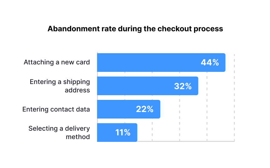
Visualizing complex design data
Good visuals make complicated design problems easy to understand. When stakeholders can see issues clearly, they're more likely to care about fixing them.
When creating visualizations for design audit findings:
- Focus on clarity over complexity: Choose chart types that best represent your specific data: bar charts for comparisons, heat maps for user interaction patterns, and line graphs for trends over time. Use consistent color coding to indicate severity levels across different visualizations.
- Determine the key story each chart should tell: Avoid the temptation to include every data point; instead, highlight the patterns and outliers that matter most. Label charts clearly with descriptive titles that state the conclusion, not just the contents ("Checkout abandonment spikes at payment entry" rather than "Checkout flow analysis").
For usability issues, consider using annotated screenshots with problem areas highlighted, or side-by-side comparisons showing current design versus best practices. Create visual hierarchies that guide viewers to the most critical information first, with supporting details available but not overwhelming.
Pro Tip: For each visualization, create a single-sentence takeaway that captures the most important insight to help stakeholders remember and act on your findings.

