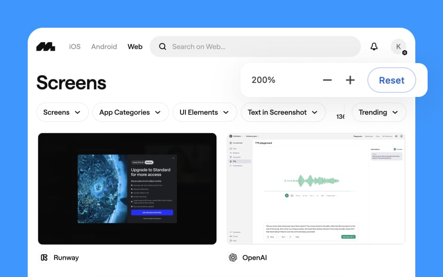
Responsive design standards
Web interfaces must function well across various screen sizes and devices. Accessibility audits should evaluate how responsive design implementations affect all users, particularly those with disabilities.
When conducting responsive design standards evaluations, follow these steps:
- Test content readability across different viewport sizes without horizontal scrolling
- Verify that touch targets are sufficiently sized (at least 44x44 pixels) for mobile users
- Check that text remains legible when zoomed up to 200% without loss of content
- Ensure that interactive elements remain usable when screen orientation changes
- Verify that layout shifts maintain logical reading order for screen readers
- Test that navigation menus are accessible in both expanded and collapsed states
- Confirm that images scale appropriately without losing essential details
Document issues by capturing screenshots at problem breakpoints and providing specific recommendations for improvement.
Pro Tip: Test responsive designs with both keyboard navigation and touch interaction at each breakpoint to identify issues that might affect users with limited dexterity.

