Use larger fonts
Small text creates reading barriers for people with dyslexia as the letters are harder to distinguish and increase eye strain. Large, clear text helps readers identify letters more easily and reduces reading errors.
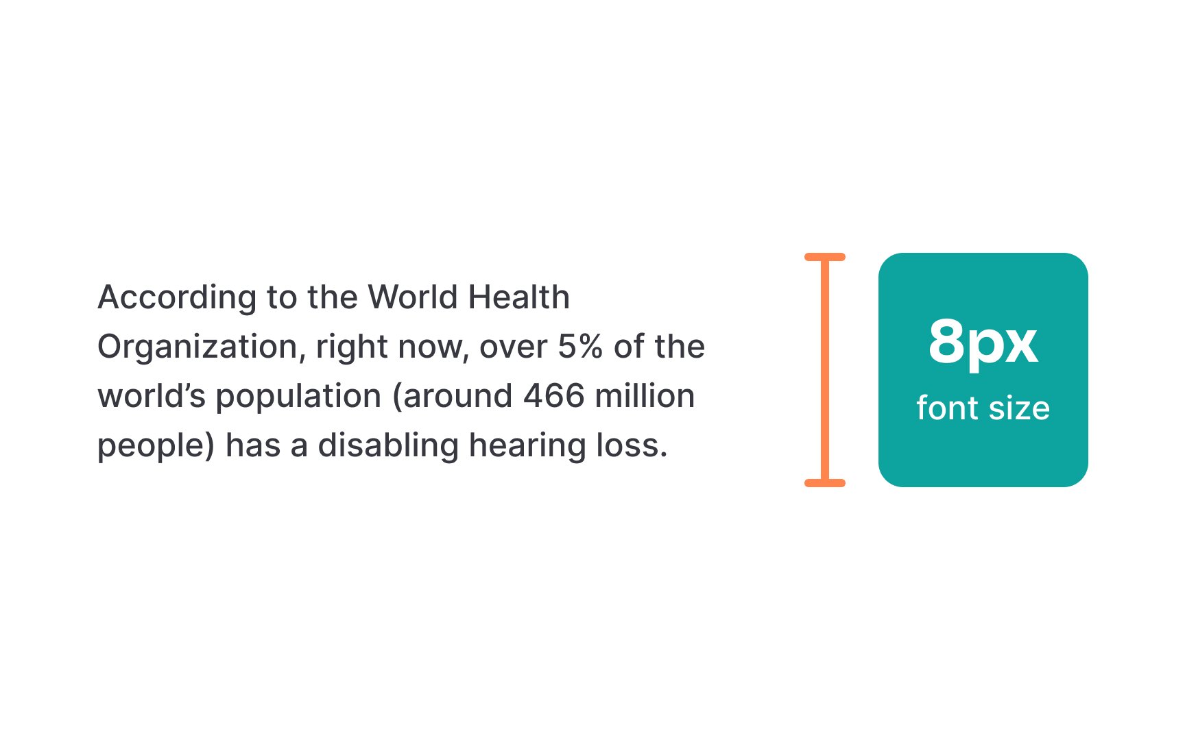
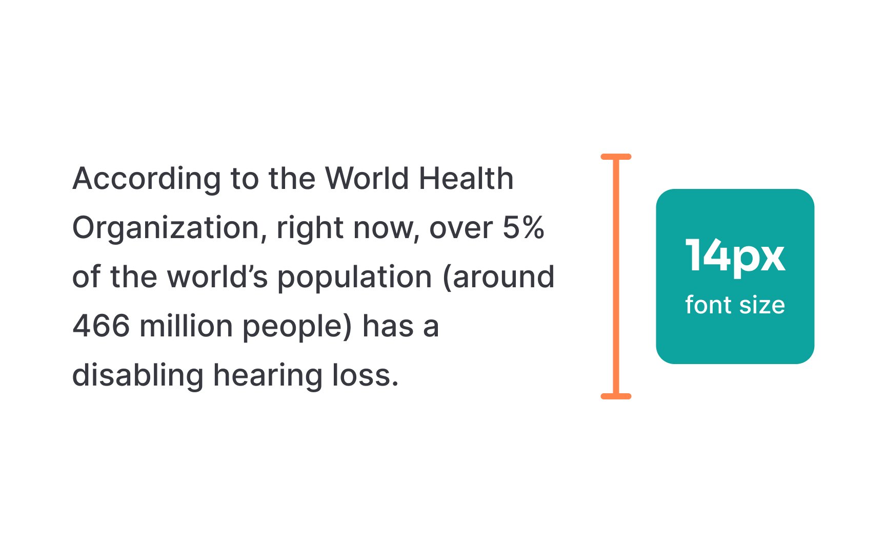
Font size directly impacts reading comfort and speed, too. The British Dyslexia Association recommends using fonts at least 12-14pt for body text.[1] Headers should be even larger to create a clear visual hierarchy. Mobile screens may need bigger fonts to maintain readability at typical viewing distances.
Remember that font size preferences vary among users. Providing options to adjust text size helps readers customize their experience. This feature especially helps people who use screen magnifiers or need different text sizes throughout the day as their eyes tire.
Top contributors