V = Visualize
Learn how to transform raw customer data into visual stories that drive product decisions and team alignment
Before opening any mapping tool to start customer journey mapping, reflect on the data you've gathered. Your research repository, whether it's a spreadsheet or collaborative board, contains the raw materials for your visual story. Take time to review patterns and key insights before jumping into layout decisions. This reflection ensures your design serves the story, not the other way around.[1]
Start with pencil and paper to sketch the basic structure, including any branches for alternate paths or important loops in the customer process. This initial planning saves significant time during digital creation and helps you think through complex journey flows. Visual clarity comes from establishing a strong grid system once you move to digital tools. Add all text content first before formatting or adding imagery. This ensures your information architecture is solid before visual design begins.

Customer journey map layouts follow a left-to-right chronological flow that mirrors how we naturally read information. The most successful maps use consistent spacing between stages and maintain clear boundaries between different sections. This structure helps viewers quickly understand the customer's progression through time. However, if your story calls for a different format, like showing 24 hours in the life of a user, a circular
Visual clarity comes from establishing a strong
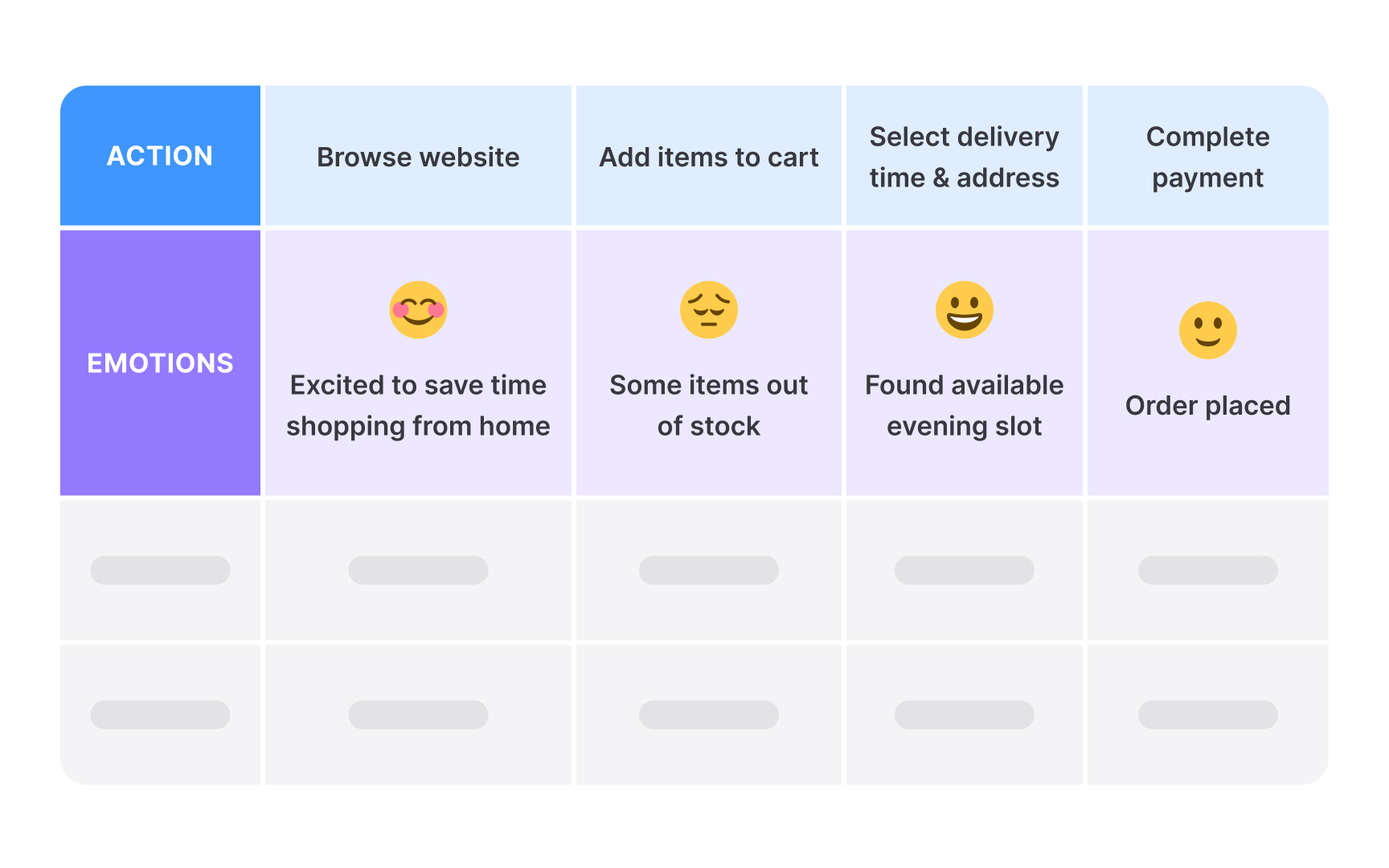
Color coding and icons serve as visual anchors that guide the eye through complex information. Use color strategically to highlight pain points, moments of delight, or different user segments. Icons should be simple and universally understood, reducing the need for extensive legends or explanations.
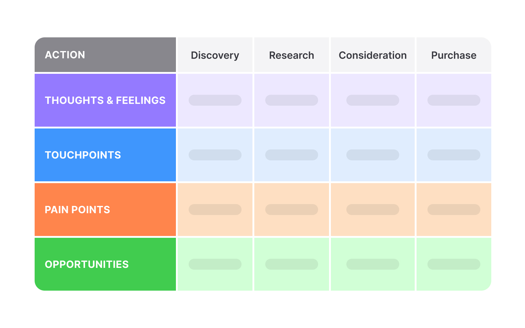
Swimlanes organize different layers horizontally across your
The order of swimlanes matters significantly for comprehension. Group the most relevant information first for your audience, for example, user actions at the top since they drive the narrative, followed by emotional states, then system touchpoints. Supporting information, like opportunities or metrics, can occupy lower swimlanes. This hierarchy helps readers follow the story naturally.
Use subtle background
Journey stages represent major phases in the customer experience, typically ranging from initial awareness through post-purchase support. Effective stage organization groups related actions and decisions into logical chunks. Most
Stage names should use customer language rather than internal terminology.[2] Instead of "Conversion Phase," use "Purchase." Each stage should have clear start and end points based on user goals or significant transitions. Avoid creating stages based solely on internal processes or departments.
Ensure stage widths reflect their relative importance or duration rather than forcing equal sizes. Longer, more complex stages naturally require more horizontal space.
If you're working from scratch in a design tool, begin with rough sketches that capture the basic flow. Then layer in more detail, like emotions, pain points, backend processes, or metrics, over time. This prevents early commitment to a format that may need major changes. Each iteration should have a clear focus. Early drafts define key stages and
When using mapping software, the process looks slightly different but is more scalable. These tools support live collaboration, reusable components, and easier version tracking. You can still iterate, just faster, and often with better structure. Stakeholders can comment directly in the tool, making it easier to align early and often.
Regardless of your method, document what changes between versions and why. This builds trust in the process and shows that the final map reflects real learning, not just polished design.
Use plain language throughout the map, avoiding jargon or technical terms. Include a brief legend explaining any symbols or
Try to balance completeness with accessibility. Executive audiences need high-level insights and clear action items, while operational teams require detailed touchpoint information. Consider creating different versions or layers that serve various audience needs without sacrificing clarity.
Structure the map to support decision-making by clearly marking problem areas and improvement opportunities. Use visual emphasis techniques like size, color intensity, or positioning to guide viewers to the most important information. Lastly, include a summary section that captures the main findings and recommended next steps.
Analog techniques using whiteboards, sticky notes, and printed templates excel during in-person workshops. They encourage participation, reduce technology barriers, and create tangible artifacts that teams can physically manipulate. The tactile experience often generates more engaged discussions and creative problem-solving.
Digital approaches enable remote collaboration, easy updates, and seamless sharing. They provide infinite canvas space, undo capabilities, and integration with other digital tools. Version control and commenting features support asynchronous collaboration across time zones and locations.
Successful projects combine both approaches. Start with analog techniques for initial discovery workshops, then transition to digital tools for refinement and distribution. This hybrid method leverages the engagement benefits of physical mapping with the practical advantages of digital documentation.
Tool selection depends on your
Dedicated journey mapping tools such as Smaply or UXPressia provide purpose-built features like
Traditional design tools like Figma or Adobe XD offer maximum visual control and integration with other design deliverables. While requiring more manual setup, they provide flexibility for custom visualizations and brand consistency. You may also consider hybrid approaches using workshops tools for collaboration and design tools for final deliverables.
Accessible
Supplement color coding with patterns,
Provide alternative formats when possible. Include text descriptions of key insights for screen reader users. Consider creating simplified versions that focus on essential information. Test your maps with grayscale printing to ensure they remain understandable without color.
References
- Customer Journey Mapping for Business Growth | Oliver West
Top contributors

Topics
From Course

Share


Similar lessons

What is Journey Mapping?

Types of Journey Maps
