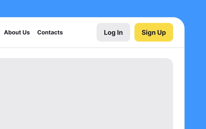
Avoid similar-looking wording for button labels
The call-to-action (CTA) labels on your login and signup buttons are more than just placeholders; they guide users through the initial steps of their experience with your product. While "sign in" and "sign up" may seem sufficiently distinct, the similarity can lead to users clicking the wrong button. So, let's be crystal clear and opt for terms that are visually distinguishable at a glance, like "log in" and "sign up" or "register."
Pro Tip: You can also experiment with more descriptive or engaging labels, such as "Join the Community" for sign-up or "Welcome Back" for login. Just ensure the terms are clear and straightforward.


