Place help & feedback options at the bottom
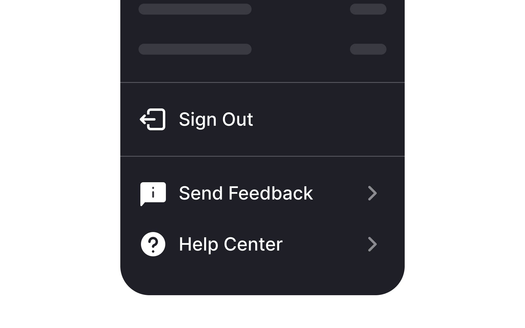
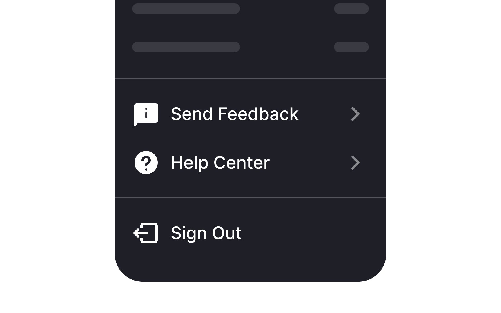
When organizing navigation and overflow menus, it's good practice to position the help and feedback options towards the bottom. Following Material Design guidelines, help should ideally be the final option, with feedback sitting just above. This layout is intuitive for users who often expect to find these options at the end of their menu journey.
However, if your menu includes a sign-out option, this should take the bottom spot. Placing it last helps prevent users from accidentally exiting the application or website, as it's a deliberate action taken less frequently than seeking help or providing feedback. Remember, the goal is to create a seamless and logical flow that users can navigate with ease.[1]
