Platform adaptation principles
Each Apple platform needs its own approach to interface design. Understanding core principles helps create experiences that feel native on every device.
Key platform characteristics:
- iPhone: Optimized for quick tasks and one-handed use. Interface elements stay within thumb reach, with clear touch targets and focused navigation.
- iPad: Balances touch control with productivity features. Supports complex tasks through split views and drag-and-drop while maintaining touch-friendly interactions.
- Mac: Built for precision and multitasking. Windows, menus, and controls adapt to pointer input and keyboard shortcuts.
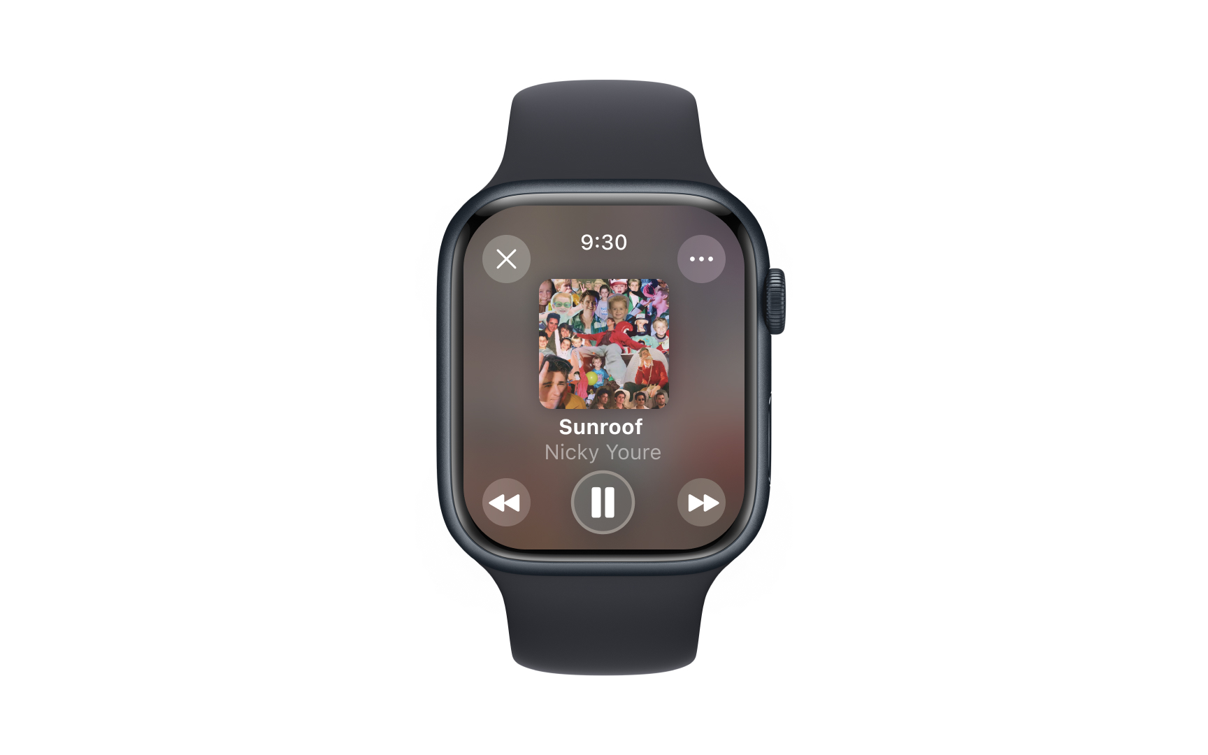
- Watch: Designed for brief glances and essential interactions. Interface elements focus on quick access and clear visibility on a small screen.
- Vision Pro: Responds to eye tracking and hand gestures in spatial computing. Content maintains visual comfort while supporting natural interactions.
Learn what makes each platform unique. Consider how people hold and interact with different devices, how far they sit from screens, and which features they use most often. Design choices should match these natural behavior patterns.
