Dark mode principles
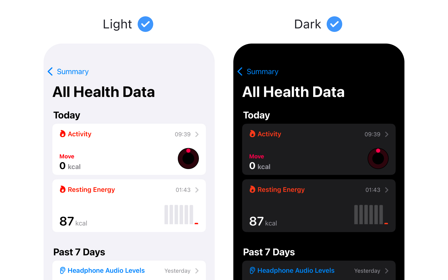
Dark Mode provides an alternative dark appearance that affects all screens, views, menus, and controls. Each platform approaches dark appearance differently to best serve its context and use cases.
Platform-specific behaviors:
- iOS/iPadOS — full system support with dynamic adaptation
- macOS — includes vibrancy effects for depth and hierarchy
- visionOS — uses glass material that adapts to surroundings
- watchOS — primarily dark with optional color gradients
Key dark mode characteristics:
- Uses a darker color palette throughout
- Increases vibrancy effects for contrast
- Blends foreground and background dynamically
- Preserves brand recognition
- Ensures accessibility standards
Dark Mode isn't just about inverting colors — it's about creating a comfortable viewing experience that maintains visual hierarchy and functionality across contexts.[1]
Pro Tip: Design for both modes from the start rather than adapting light designs to dark later.
References
- Dark Mode | Apple Developer Documentation | Apple Developer Documentation
Top contributors