Color contrast
Maintaining proper contrast in both light and dark modes is crucial for readability and usability. Apple's platforms provide several tools and guidelines to help achieve this.
How to maintain proper contrast:
- Use system-provided label colors for different text hierarchies (primary to quaternary)
- Apply dynamic system colors that automatically adjust contrast
- Keep primary content at the highest contrast level
- Reserve lesser contrast for secondary and tertiary elements
- Use fill colors appropriately for backgrounds and UI elements
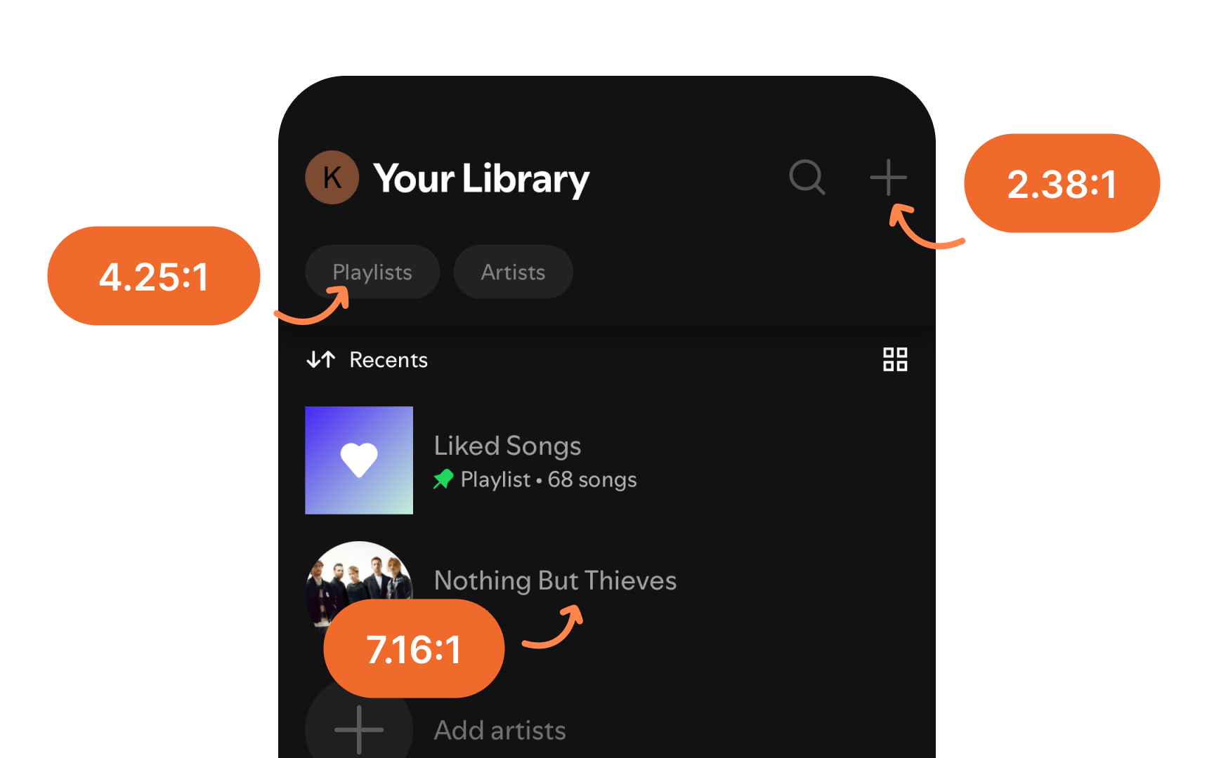
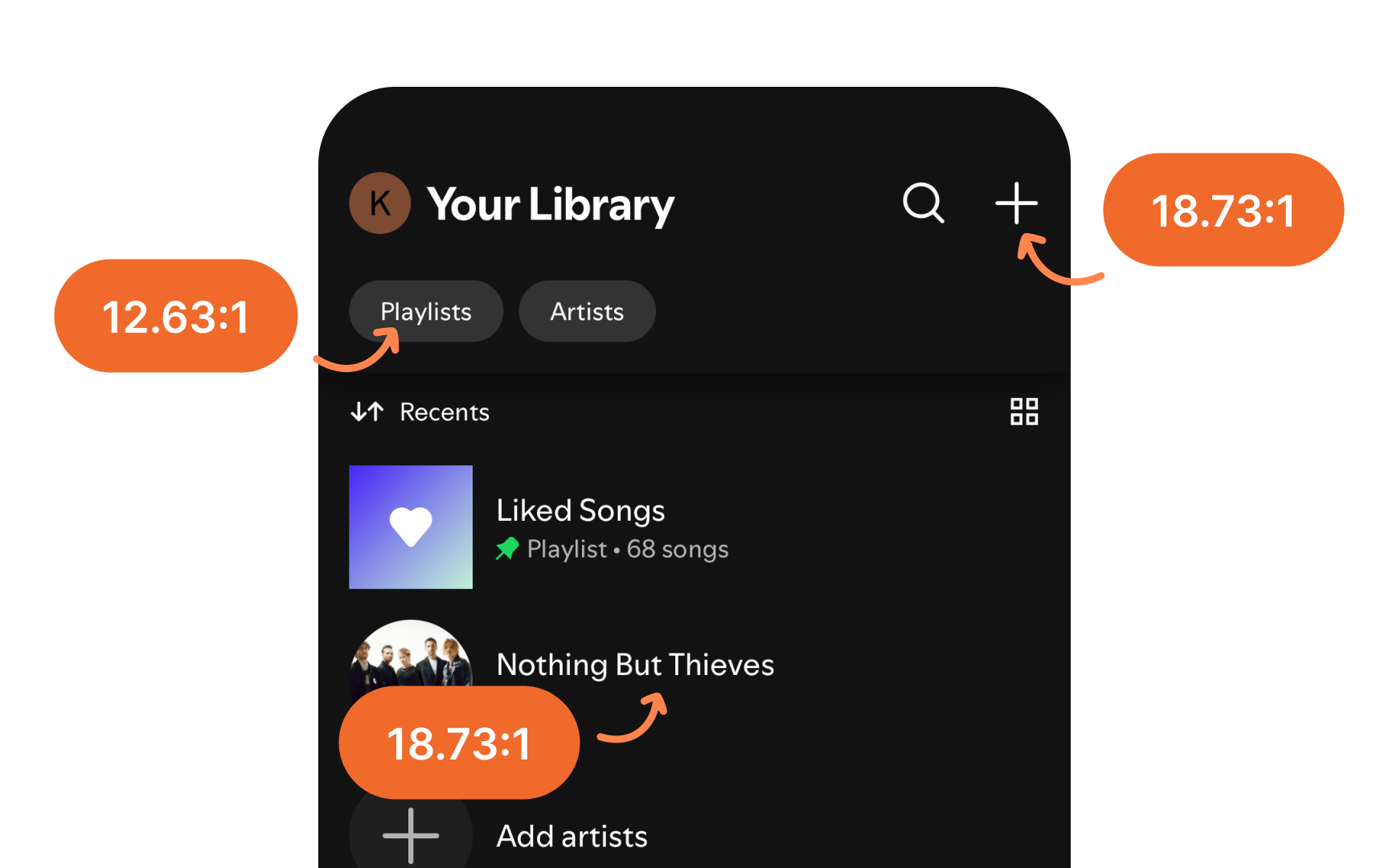
When using custom colors, test them against both light and dark backgrounds to ensure they maintain proper contrast ratios: at least 4.5:1 for standard text and 3:1 for large text (18pt+) and UI components. This ensures legibility across all modes and meets accessibility standards.[1]
