Zenkit - Color System

I chose Zenkit as the object for reimagining its brand image. The original primary color is blue, which gives an overall impression of trustworthiness, calm, and cleanliness.
My goal is to create more focus, add a bit of energy, while still maintaining a sense of calm for the user.
Let's see how I apply color palette to design in the presentation

Reviews
2 reviews

Great job, Gia! Your presentation and redesign were amazing. I was pleased that you included UI examples and WCAG, which are often overlooked. However, I was wondering why you decided to use a red colour for notification pops but a darker colour for the number of notifications. Perhaps it was due to brand guidelines, but it felt like it lacked a sense of urgency. Anyway, good job!

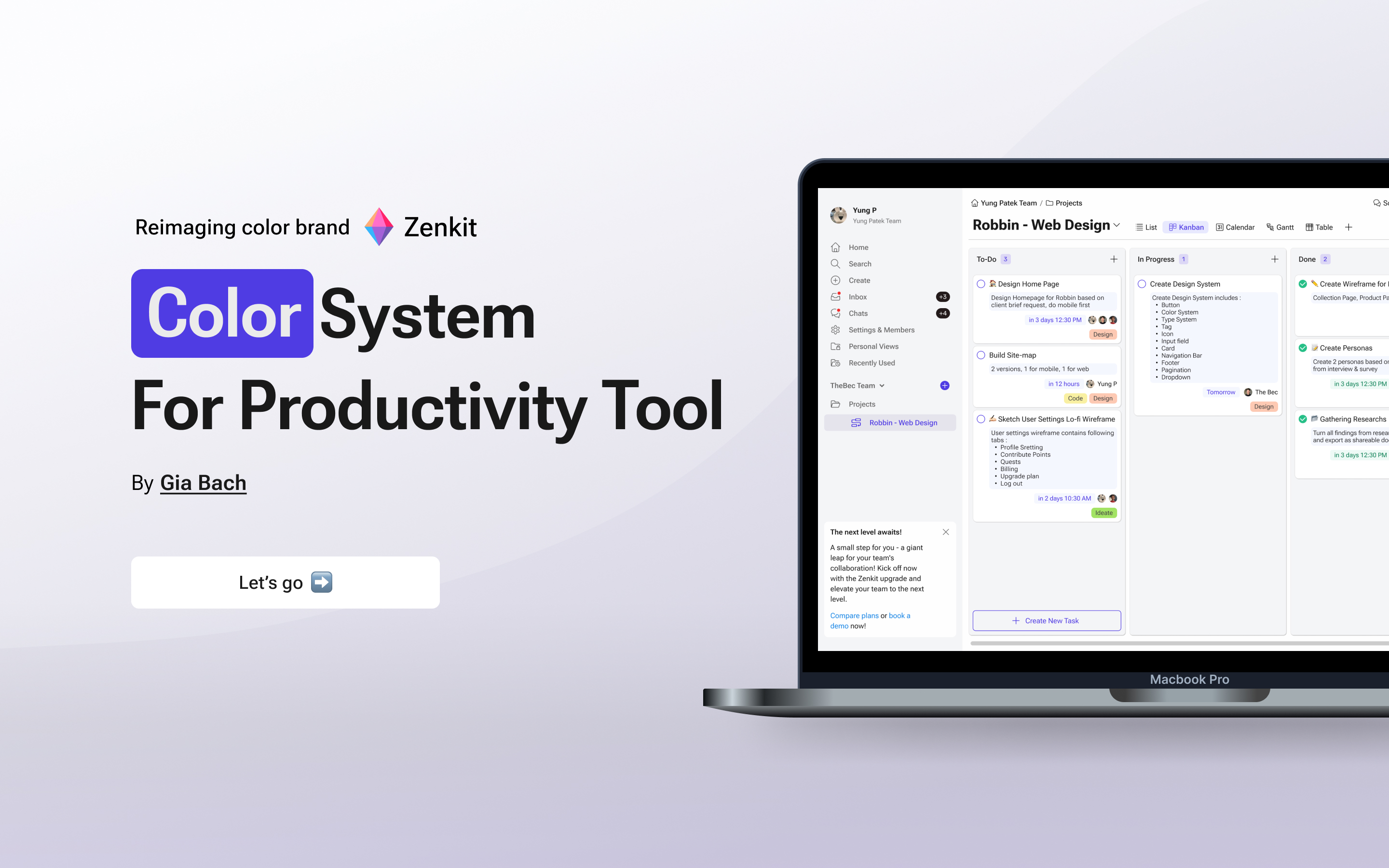
In the original version, it feels like everything is blue, making everything look the same. But the way you use different colors for different parts of the UI makes the structure much clearer at a glance.
You might also like

Events Managment App


Customer Journey Map — Offsite Co-Working Experience


Mobile Onboarding: Casa di Pasta


Accessible Signup & Login Experience — Brainex


Accessible Signup Form


Accessible Signup Form

Visual Design Courses

UX Design Foundations


Introduction to Figma

Design Terminology
