Zen Journal: Accessible Signup & Login
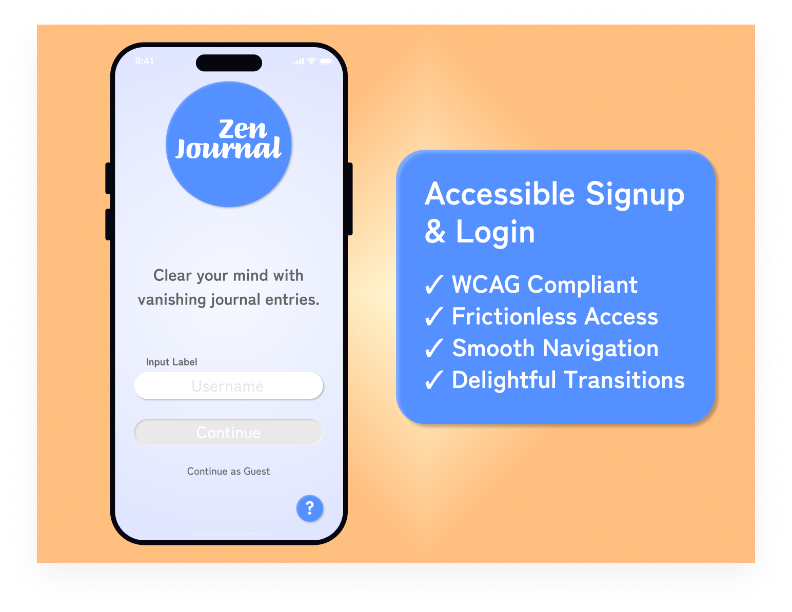
I had two goals for this project. The primary goal was to create a signup and login form that meets all WCAG AA requirements. The second was to provide a frictionless user experience that would leave users feeling calm and satisfied.
Accessibility
- Clearly defined input boundaries
- Labels outside of inputs
- Highly visible input labels surpassing 4.5:1 contrast ratio
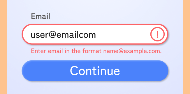
- Multiple cues for error states
- Large text meets 3:1 contrast ratio for AA
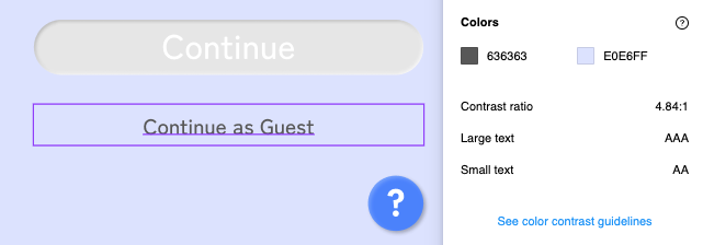
I used the Able plugin to check for appropriate contrast ratios for both large and small text.
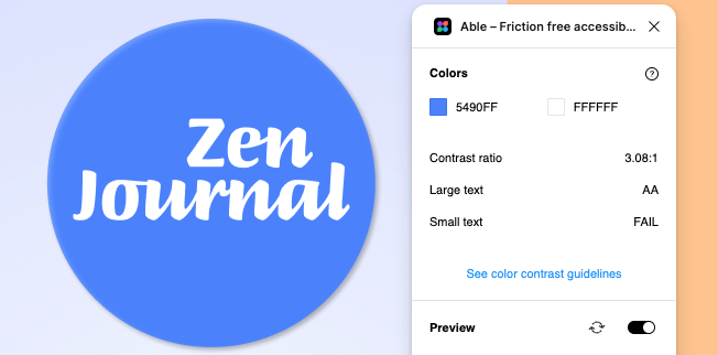
Because the background is a gradient rather than a solid color, I tested my smallest text against the lightest and darkest parts of the gradient.
Error states use images and text in addition to color to accommodate colorblind users and make the experience better for all users.
User Interface Choices
- The color blue evokes a calm mood
- Subtle gradient background helps to guide the eyes
- Rounded elements create a soft, friendly environment
User Experience Choices
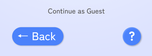
- Continue as Guest option greatly reduces friction
- Prominent Back and Help options to assist users
- Single username input reduces cognitive load
Providing simple buttons at the primary, secondary and tertiary levels makes navigation simple and easy.
Tools used
From brief

Topics
Share
Reviews
1 review

Hey Justin!
First off, well done on submitting your design brief! You’ve demonstrated a good understanding of conventional login layouts and functionality which is always your most important first step.
I think the next big focus should be on refining your visual design. There’s always room to grow, and here are a few steps that could help elevate your work even further:
- Texture in Design: Experimenting with texture can be a nice touch as you’ve done with your background, but it’s a fine balance—it shouldn’t distract from the important areas of the screen. A more subtle application could keep things clean while adding depth.
- Disabled State Visibility: On the first screen, the disabled state is a bit faint, which could cause confusion. Increasing contrast slightly will help users recognize it more easily.
- Input Field Text & Alignment: Double-check the text size in your input fields. A great way to ensure correct proportions is to reference a default iOS or Android login screen as a stencil. Also, keeping input text left-aligned improves readability and user experience.
- Continue as Guest Visibility: This text is blending into the background, making it easy to miss. A bit more contrast will ensure users don’t overlook this option.
- Figma File Efficiency: I took a quick look at your Figma file, and it’s great to see you prototyping well done! You might find it helpful to explore some of Figma’s advanced tools to streamline your high-fidelity designs and make iterations easier.
This isn’t an exhaustive list, but just some steps to help you refine your design further. You’re off to a great start, and I’m excited to see how you continue developing your skills. Keep up the good work!
You might also like

Improving Dating App Onboarding: A/B Test Design

FORM Checkout Flow - Mobile


A/B Test for Hinge's Onboarding Flow


Accessibility Asse


The Fitness Growth Engine

Uxcel Halloween Icon Pack

Visual Design Courses

UX Design Foundations


Introduction to Figma

Design Terminology
