Wireframing for Video Streaming Service

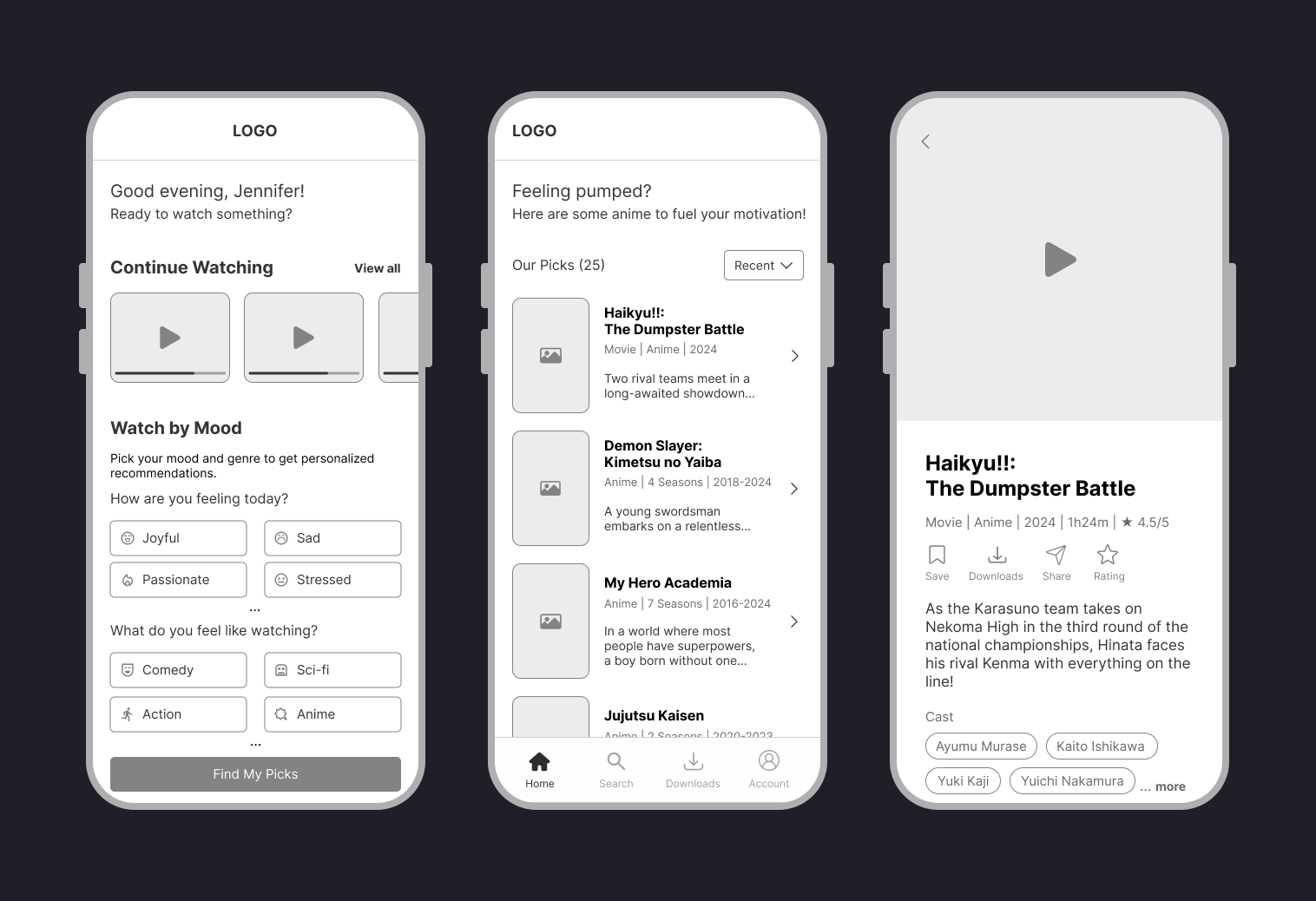
This project reimagines a video streaming experience by introducing mood-based recommendations.
Instead of browsing endless categories, users can select how they feel — for example happy, sad, or stressed — and pair it with a preferred genre to discover tailored content.
The goal is to make the platform feel more personal, intuitive, and emotionally engaging, helping users find what fits their mood with just a few taps.
Tools used
From brief

Topics
Share
Reviews
4 reviews

Nice work Jenn, clean simple wireframes, properly annotated and with the right level of detail. You have been able to convey how your solution would work.
I have to admit that, at first sight, I didn't really get how your first screen was meant to work. To me it does resemble a bit an onboarding screen where you set some preferences right after signing up on a service.
If you want to work a bit more on it, here are some point to get you started:
- The [...] to access more moods / genres not displayed is not really an obvious or intuitive interaction, I would look at least how to integrate a properly labelled button or an icon button (if not other interactions like, for example, a drawer).
- The CTA does not have a straightforward relationship with what the second screen is. What are "my picks"? Why do I want to "find" them? For example, you could make it much more obvious with a "Build my playlist"
- You should consider how your feature sits in the overall user flow. For example, I found it very odd that the first screen does not show the bottom toolbar. Why would I need to go to the second step in order to acces my account or my downloads?
Thanks for your submission!

I love the idea of mood-based recommendations. Your wireframes are really clean and easy to follow, and I like that you’ve shown some of your thought process behind them too.
Some things to think about on the ‘Sign in result page’:
- You mention this screen shows up after signing in. Where does this screen sit within the user flow after that initial sign-in? Since there’s no bottom navigation visible, users might feel a bit stuck or unsure of where to go next.
- It feels a little like a search or home screen to me — It could work well to combine it with one of those.
- I’m also curious how the “watch by mood” feature works. If I choose sad or stressed, would it show me movies that match that mood, or ones meant to lift it? And for joyful, would it repeat similar content or change? A little more context for users may build trust around the feature.
Nice work overall — you’ve got a solid foundation here!
S Ravikant
clean wireframes

Clean wireframes, did you prototype them too?
You might also like

edX Sign-Up Page Redesign


Beautify Login page WCAG principles


Design Prioritization Workshop


Notion Login Page Accessibility Optimization


Sanyahawa - Landing page Design


Healthy Dashboard

Interaction Design Courses

UX Design Foundations


Introduction to Figma

Design Terminology
