Website Design for Publishing House

The previous website was outdated and didn't effectively showcase our extensive catalog of books. To create a more engaging online experience, we conducted thorough market research and analyzed industry best practices.
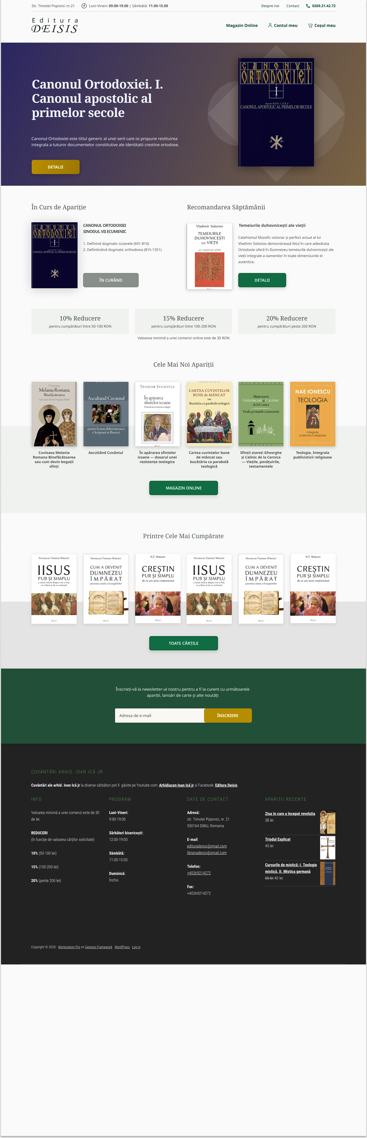
We redesigned the website, optimizing the existing content and leveraging high-quality book covers to create a visually appealing and user-friendly platform. The new site is clean, modern, and loads quickly. The design is visually appealing and aligns with our brand's aesthetics.
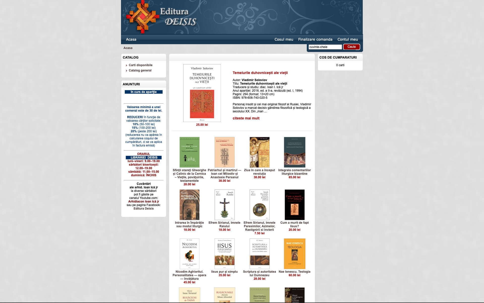
The old website looked like this:
Tools used
Share
Reviews
1 review

First of all, thank you for sharing your work! It’s clear you put in a lot of effort, and I especially like the elegant way you’ve presented the books in your layout. And this version is by far an improvement over the old one. nice work in that sense!
That said, there are some areas where you could improve:
• Accessibility: Pay closer attention to contrast, particularly with the green text on the dark background. It could be harder for some users to read.
• Typography Hierarchy: The typographic hierarchy lacks consistency, and at times the layout feels a bit disorganized. I recommend refining your typography system to achieve the clean look you’re aiming for.
I understand that this is a challenging project, but I encourage you to go for a second iteration. I’d be happy to provide more feedback after you refine it.
Keep up the consistent effort!
Ciprian Tepes
You might also like

Customer Journey Map for a Co-Working Space


Reimagining Asana's Color System


Latios - Free Portfolio Template for UX/UI Designers

Workspace Booking Flow - UI/UX Design

Responsive Main Screen

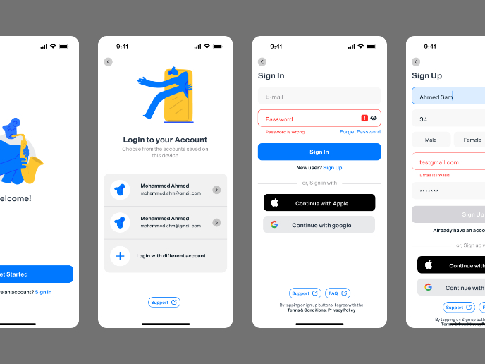
Login/Sign up Form

Popular Courses

UX Design Foundations


Introduction to Figma

Design Terminology
