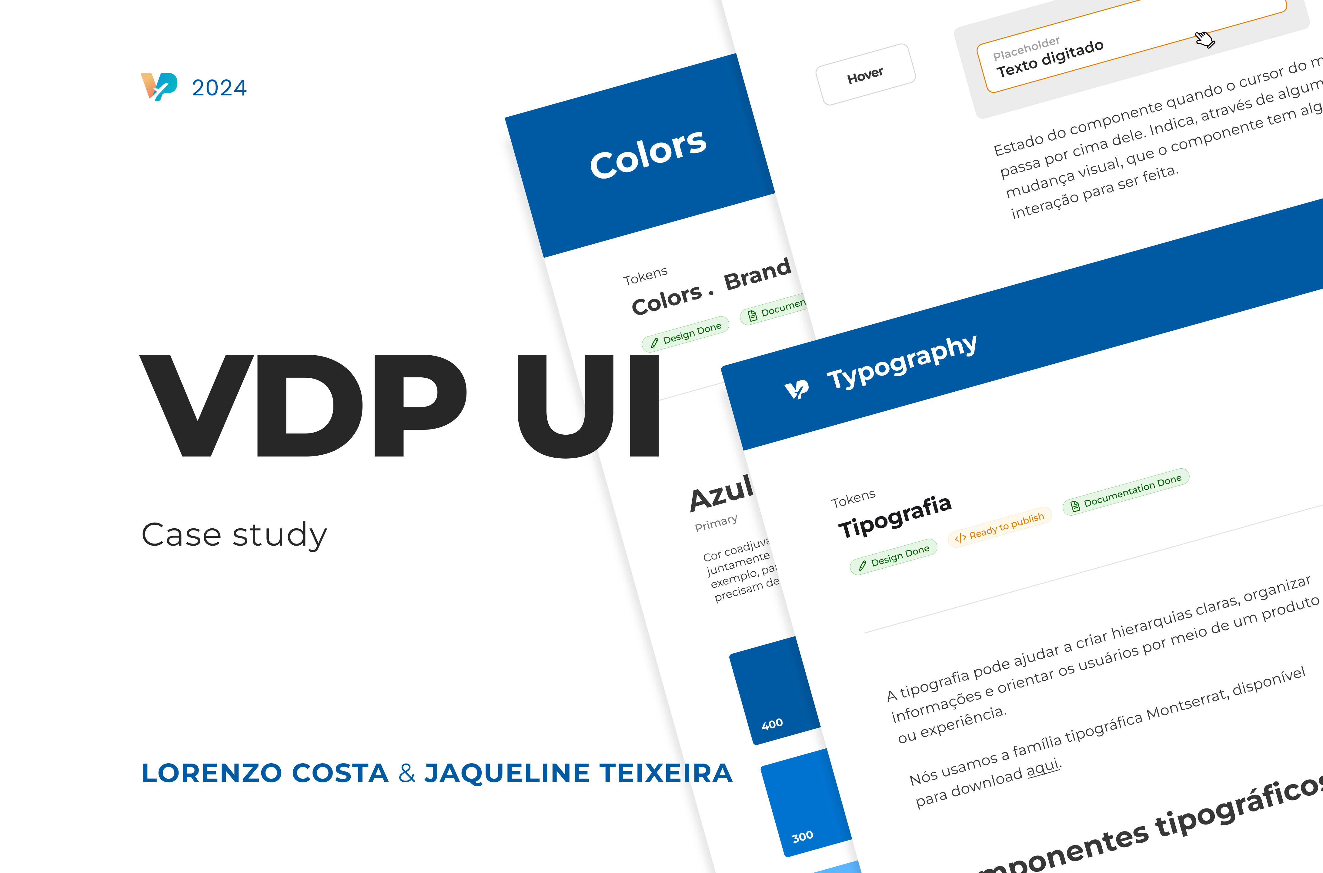
VDP UI: Creating a Design System to assure consistency

Vai de Promo is a travel eccomerce with the mission of helping travelers find every service they need for a trip.
🗣️ Overview
This project was initiated to address critical issues in the existing product's design and usability. As a Product Designer, my goal was to develop a comprehensive design system that would create consistency, ensure accessibility through comprehensive elements, and provide a product that was scalable.
You can access the Figma file here -> https://www.figma.com/design/P6nHXuYF3nCIy7NExvtB9G/VDP-Style-Guide-(Copy)?node-id=0-1&t=iNFVye2MKNs3SHUJ-1
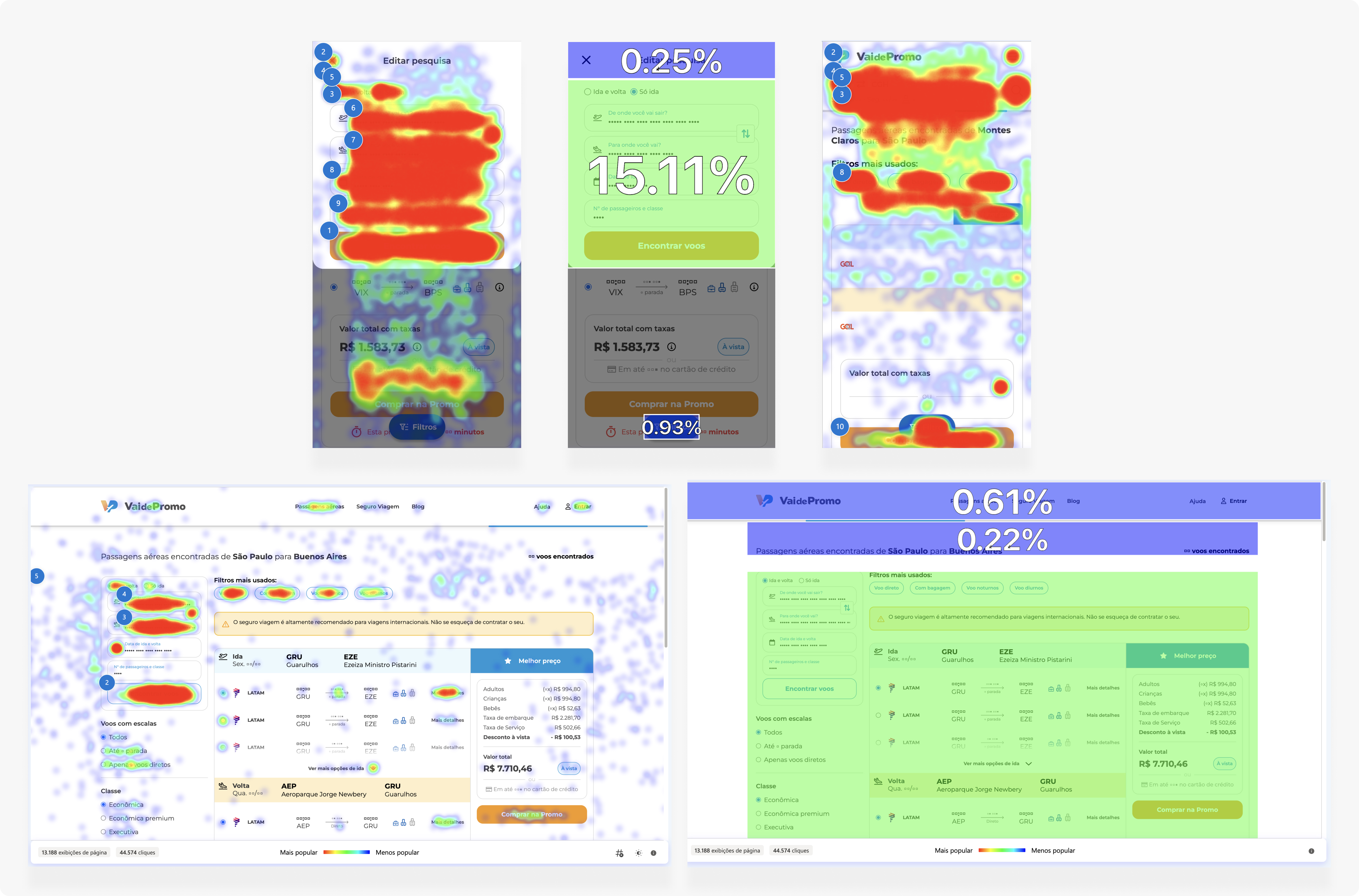
🚨 Identifying the Problems
Before the project's inception, the website suffered from several challenges:
- Visual Inconsistencies: Elements such as buttons, colors, and inputs varied greatly, leading to a fragmented user experience.
- Usability Issues: Navigation was confusing and obsolete, and users frequently encountered trouble completing tasks.
- Maintenance Difficulties: Adding new features and maintaining the existing codebase was challenging and would cause bugs due to the lack of standardized components.
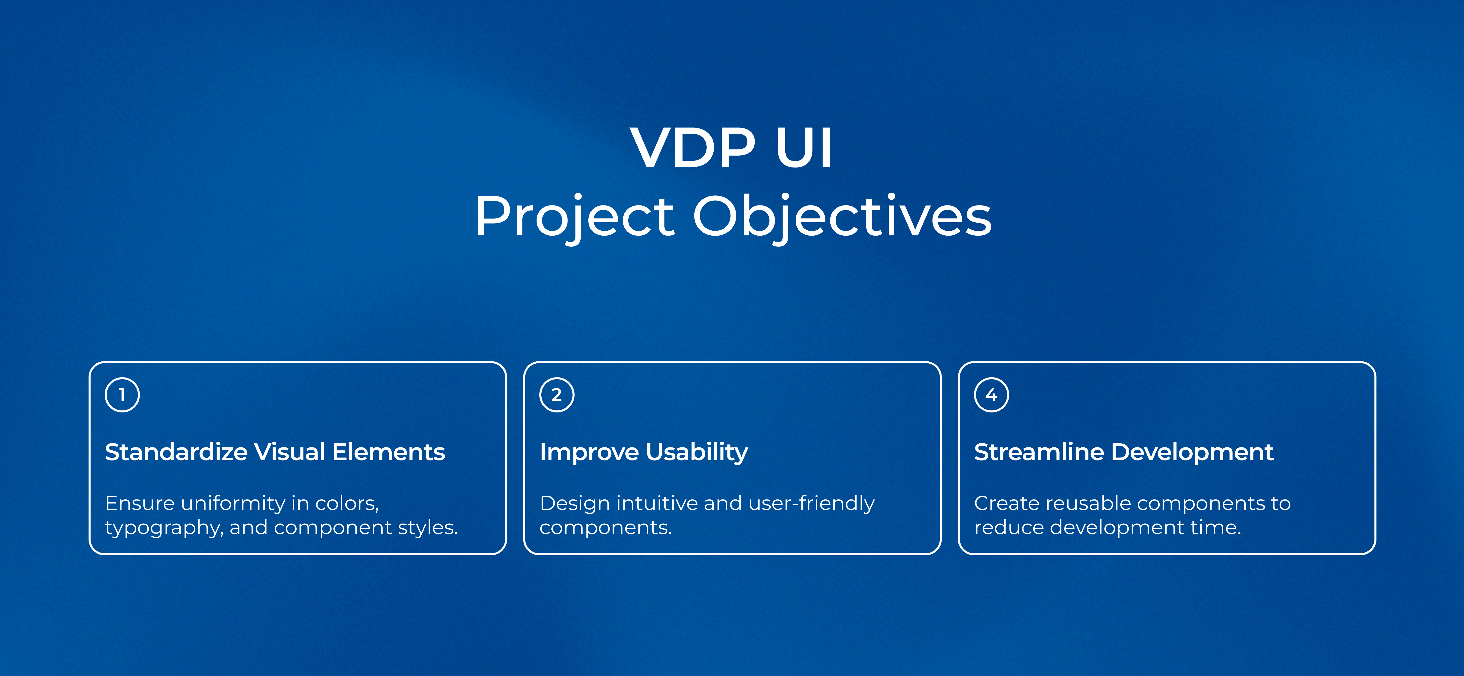
By clearly identifying these problems, we were able to set specific goals for the new design system: achieve visual consistency, improve usability, and streamline the development and maintenance process.
🔎 Research and Analysis
To address the identified problems effectively, we conducted comprehensive research. This involved:
Analysis of the Existing Site: A detailed audit revealed inconsistencies in elements like buttons, colors, and inputs. These inconsistencies led to a fragmented user experience.
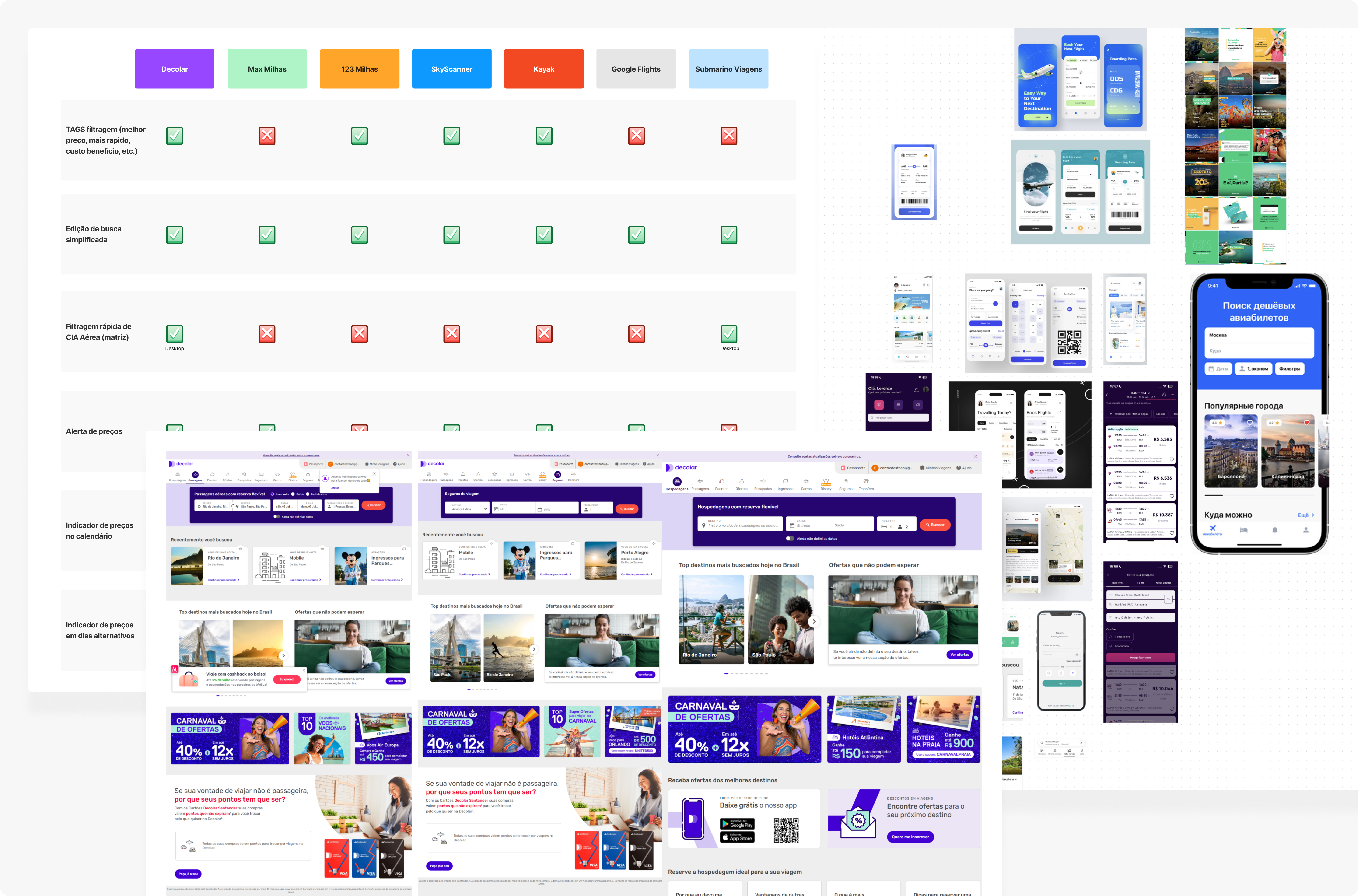
Benchmarking: We studied industry-leading design systems like Google’s Material Design and IBM’s Carbon Design System, and also competitor like Hurb's Suitacase DS and Smiles Tangerina, identifying key practices, such as component structuring, layout principles, and accessibility standards, that informed our approach.
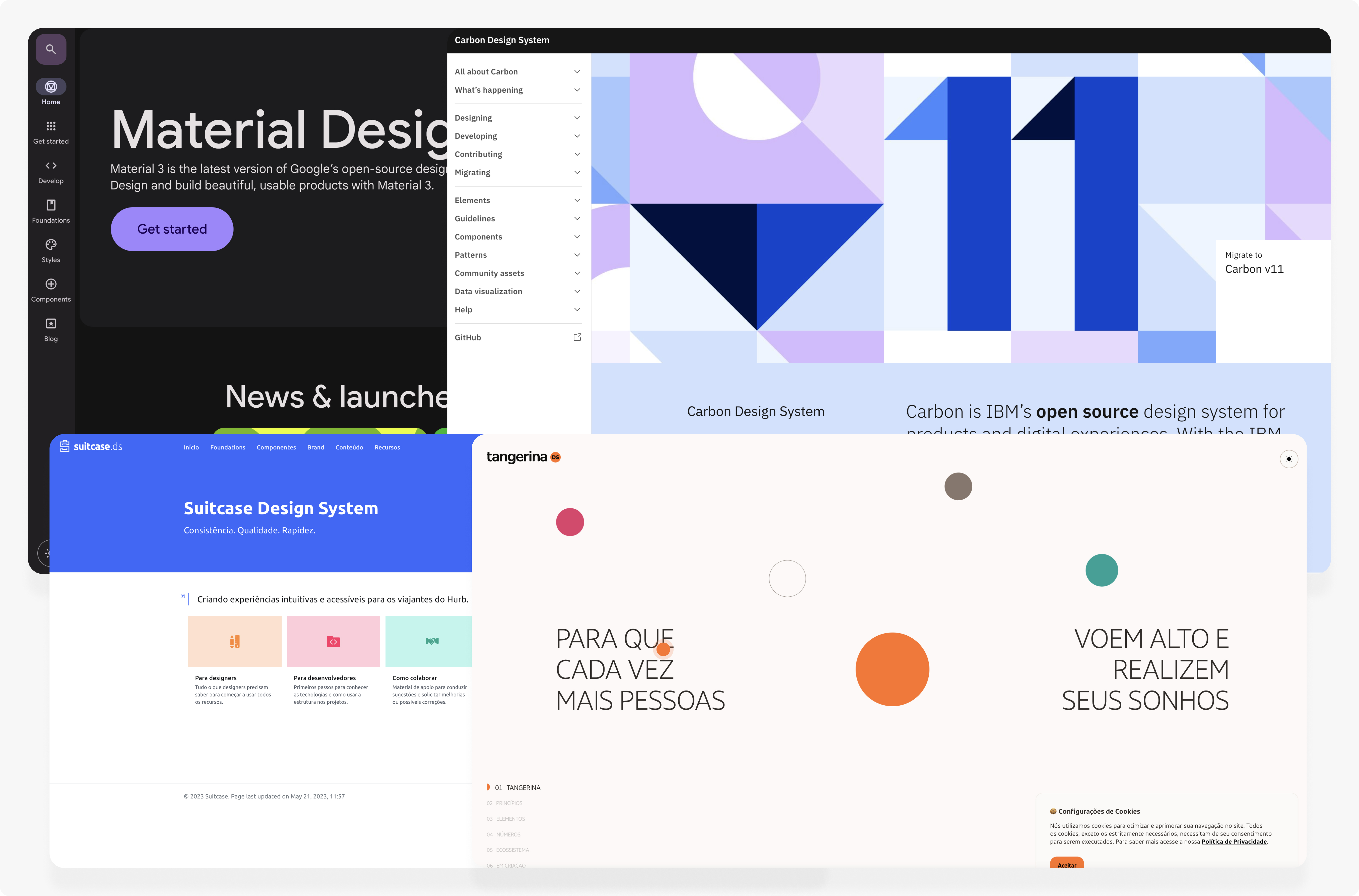
Feedback from Users and Stakeholders: User behavior and stakeholder interviews highlighted pain points such as low hierarchy o components and buttons that were too small, guiding our design decisions.
Competitor Analysis: Examining competitors' sites like Decolar and Hurb revealed effective strategies like reusable components, which influenced our approach.
This research phase ensured our approach was data-driven, laying the foundation for a successful design system.
🚀 Defining the Scope and Objectives
The vision for the VDP UI project was to create a unified, scalable design system that enhances user experience and simplifies development.
Components and Patterns: Key elements included buttons, forms, modals, navigation menus, and typography standards, designed for versatility.
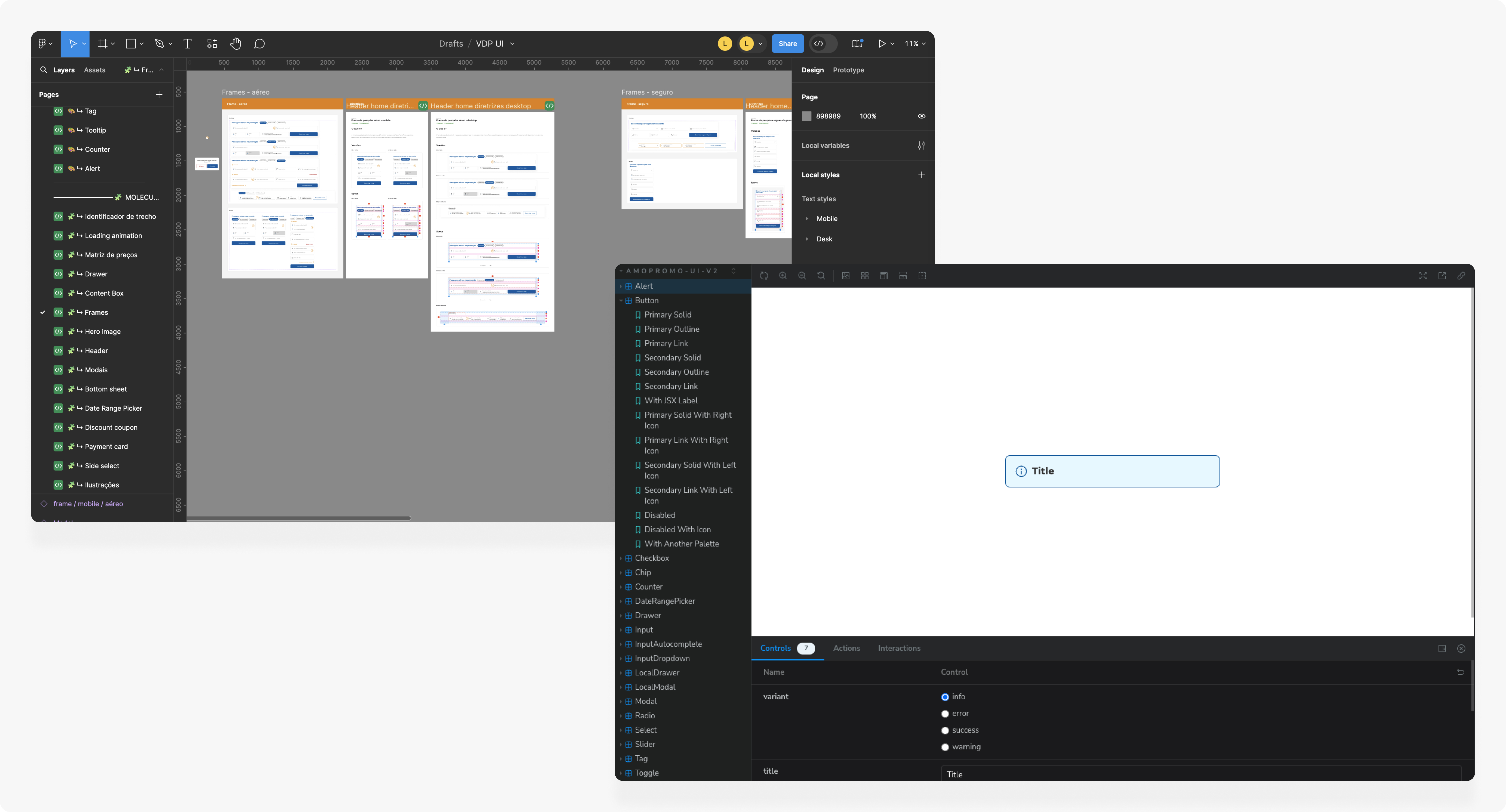
Tools and Technologies: We used Figma for design collaboration and Storybook for documenting components, chosen for their support of real-time collaboration and consistency.
Design Tokens: Variables for colors, spacing, and typography ensured consistent styling and easy updates.
Documentation and Guidelines: Detailed guidelines for each component included usage instructions and best practices, serving as a reference for designers and developers.
By defining the scope and objectives, we laid a solid foundation for the design system, aligning efforts towards a cohesive and efficient outcome.
🪚 Tools
To facilitate the creation and maintenance of the VDP UI, we selected key tools designed to support collaboration and consistency.
Figma:
- Purpose: Design collaboration and prototyping.
- Features: Real-time collaboration, component libraries, and design tokens.
- Benefit: Enabled seamless communication and consistent design application across the team.
Storybook:
- Purpose: Developing and documenting UI components.
- Features: Interactive component explorer, live preview, and add-on support.
- Benefit: Centralized component documentation, facilitating easier development and maintenance.
These tools ensured that our design and development processes were well-coordinated and efficient.
🎨 Design Tokens
Design tokens were a crucial element of the VDP UI, providing a standardized way to manage core design properties. We focused on the three main tokens that we considerate important: Colors, Typography and Grids. These tokens ensured consistency and allowed for easy updates across all components.
Brand Colors
- Defined a core set of brand colors to maintain a consistent visual identity across all elements.
Accent Colors
- Established accent colors for highlighting important information and actions, ensuring a harmonious visual experience.
Typography:
- Established a comprehensive typography system, including font sizes, weights, and line spacing for headings, body text, and captions.
Grids:
- Created standard spacing and layout guidelines, including margin and padding values and a grid system, to ensure a clean, organized interface.
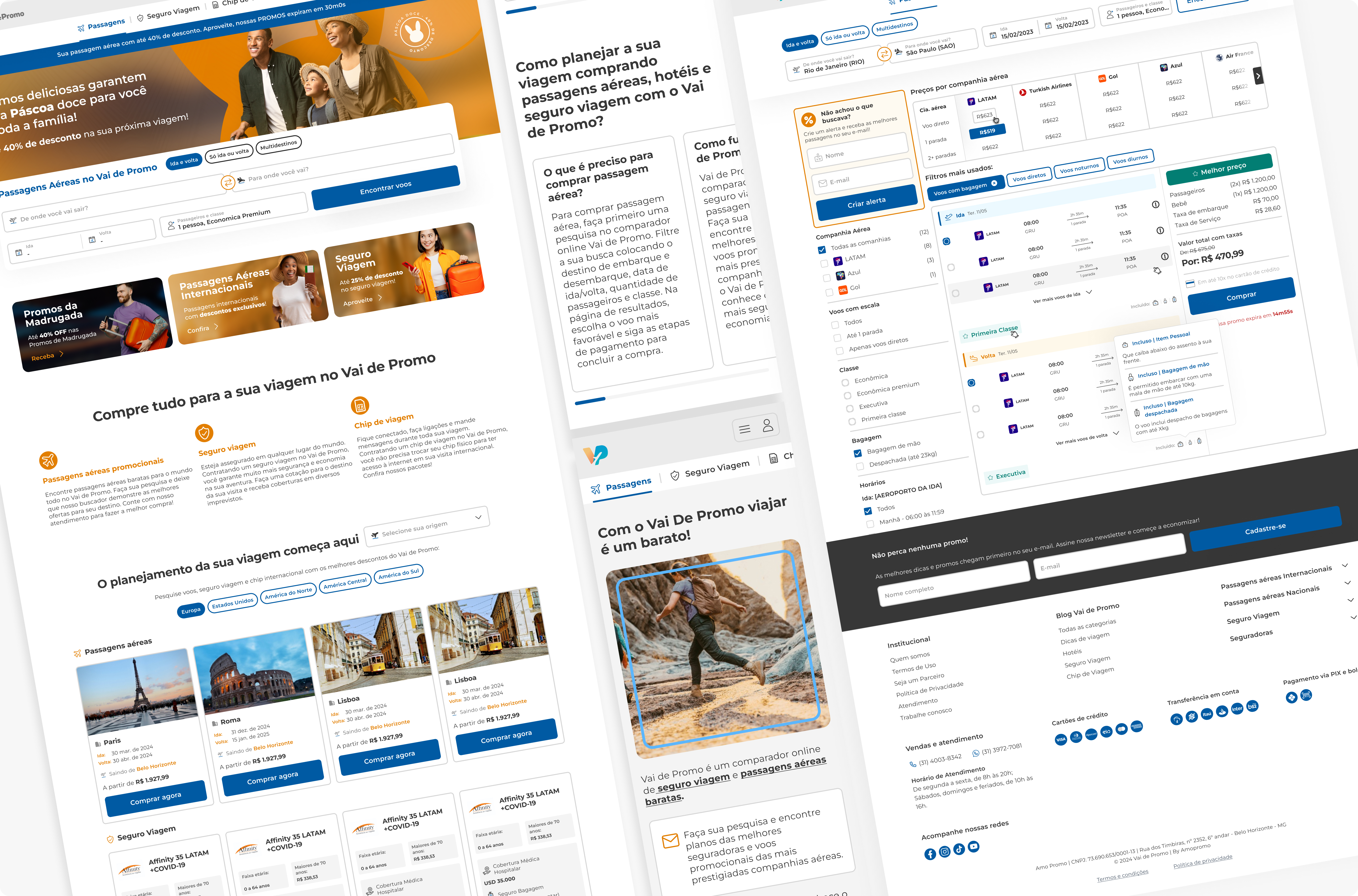
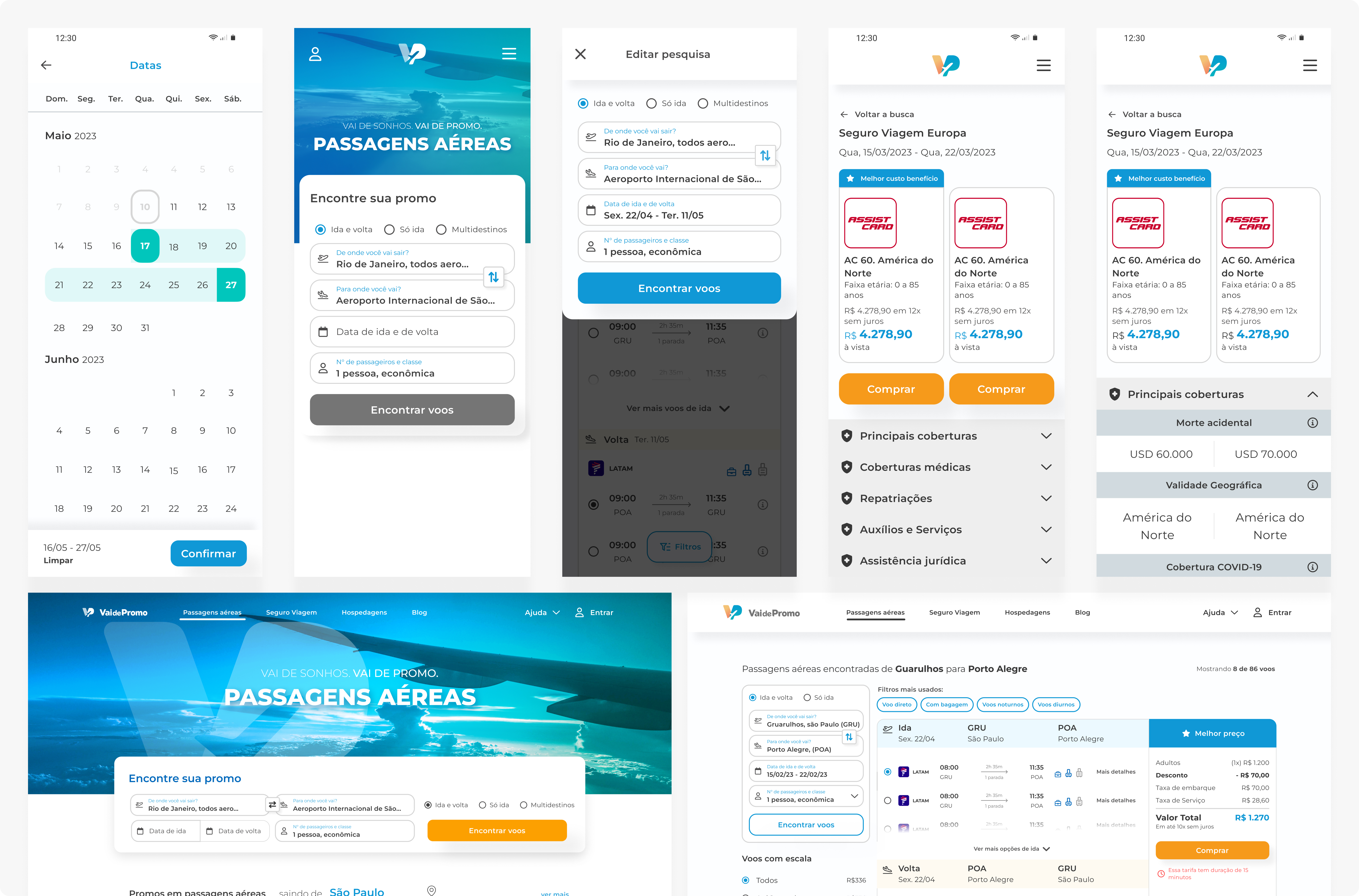
🧩 Components (molecules)
For the components, we started out documenting the two main that were causing trouble on the UI: Buttons and Inputs. We again focused on key components to create the foundation of a cohesive design system:
Buttons:
- Standardized button styles for primary, secondary, and tertiary buttons, including various states (hover, active, disabled) for clear visual feedback.
Inputs:
- Unified form elements like text fields, checkboxes, radio buttons, and dropdowns for predictable and intuitive user interactions.
Each component was documented with usage guidelines to ensure consistent implementation and application. These standardizations laid the groundwork for a cohesive and scalable design system, enhancing user experience and development efficiency.
🖥️ Implementation and Integration
Integrating the new design system with the existing site required careful planning and execution. A phased approach was adopted, starting with the most critical components and gradually replacing the old ones. This allowed for continuous testing and feedback, ensuring a smooth transition.
Usability and accessibility testing were integral to the implementation process. Each component underwent rigorous testing to ensure compliance with accessibility standards, ensuring that the new design system was inclusive and user-friendly.
⛰️ Challenges and Solutions
Several challenges were encountered during the project. One significant issue was resistance to change from the development team, who were accustomed to the old ways of working. To address this, handoff sessions and workshops were conducted to familiarize the team with the new design system and its benefits.
Technical challenges, such as integrating the design system with legacy code, were tackled by providing hands-on support to developers. These efforts helped minimize disruptions and ensure a seamless integration.
📈 Results and Impact
The implementation of the design system yielded significant benefits. Visual consistency improved dramatically, creating a cohesive and professional look and feel across the site. Usability enhancements led to a better user experience, reflected in increased user engagement and reduced bounce rates.
Maintenance and development efficiency saw a marked improvement. The standardized components reduced rework, cutting down development time and allowing the team to focus on new features and improvements.
Stakeholders were pleased with the enhanced brand identity and the efficiency gains in the development process.
🌟 Conclusion
The VDP UI project successfully addressed critical issues of the existing product by developing and implementing a comprehensive design system. This project not only improved visual consistency and usability but also streamlined the development process, resulting in significant efficiency gains.
Moving forward, continuous improvement and maintenance of the design system will be essential. Plans are in place to regularly update the system based on user feedback and evolving design needs. Also, some of the documentation isn't finished, so we still have a lot to work on.
The success of this project underscores the importance of a well-structured design system in creating a cohesive, efficient, and user-friendly digital experience.
You can access the Figma file here -> https://www.figma.com/design/P6nHXuYF3nCIy7NExvtB9G/VDP-Style-Guide-(Copy)?node-id=0-1&t=iNFVye2MKNs3SHUJ-1
🤝 Acknowledgments
I would like to extend my gratitude to the entire design and development team for their hard work and dedication. Special thanks to my coworker Jaqueline Teixeira, without her mentorship and technical skills, this project wouldn't be as exceptional as it was!
Tools used
Topics
Share
Reviews
-1 reviews
You might also like
Ubani Design System


CJM for Co-Working Space - WeWork

Accessible Signup Form for SaaS Platform
Loginino

Notification microcopy - Project

El Mandoub-GovTech App

Popular Courses

Core UI Components


Introduction to Design Systems


Design Thinking