Uxcel Vibrant Harmony

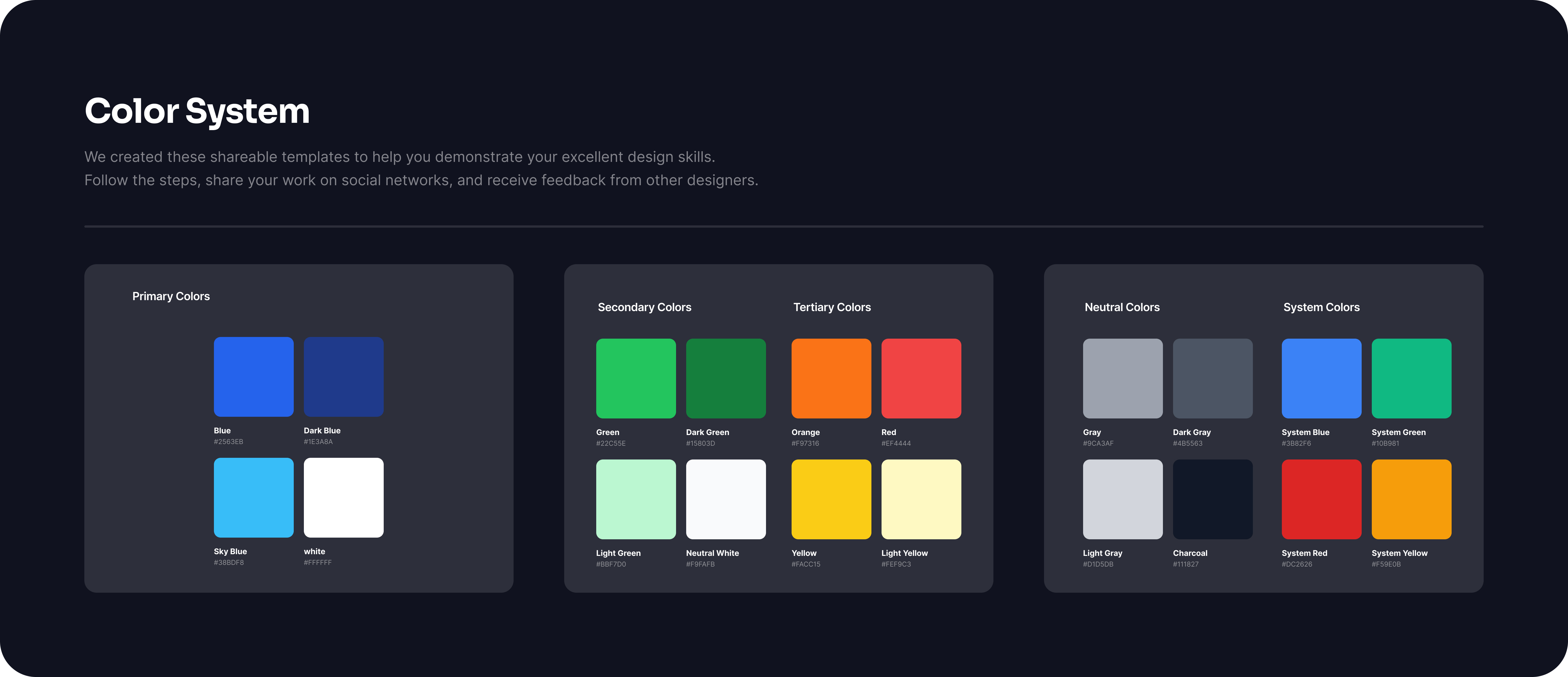
The color system for UXcel is designed to create a cohesive and intuitive user experience while aligning with the brand's identity and usability principles. The palette balances vibrant accent colors for interactivity with neutral tones that ensure accessibility and readability.
Core Elements:
- Primary Colors: A bold and recognizable shade is used to highlight key actions and brand elements, ensuring consistency across all touchpoints.
- Secondary Colors: Complementary hues provide variety for secondary actions, navigation, and visual hierarchy.
- Neutral Palette: A gradient of whites, grays, and blacks supports text, backgrounds, and subtle elements, ensuring clarity and focus.
- Feedback Colors: Purposeful use of green for success, red for errors, yellow for warnings, and blue for informational states reinforces immediate understanding.
- Background and Surface Colors: Subtle and soft tones create a clean canvas, allowing interactive elements to stand out.
Usability and Accessibility: The system adheres to WCAG standards for color contrast, ensuring readability for all users. Interactive states, such as hover and active, are differentiated with slight tonal shifts, providing visual feedback.

Reviews
1 review

Excellent color system! Vibrant and well-organized palette with clear categorization. Great work!
5 Claps
Average 5.0 by 1 person
You might also like
Project
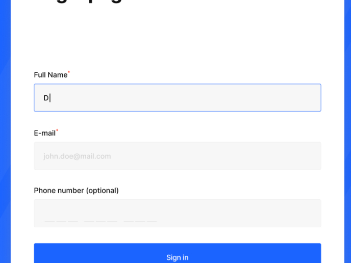
Loginino

The primary goal of this login page was to create a clean, intuitive, and accessible user experience that minimizes friction and guides user
Project
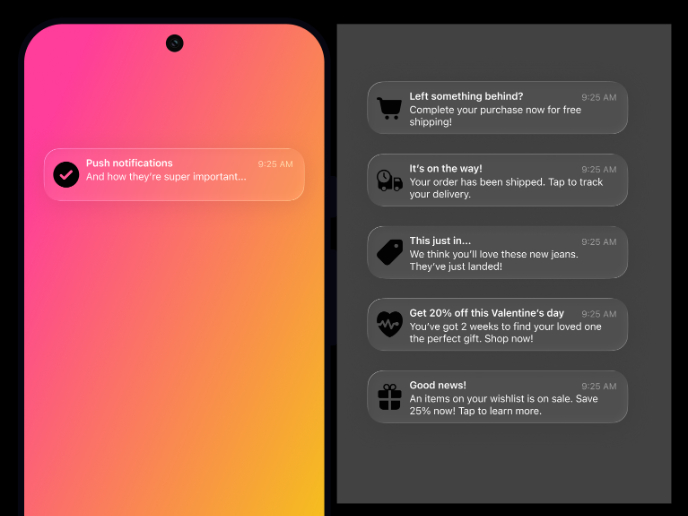
Notification microcopy - Project

This project focuses on writing clear, concise push notification microcopy for a mobile e‑commerce app. The goal is to improve the user expe
Project
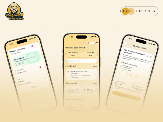
El Mandoub-GovTech App

Mandoob is a Qatar-based, subscription-driven GovTech app that simplifies government procedures for individuals and businesses.The platform
Project
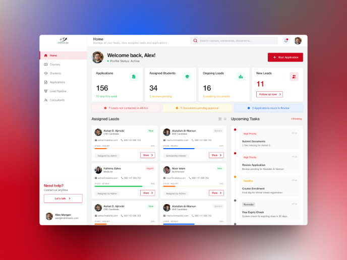
MalishaEdu Counselor Workspace

Context MalishaEdu is a student consultancy management platform used by counselors and branch teams to manage leads, applications, documents
Project
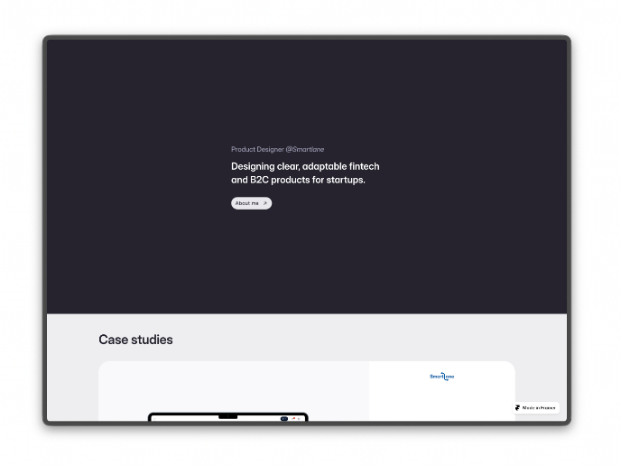
Portfolio website

For this update, the objective of the portfolio is to achieve a cleaner and more structured layout while remaining fully aligned with the br
Project
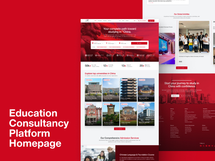
MalishaEdu - Website Design
MalishaEdu is an international education consultancy platform helping students study in China through end-to-end guidance, from program sele
Visual Design Courses

Course
UX Design Foundations

Learn UX design fundamentals and principles that create better products. Build foundational knowledge in design concepts, visual fundamentals, and workflows.

Course
Introduction to Figma
Learn essential Figma tools like layers, styling, typography, and images. Master the basics to create clean, user-friendly designs

Course
Design Terminology

Learn UX terminology and key UX/UI terms that boost collaboration between designers, developers, and stakeholders for smoother, clearer communication.