Reviews
2 reviews
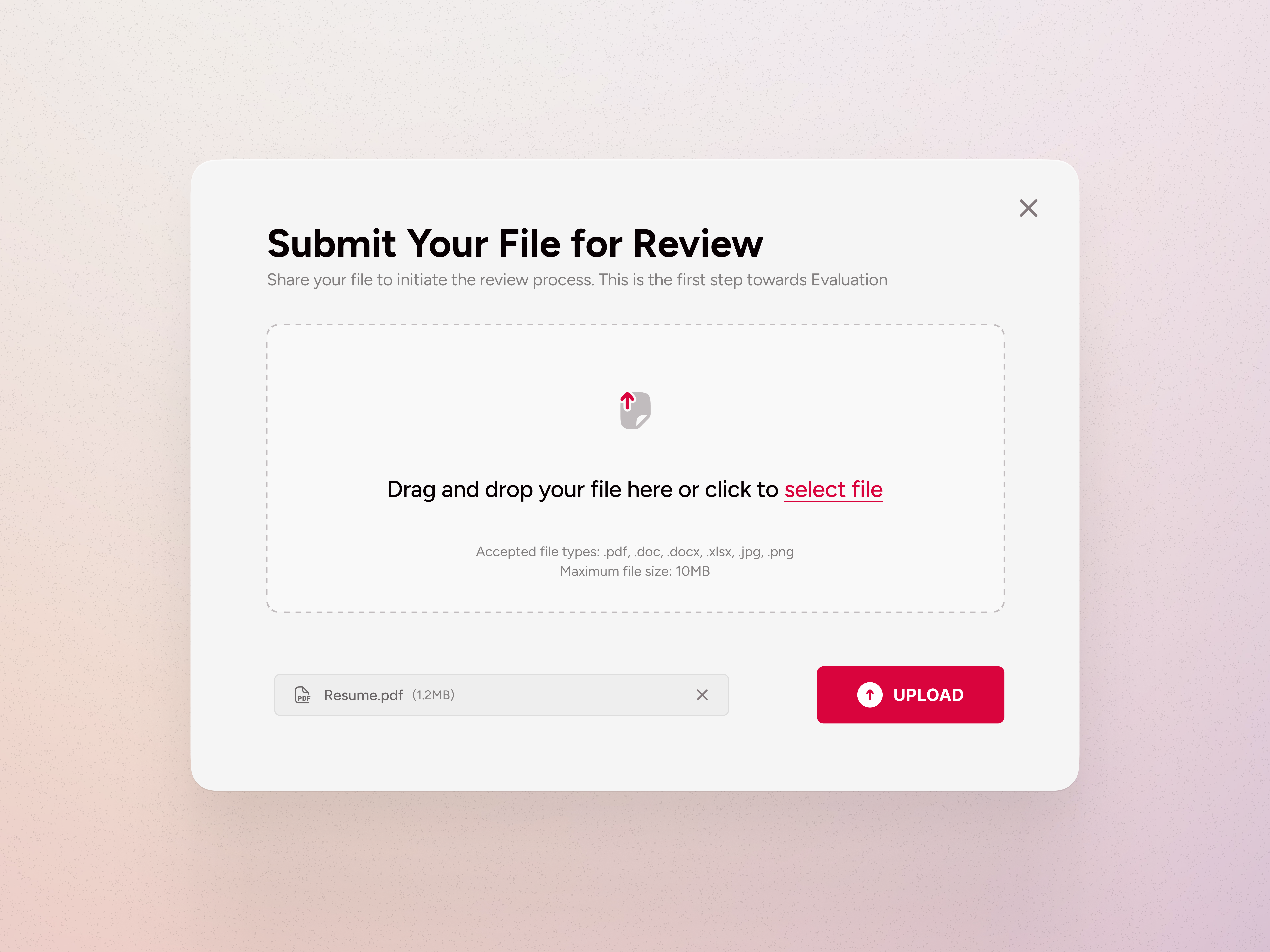
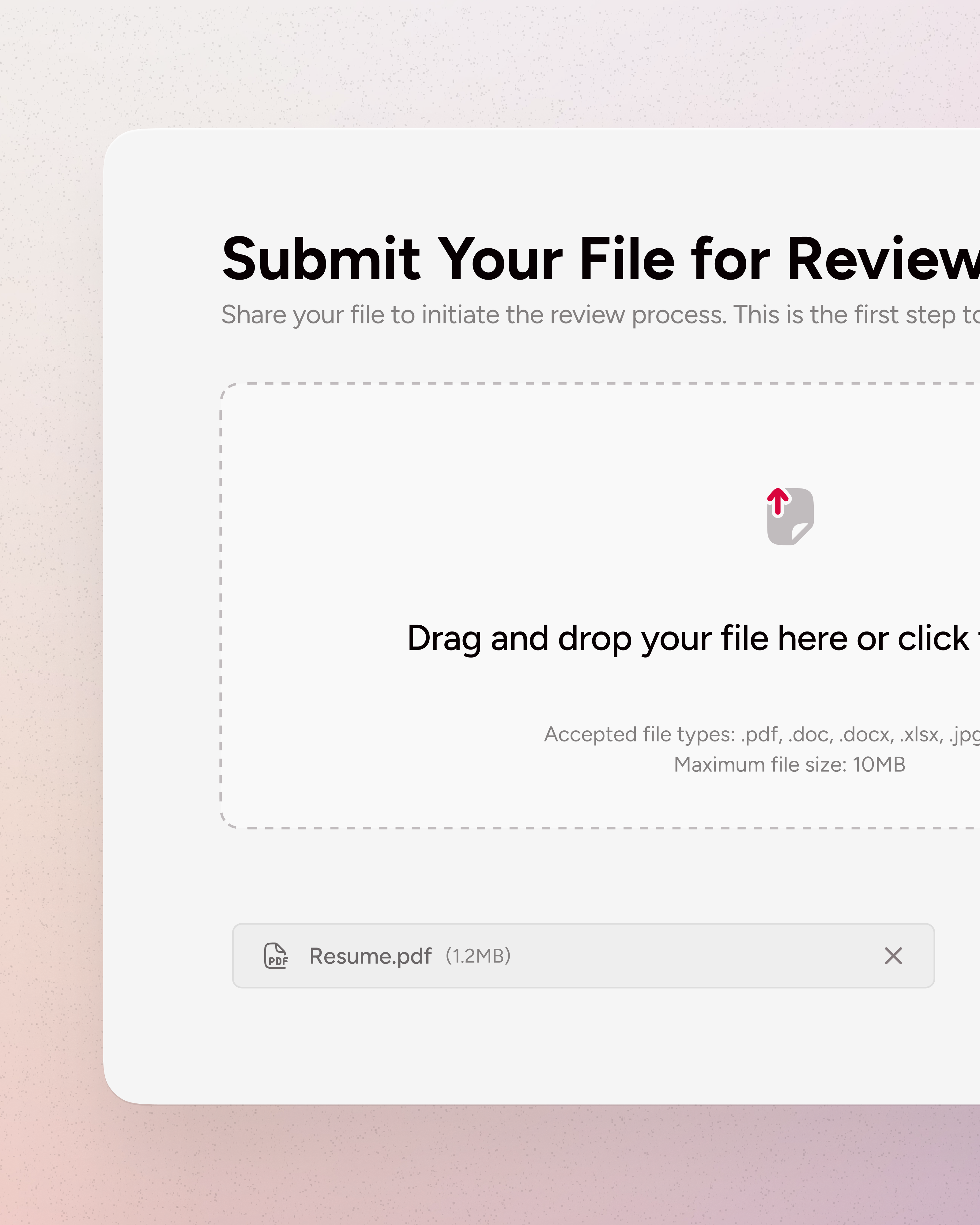
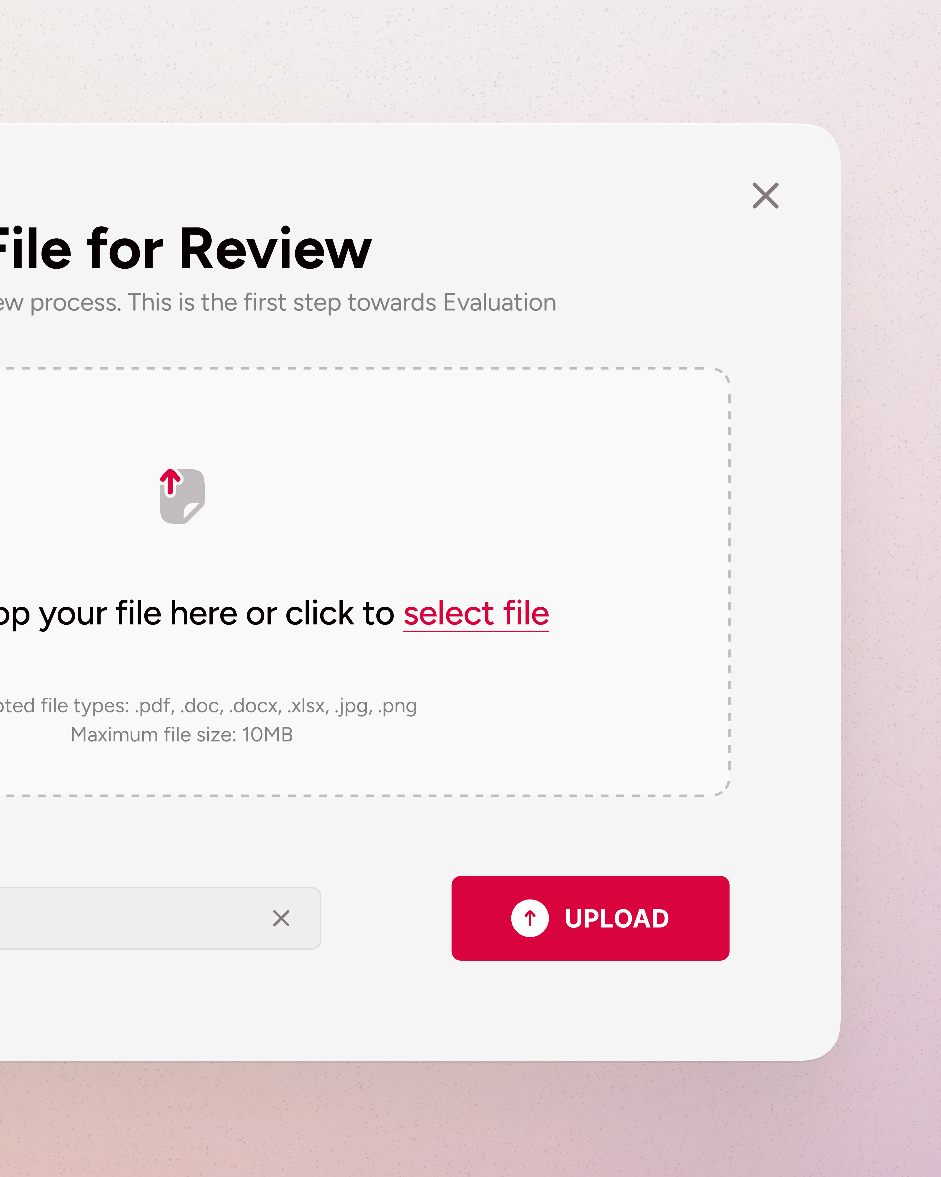
The design is crystal clear and brings attention to the primary action of uploading files. The dashed border-line around the drag-and-drop area provides a visual cue for where users can drop their files and the mention of which files are supported helps users know what kinds of files they can upload to avoid unnecessary errors. A great addition is the uploaded file (e.g., "Resume.pdf") because it gives immediate feedback to the user that the file has been successfully added.
I would like to see a small description of the project as well, because the wording "Share your file to initiate the review process..." is unclear to me. I am missing context here which would help me to review your design better. Also it says "This is the first step towards Evaluation" which makes me think that this is part of some wizard or some stepped-flow?
Visually I do notice different font-sizes. It's unclear what is a heading, subheading and what is helper text. I think getting more consistency here will take your design to the next level. Also making the "Resume.pdf" the same height as the button would would make look really neat and tight. Some small tweaks in padding to make it more consistent between and around elements will be the cherry on the top.
Outside of those points the design contains clear instructions, minimal distractions, and immediate feedback! This makes it an intuitive user experience for uploading files.
Hey , you've done a nice job but I think the upload button should be smaller !
You might also like

HealthFlow: Designing a Simple and Insightful Wellness Dashboard

Improving Dating App Onboarding: A/B Test Design

FORM Checkout Flow - Mobile

A/B Test for Hinge's Onboarding Flow

Accessibility Asse

The Fitness Growth Engine
Popular Courses

UX Design Foundations

Introduction to Figma


