Upload your post - Dashboard

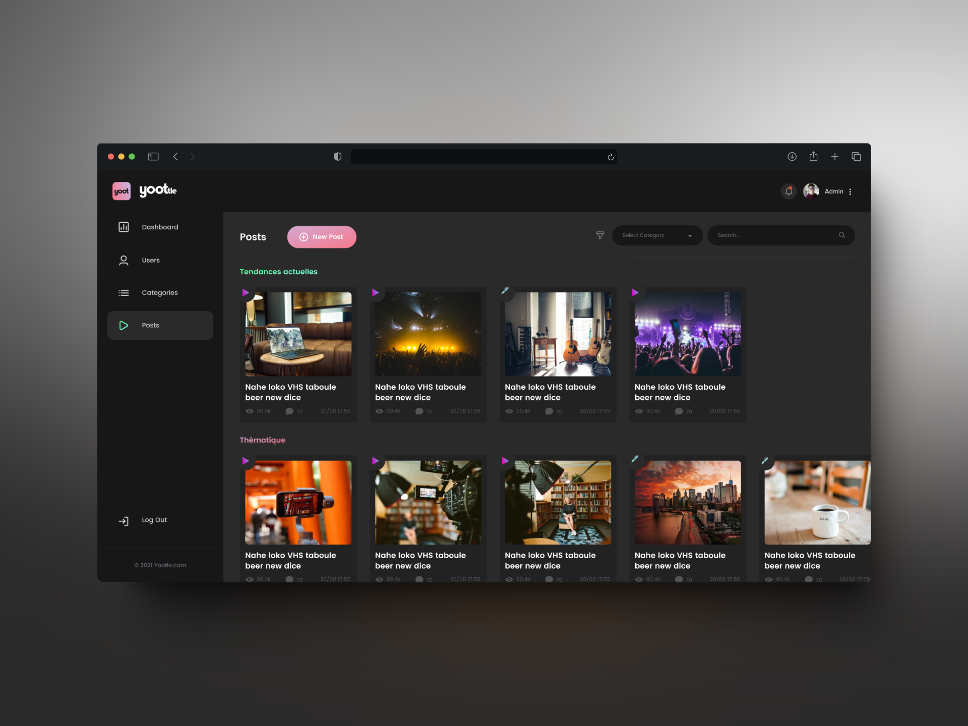
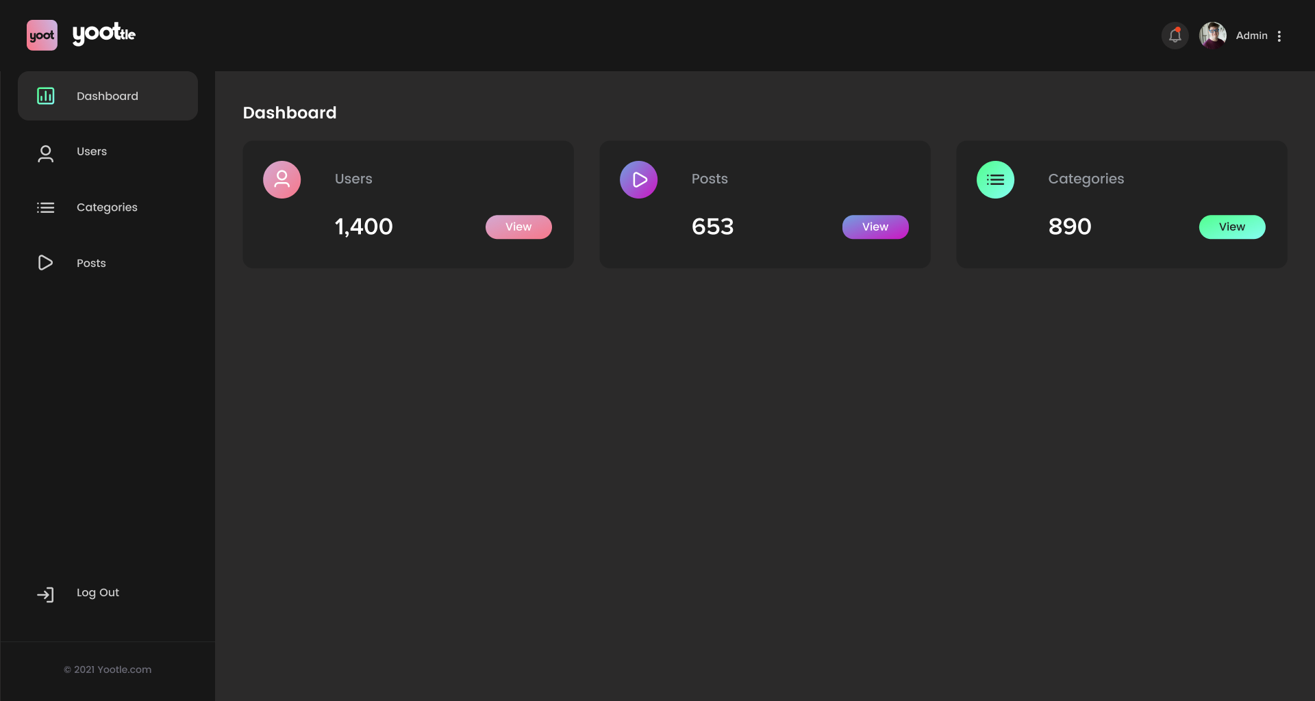
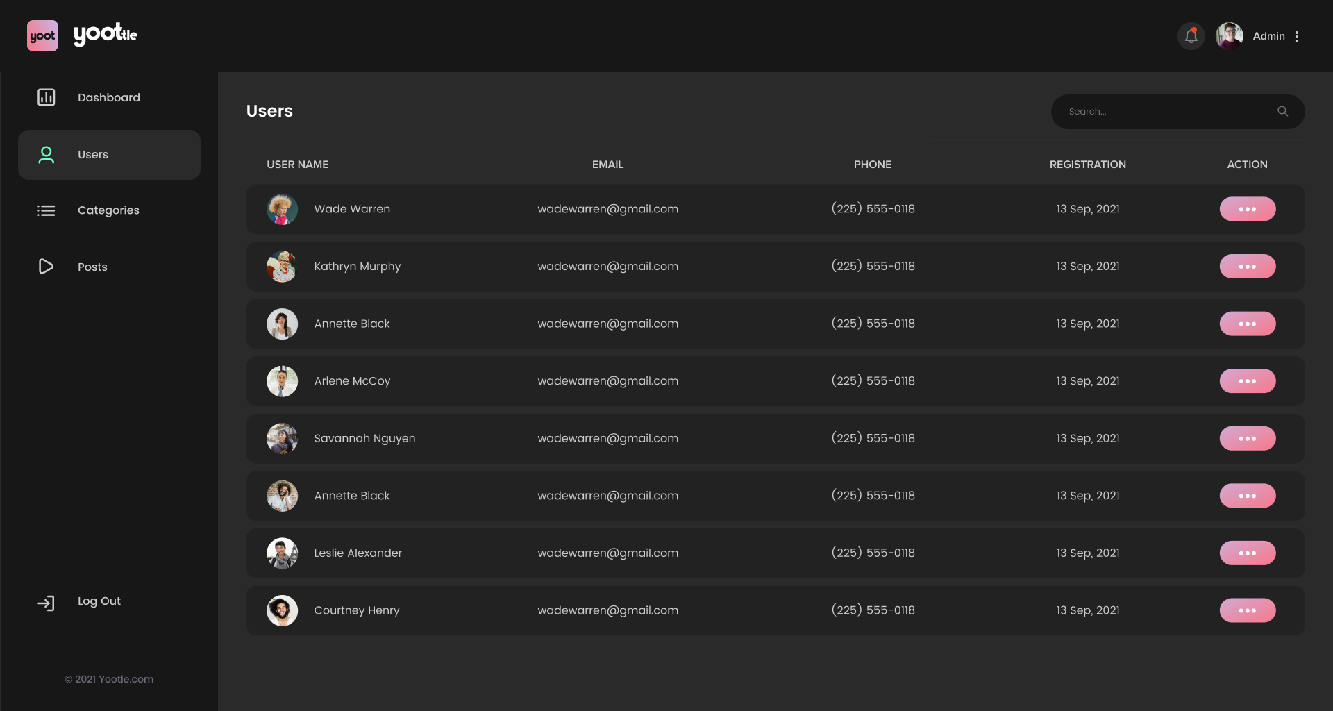
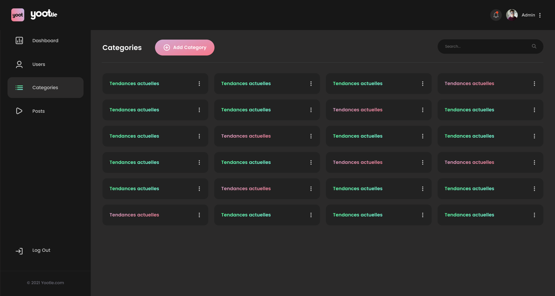
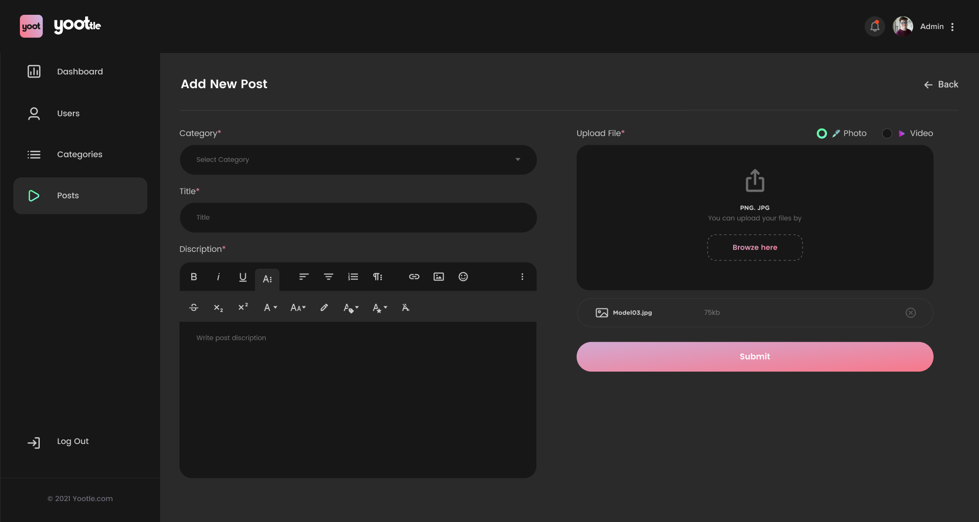
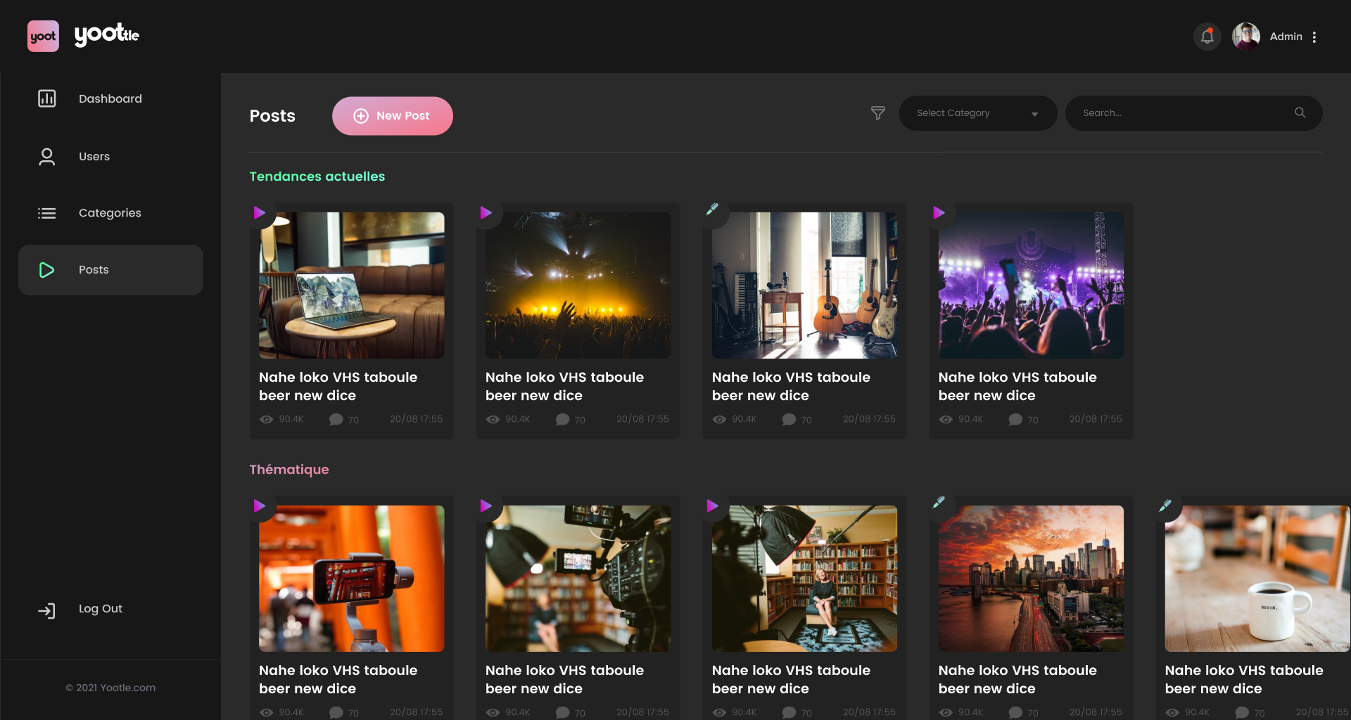
Hi 👋🏻, Today I want to share with you the Dashboard concept of a Post Dashboard
What do you guys think? Let me know in the comments section!
I hope you guys enjoy it. Press "L" if you like it. 🔥🔥🔥
Let's talk: mahendra@thedreamsteps.com
Thank you !!
📧 Have a project idea? I am available for new
Reviews
3 reviews

Great job, the design looks great! I like the consistency of the design and overall aesthetic value. I've left some potential improvement ideas below.
Firstly, I noticed that on the bottom left corner, the "log out" text and icon within the text button are not visually aligned in the center. The text should be slightly lowered so that it is centered with the icon.
Secondly, I noticed that the top navbar is quite tall for the minimal amount of actions it contains (notifications, account). Perhaps it could be made smaller to make more space for the contents of the page, showing more list items.
Lastly, in the "add new post" page, the breadcrumbs were designed in a less typical fashion on the right side. I recommend sticking to traditional solutions, in this case placing the breadcrumb on the left side (eg. above the header). According to Jakob's Law, users prefer when platforms they use utilize the same expected patterns. Breadcrumbs are almost always placed on the left side, hence not having it there may confuse the user.
Keep it up & I'd really like to see the mobile designs for this project!

Hi Mahendra. Great exploration and a clean, polished design! I appreciate how you’ve incorporated gradients—they add a playful and entertaining vibe that works well for this type of product.
A few suggestions for improvement:
- Accessibility Concerns: The text on buttons and post thumbnails lacks sufficient contrast, which could affect readability. Consider increasing the contrast for better visibility and usability. The grey tones on the 'black' backgrounds could be adjusted for greater clarity and to ensure the design elements stand out more effectively.
- Design system. Think strategically about your design system. For example, using a 'prime' button in various gradient colors can confuse users. Consistency is key—uniform buttons help users recognise and familiarise themselves with your product. To ensure easy maintenance and better user experience, the design system should always remain cohesive and unified.
Keep up with good work!
Yuliia

Hi Mahendra,
Fantastic job on the clean design and polished layout! The gradients really add a fun and playful vibe to the product. For a little improvement, consider adjusting the contrast of the button text for better readability and ensuring consistency in your design system. You’re doing great—can’t wait to see more!
You might also like
SiteScope - Progress Tracking App


FlexPay


CJM for Co-Working Space - WeWork


Ubani Design System


Accessible Signup Form for SaaS Platform

Loginino

Popular Courses

UX Design Foundations


Introduction to Figma

Design Terminology
