Upcycl.ing Logo Design
Client Background
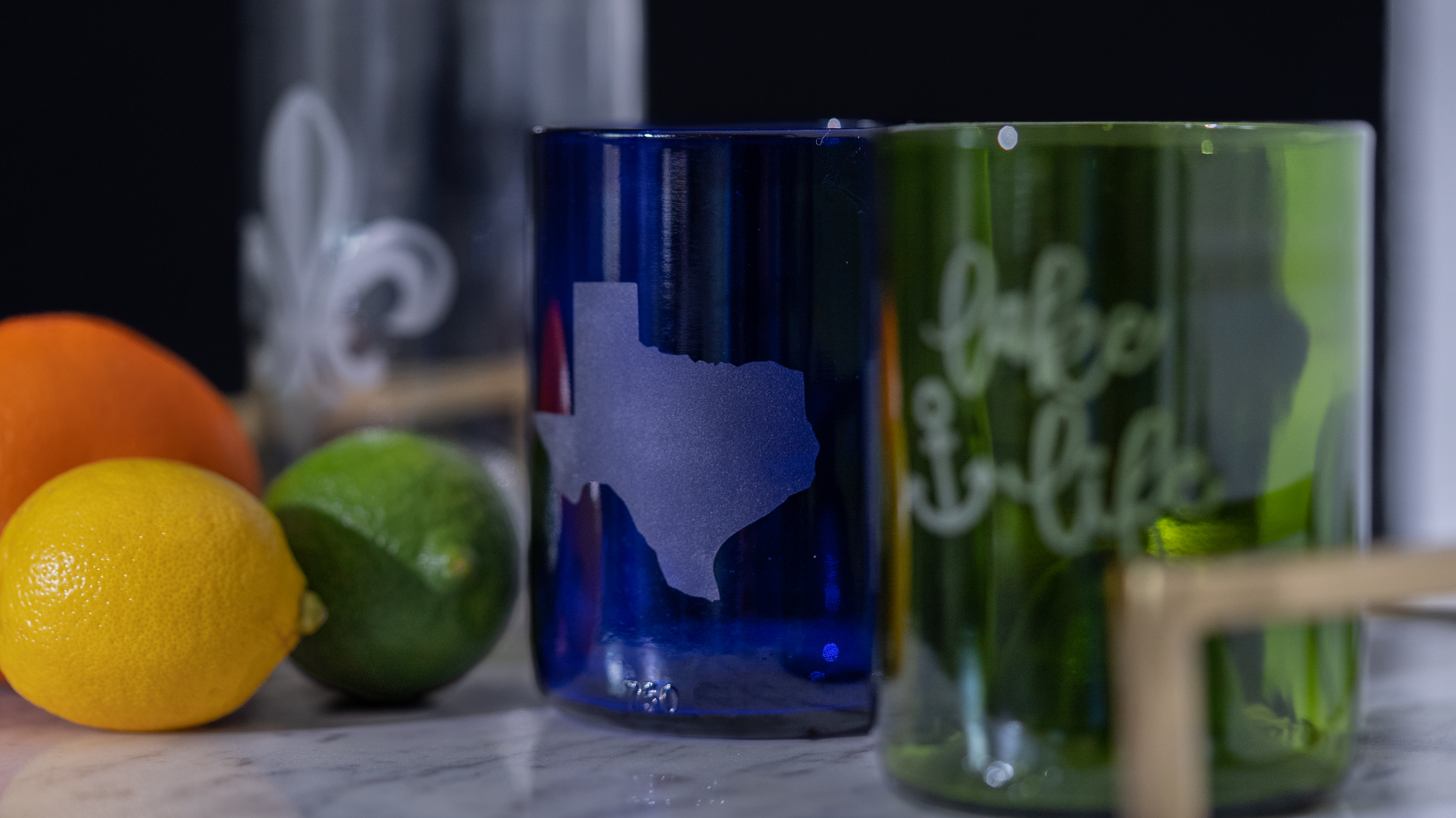
Upcycl.ing, an upcoming company from A Second Round Glass, is a forward-thinking company, producing high-quality, upcycled drinking glasses that are hand-made and customer-inspired. The company is family-owned and emphasizes eco-friendliness and craftsmanship, creating unique pieces that reflect their commitment to the environment and quality.
Project Overview
The objective was to create a logo that encapsulated the essence of Upcycl.ing—sustainability, friendliness, and craftsmanship. The process involved several iterations, each incorporating feedback from the client until we arrived at the final design.
Iteration Process
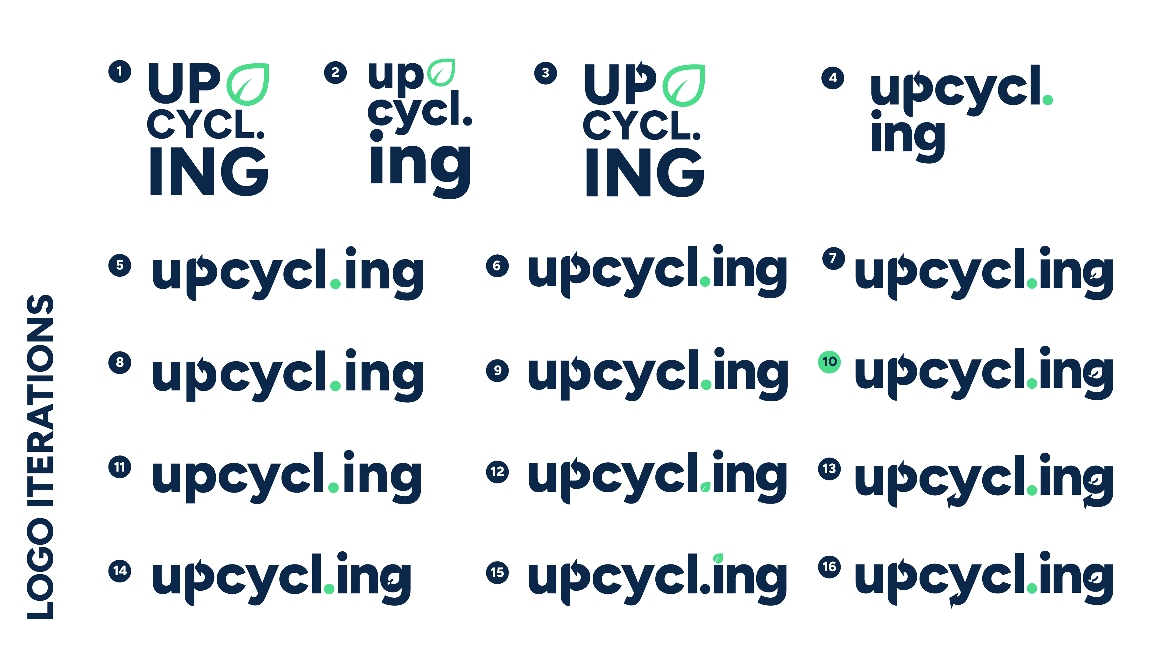
I began sketching different concepts in my notebook and translated them into vector artwork. The first set of logos explored various arrangements and styles, focusing on integrating elements that symbolize recycling and nature.
The client provided valuable input on each iteration, highlighting preferences and suggesting improvements. This collaborative approach ensured the final design resonated with the brand’s identity. There were several designs the client enjoyed, particularly ones that incorporated the arrows and "smiley face leaf". This subtle yet impactful detail of the smiley leaf adds a friendly and approachable feel to the logo. The leaf signifies sustainability, and the smiley face within the 'G' fosters a sense of warmth and community.
Based on feedback, other refinements were made to typography and color schemes to match their existing A Second Round Glass branding.
Final Design
The client ended up choosing option number 10 as their preferred choice, capturing the essence of Upcycl.ing with its clean, modern look and meaningful graphical elements.
Color:
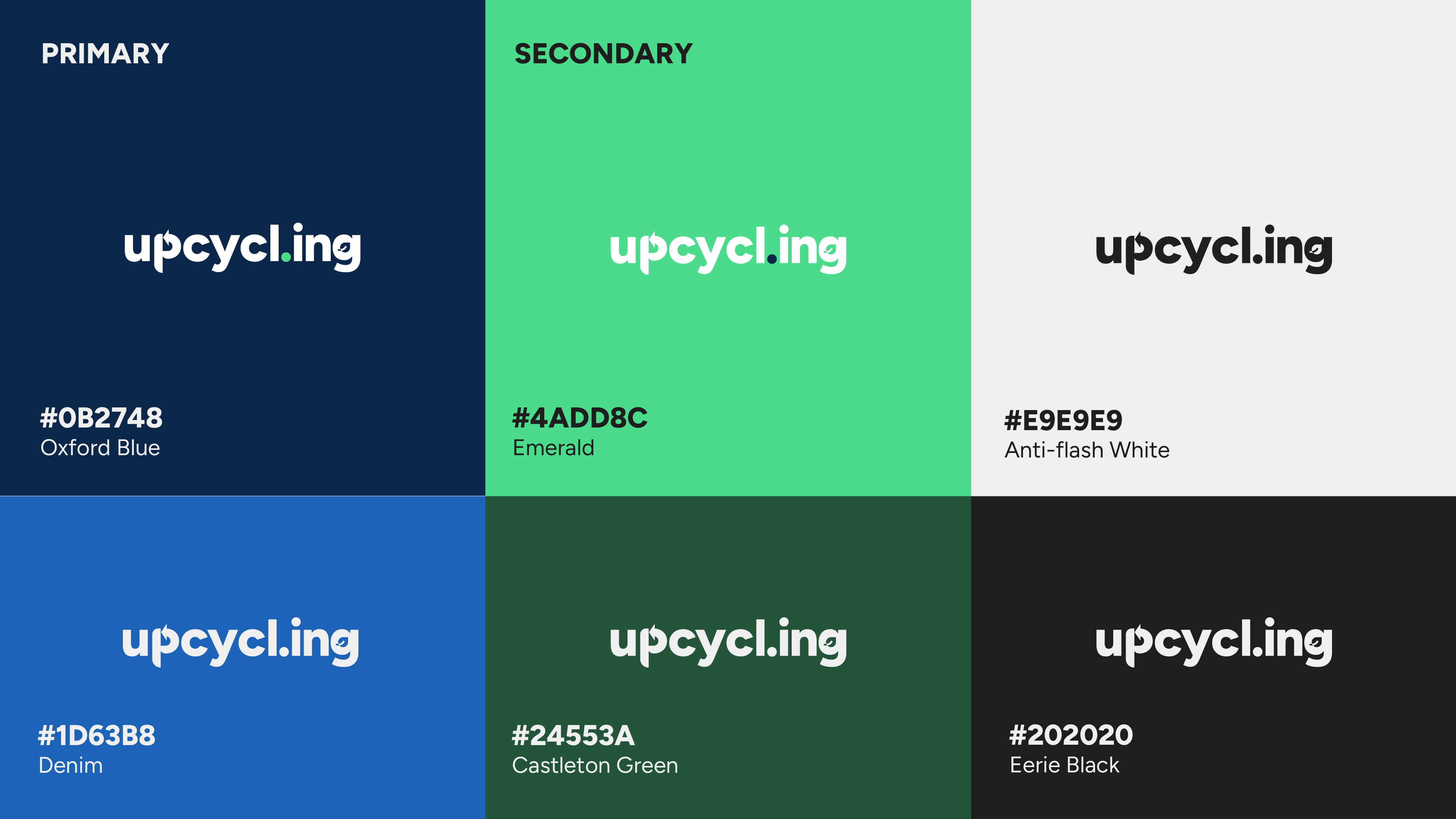
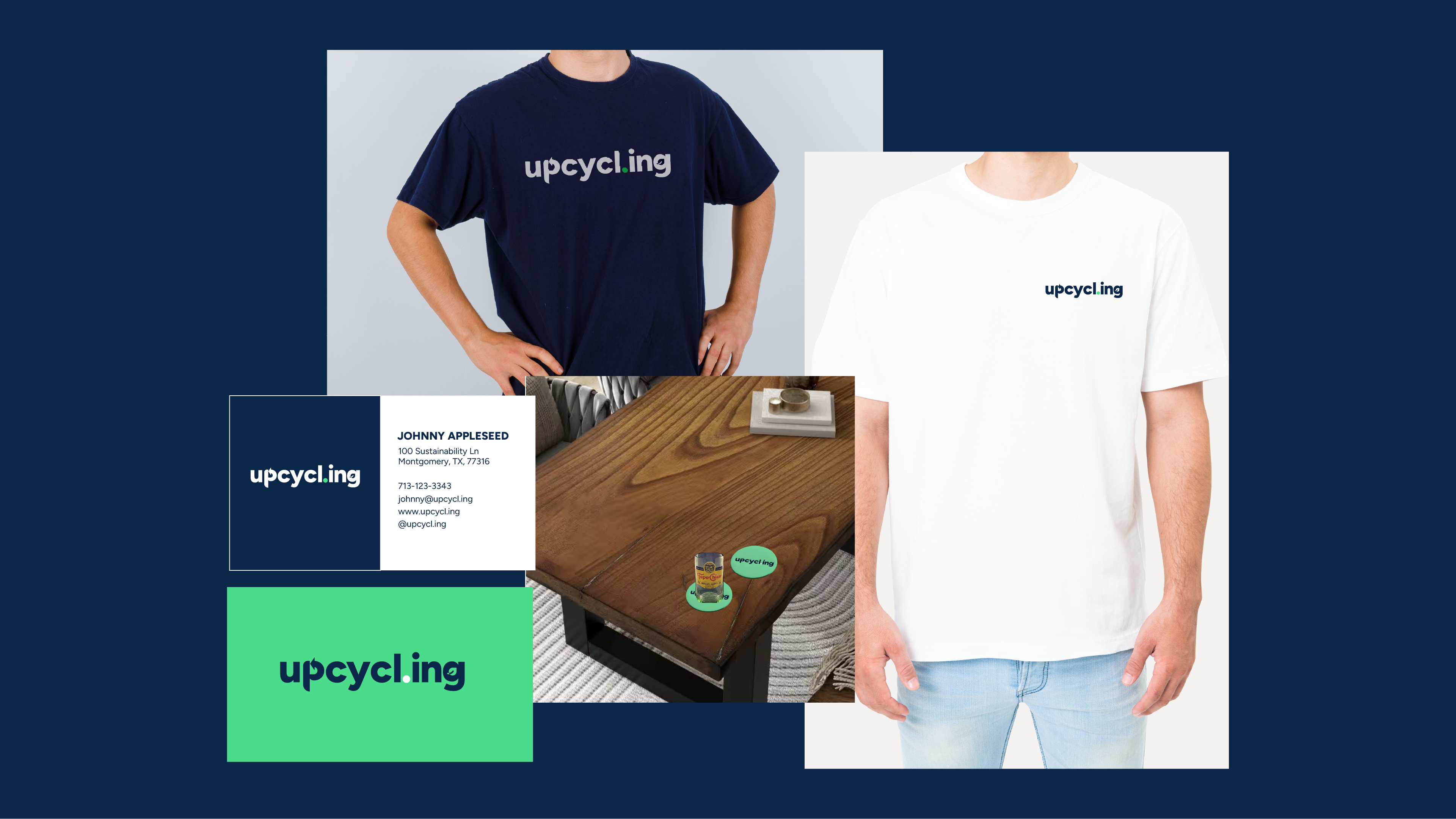
- Primary Color: Oxford Blue (#0B2748) - Chosen for its association with trust, professionalism, and depth.
- Secondary Color: Emerald (#4ADD8C) - Symbolizes growth, renewal, and environmental consciousness.
- Complementary Colors: Anti-flash White (#E9E9E9), Denim (#1D63B8), Castleton Green (#24553A), and Eerie Black (#202020) were added to provide a versatile palette that supports various applications while maintaining brand consistency. They can be used as alternative colors
Typography
Figtree ExtraBold and Regular were chosen for their clarity and modernity. This font family is a great, modern-looking sans serif that conveys strength and reliability, while the regular weight offers readability and elegance.
Brand Collateral
For business cards, I made both minimalistic and bold designs to cater to different professional settings while maintaining brand identity. The cards feature the logo prominently, ensuring instant recognition.
T-shirts and coasters were designed to showcase the logo, promoting brand visibility and customer engagement. The use of primary and secondary colors ensures a cohesive look across all items.
Conclusion
The logo design for Upcycl.ing was a collaborative and iterative process that resulted in a mark embodying the brand’s values of sustainability, friendliness, and quality craftsmanship. The final logo and branding stood out for its modern aesthetic, meaningful graphical elements, and versatile color palette, perfectly aligning with Upcycl.ing’s mission to make a positive impact through upcycled glassware.
Reviews
1 review
I thoroughly enjoyed your description of the logo creation process for the eco-friendly company. The incorporation of leaves into the typeface and the choice of colors are both fantastic. Thank you for sharing!
You might also like

Smartwatch Design for Messenger App

Bridge: UI/UX Rebrand of a Blockchain SCM Product

Pulse Music App - Light/Dark Mode
Uxcel Halloween Icon Pack

Monetization Strategy

Designing A Better Co-Working Experience Through CJM
Popular Courses

Introduction to Figma

Typography


