❖ Untitled UI Color System


A color palette is simply a set of colors that work well together, combined to form a brand or a concept.
Defining the right color palette for a project is one of the most important steps in the design process, but it can be quite difficult to get right. Hues affect the style and mood of the design, create the "look & feel" and are highly memorable. Our design system leverages a purposeful set of color styles as the perfect starting point for any brand or project.
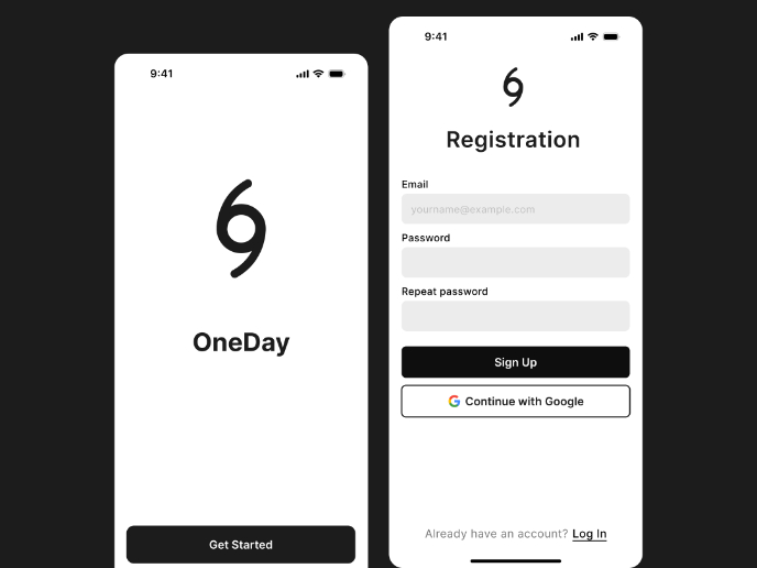
A simple color palette should contain both neutral, primary, and accent colors. It's also good to include feedback colors (green for success and red for failure) - especially if forms are an essential part of the functionality.

Reviews
2 reviews

Hi,
This is a solid submission! You clearly organized the color system and tied each category to its intended functionality. The WCAG compliance section shows a thoughtful approach to accessibility.
One suggestion I’d make is to incorporate more examples of the secondary and tertiary colors in the UI screens toward the end. This would really help demonstrate how they work together with the primary colors to create a cohesive system. Looking forward to seeing more from you. 😊

Hi Ho Minh Tuan, I really love the overall presentation—great work! However, the safe zone of mobile on Page 13 feels a bit off and could use some tweaks to make it align better with the rest of the presentation. I’m also intrigued by the name "Untitled UI." Perhaps you could include an explanation in the presentation to give us more insight into the choice—it would add an interesting layer to your work. Overall, fantastic job! Keep it up! 👏🏼😁
You might also like
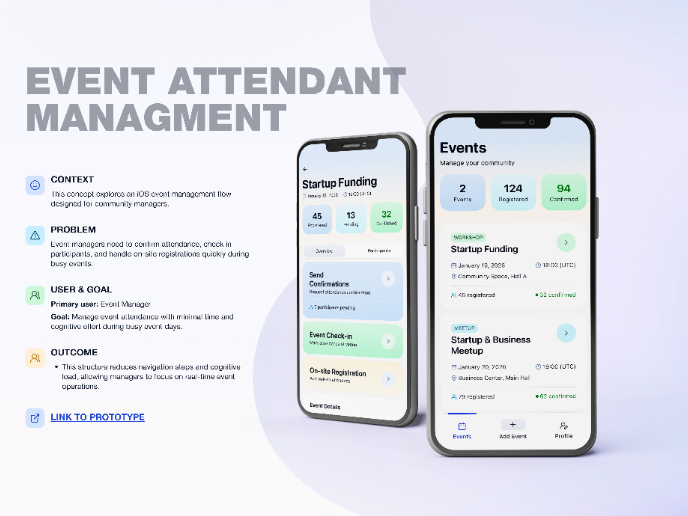
Events Managment App

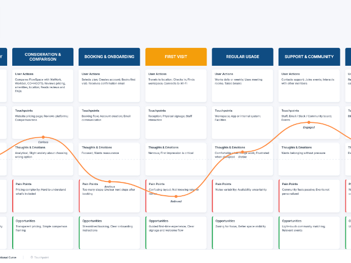
Customer Journey Map — Offsite Co-Working Experience

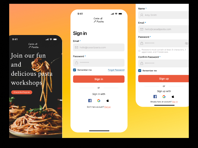
Mobile Onboarding: Casa di Pasta

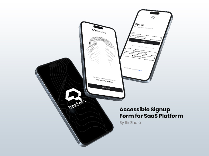
Accessible Signup & Login Experience — Brainex

Accessible Signup Form


Accessible Signup Form

Visual Design Courses

UX Design Foundations


Introduction to Figma

Design Terminology
