UNIQLO Landing Page
For this task, I created a Desktop Landing Page for brand named "UNIQLO" a Japanese clothing company renowned for its affordable, high-quality basic apparel.
The brand's philosophy centers around providing comfortable, durable, and innovative clothing that seamlessly integrates into everyday life. Uniqlo's minimalist designs and neutral color palette reflect its commitment to timeless style and versatility.
The brand's design aesthetic is characterized by clean lines, simple silhouettes, and a focus on functionality. This approach aligns with Uniqlo's goal of creating clothing that is both stylish and practical. By prioritizing essential pieces and high-quality materials, Uniqlo offers customers a wardrobe that is both affordable and enduring.
Reviews
3 reviews
Nice work, Maria! You’ve truly embodied the simplicity and elegance of the brand.
I tried to understand the source of your drop shadow after visiting these sites:
• uniqlo.com/jp/ja/
• uniqlo.com/es/es/
I’m assuming you drew inspiration from those shadowy elements and attempted to incorporate them into your design. Now it makes sense!
I wouldn’t want to jump to conclusions without fully understanding your approach, but at first glance, it seems like you’re building the landing page in separate sections. The two sections have different border colors and varying depths due to the shadow effect, which gives it a stacked appearance.
Content-wise, we typically see a hero banner right after the navigation, so I’m curious why did you choose to place the product search field first instead of the typical hero banner right after the navigation?
Aside from the element inconsistency, the overall look is great!
Nice work I can see a lot of effort has been put into the design. I like the logo placement and the imagery used so well done! I found the nav a bit confusing as you have shop and products. I liked the use of whitespace in the design as well! The newsletter doesn't necessarily need to have a name filed so perhaps just stick with the email?
Great work! Well done
While the design is great, Uniqlo, a clothing store offering sales and bundles, lacks a clear navbar hierarchy. A well-designed navbar guides users to the best deals and helps them navigate the shopping experience efficiently. Great UI design stems from a deep understanding of UX principles. Keep up the great work
You might also like
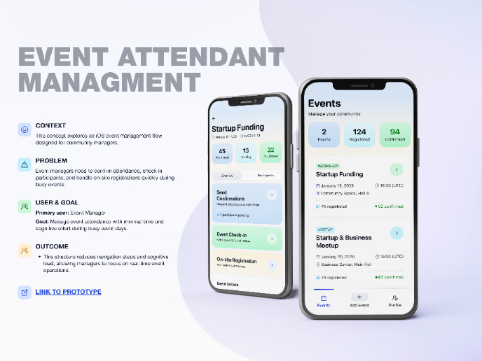
Events Managment App
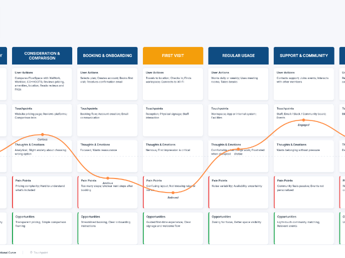
Customer Journey Map — Offsite Co-Working Experience
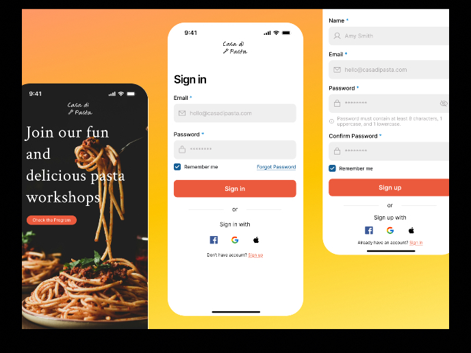
Mobile Onboarding: Casa di Pasta
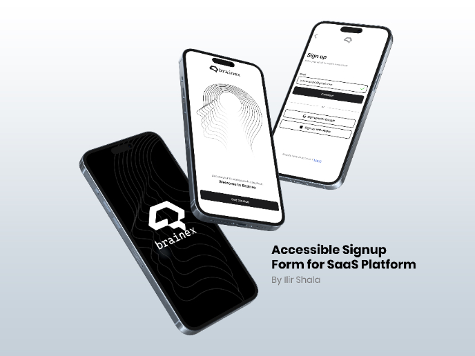
Accessible Signup & Login Experience — Brainex
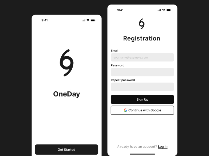
Accessible Signup Form
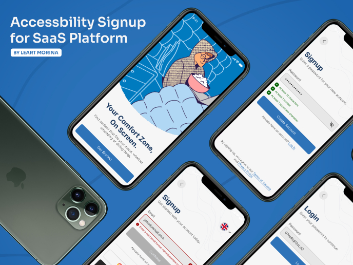
Accessible Signup Form
Content Strategy Courses

UX Writing

Common Design Patterns

