Unichef: Wireframing for Better Recipe Learning
In this case study, I am revisiting an old university project of mine: Unichef. I’m a member of the design team for Unichef, a cooking app designed to teach the foundations of cooking for students. My task was to redesign the current lesson flow for recipes and design wireframes that support intuitive learning.
The app would be a free resource offered to students to learn basic food safety and culinary foundations so that they can eat healthy, delicious meals during the school year.
Tools used
From brief
Topics
Share
Reviews
6 reviews
Great job! The project is clear, visually strong, and demonstrates a solid understanding of wireframing. ~I like how it's not lo-fi with [placeholders or lorem ipsums, lorem ipsum days are ower! I like how easy it is to follow the presetation! overall nice start! love to see the final version too
I’ve suggested one piece of feedback in Figma regarding replacing the home icon with a back arrow for better navigation consistency. Overall, the wireframe is clear, and I really like how the cooking flow is broken into simple, sequential steps. It makes the process easy to follow.
While your Unichef project has a strong foundation and clear user focus, there are a few areas that could be improved to enhance the overall experience.
The wireframes would benefit from adding interactive elements like progress indicators or feedback to keep users engaged and help them understand their learning journey.
Accessibility is another important area to consider early on, including font sizes and contrast to ensure the app is usable by everyone.
Additionally, providing user scenarios or journeys would give more context and show how students might navigate through the lessons in real life.
Addressing these gaps will strengthen your design and make it more effective for your target users.
Hey Catherine,
You’ve got a solid project with clear goals and a strong wireframing approach that’s easy to follow. To make it even better, consider adding interactive elements like progress bars or feedback to keep users engaged. Also, think about accessibility early on—adjust font sizes and contrast for everyone to use comfortably. Adding user scenarios or journeys would help show how students actually move through the lessons. Overall, a great foundation—looking forward to seeing the final version!
greatone
Good job, keep goig
You might also like
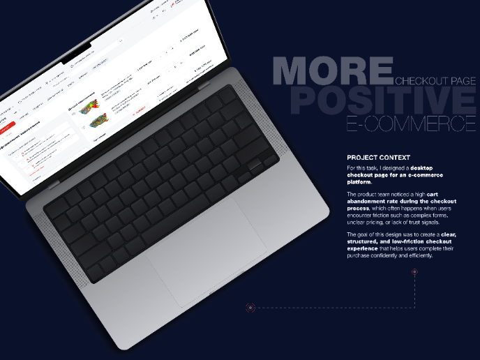
🖥 Desktop Checkout Flow Design

Website CRM Dashboard
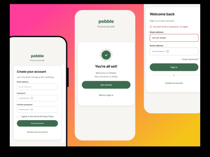
Pebble Accessible SAAS Signup Flow
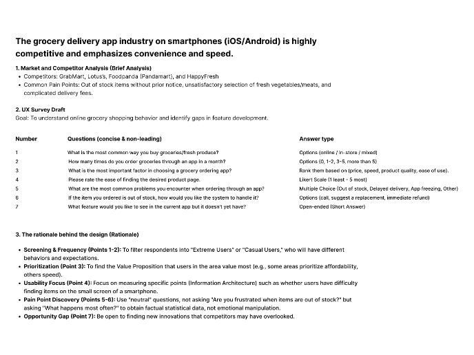
Create a UX Research Survey
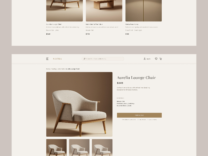
Nestra from homepage to checkout process
QuickScan Onboarding
Interaction Design Courses

UX Design Foundations

Introduction to Figma


