UNBND - Catchy typography for music lovers


Summer inspired me to create a typography system for a music festival landing page.
The goal is to create an easy-to-read hierarchy. A visually interesting system that reflects the festival’s identity. I wanted to ensure contrast between the headers and body text.
The landing page should be responsive, accessible, and easy to navigate.
What I considered:
- Brand Identity & Audience - typography must be readable, but it must align with the brand's identity. Take for instance Cruilla music festival in Barcelona, it's simple yet fun, and it aligns with the brand. A typography for a music festival should be bold, expressive, or unconventional.
- Readability and Legibility - as designers, we need to make sure that the text is easy to read. Font size, line height, and spacing are all important. Headlines must be attention grabbers without being difficult to decipher.
- Hierarchy and Structure - a clear structure must be established and documented. Hierarchy guides the user's eye through the content logically.
- Consistency - helps create a cohesive and professional look.
- Accessibility - typography systems must be accessible to all users. Text size, contrast ratios, and font sizes that are readable by users with dyslexia or visual challenges are always a must.


Design

Colors
I considered which colors would convey a feeling of coolness, freshness, and liveliness. Furthermore, the contrast between the text and background is crucial for readability.
Color choices should complement the overall design and enhance readability without causing strain.

To ensure the color contrast is accessible to all users, I ran a few tests:


Even if you have the most beautiful and dynamic typography system, it might not work with the wrong colors. It might not be user-friendly if the contrast does not meet WCAG requirements.
Note: For full disclosure, I used an existing design template by Madelyn Torff to implement my typography, colors, and hierarchy.


Reviews
1 review

It's a shame I have other plans on August 5 - 7, so I can't attend Unbnd Music Festival 🙁 But perhaps I can share my thoughts on your typographic system ✌🏼
I need better wording, but I think this system is 'safe'. My concern probably revolves more around the presentation of the usage of typography against other elements to make it whole as a design.
**Light on light:**
I didn't go too far as using a readability app, but perhaps a general rule of thumb is that using light on light colors is probably not the best way to present it.
e.g., Typeface pairing #2CD8A8 on a white background.
**Artist cards:**
Perhaps you're coming from Cruïlla Festival cards (Sustainability, Social Commitment). The way you present it seems imbalanced. Two things that immediately come to mind are either making the Poppins H2 more narrow so it has more weight against the spacing of the cards or reducing the spacing between headings and body paragraphs in the card. I haven't checked it myself; it's a possibility 😄
**Typeface VS aesthetic elements:**
It's the dot(s) •●• in the banner of artist line-up. Does it act as a text separator, an aesthetic element, or both? Can the typographic system stand without the dots? As in, does the message still convey clearly, or does it need the supporting dots?
Ahem, if it acts as a text separator, the dot might be too close to '•cocktails' than the rest that's centered.
Ahoy, oh my, that's what I have for now. Lmk what you think!
You might also like

eWallet App Development Project


🖥 Desktop Checkout Flow Design


Website CRM Dashboard

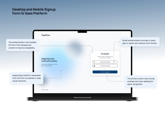
TaskFlow Authentication Flow


Helpful 404 Error Page for a Fintech Mobile App


Pebble Accessible SAAS Signup Flow

Visual Design Courses

UX Design Foundations


Introduction to Figma

Design Terminology
