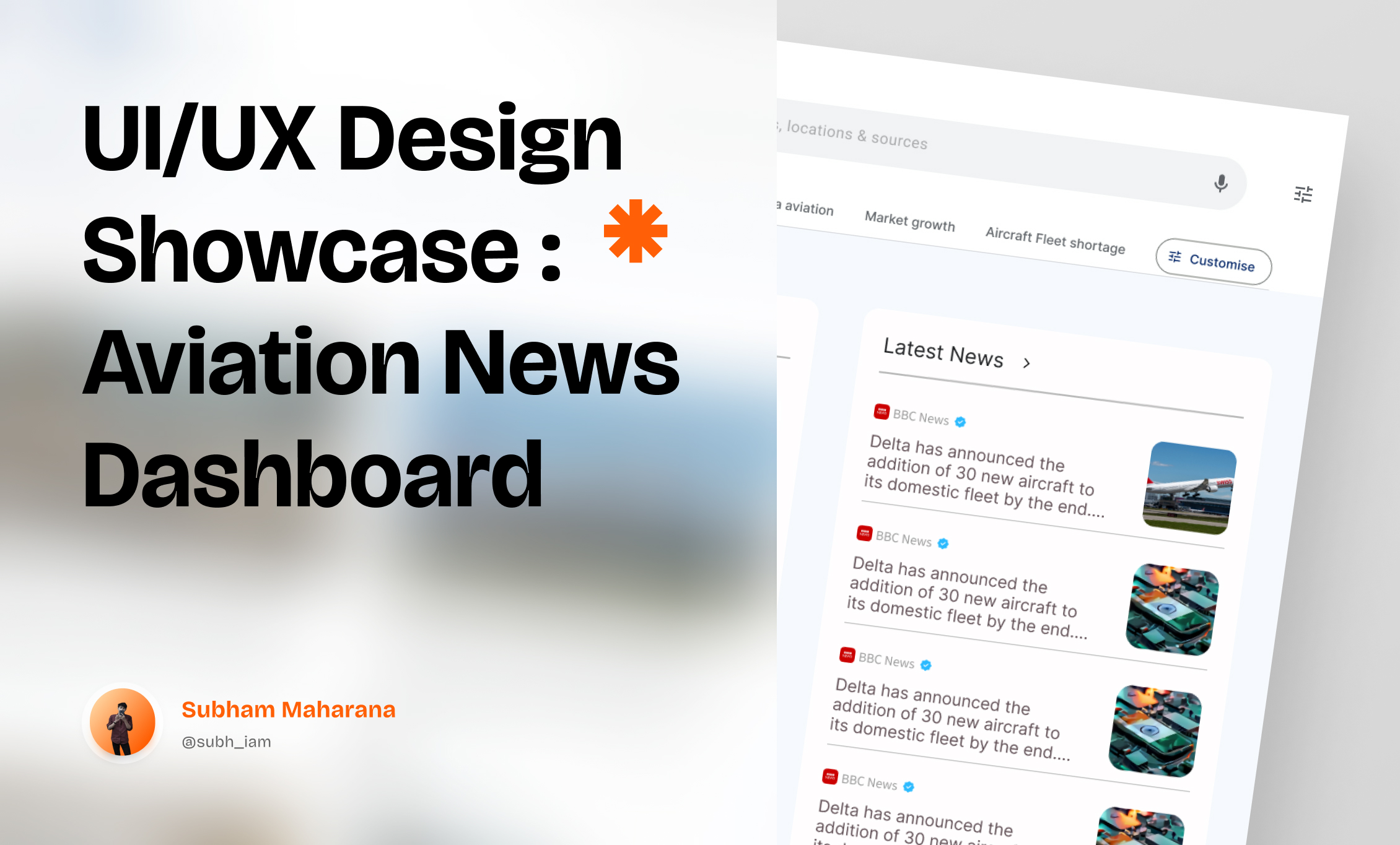
UI/UX Design Showcase: Aviation News Dashboard 🌍✈️

🔍 Project Overview:
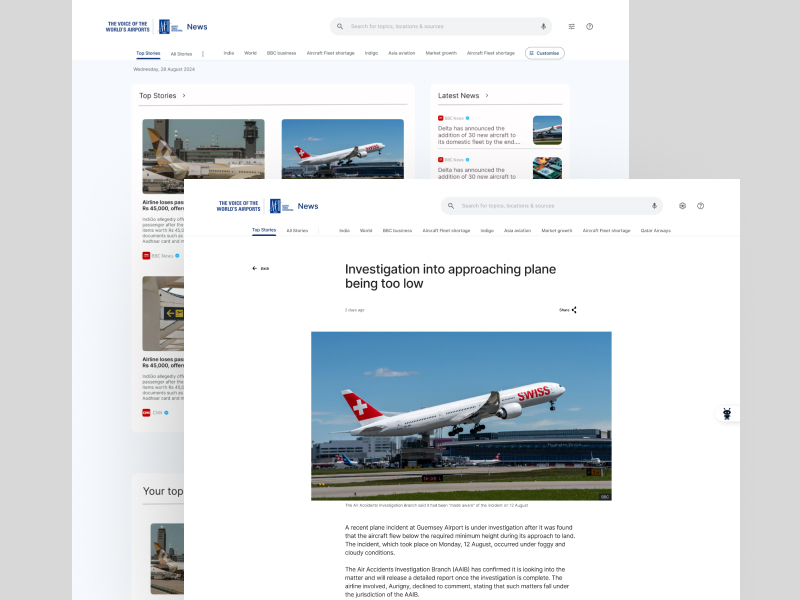
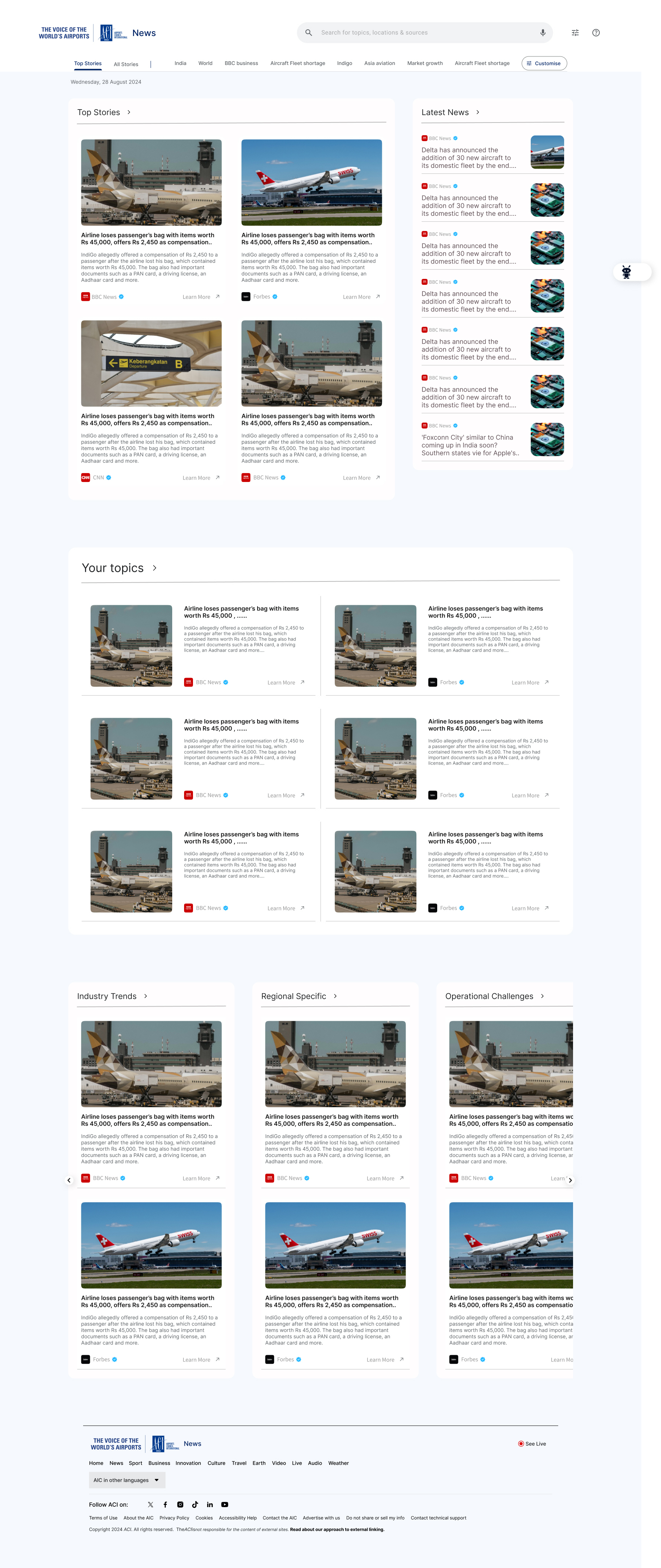
Designed an Aviation News Dashboard to streamline access to global aviation updates for business professionals and enthusiasts. The interface consolidates Top Stories and Latest News, enabling users to stay informed about trends, events, and market insights in the aviation industry.
🎯 Key Features:
- Category Tabs: Seamless navigation between topics like India, World, BBC Business, and Aviation.
- Search Bar: A prominent search bar allows users to find topics, locations, and sources efficiently.
- Customization Options: Users can personalize their dashboard experience by selecting preferred categories.
- Latest News Sidebar: Quick updates with concise summaries for immediate access.
- Consistent Visual Hierarchy: Headlines are paired with relevant images for better engagement.
💡 Design Approach:
- User-Centric Design: Focused on clean, minimal, and intuitive layouts to prioritize readability and ease of use.
- Accessibility: Ensured that color contrast and font sizes are optimized for diverse user needs.
- Scalable Layout: A responsive grid system that works flawlessly across devices.
🛠️ Tools & Technologies:
- Design Tools: Figma for wireframes and prototypes.
- User Testing: Gathered insights through usability tests to iterate on designs effectively.
✨ Impact:
The design enhances the user experience by providing a visually engaging and easy-to-navigate dashboard. It allows users to focus on relevant content without distractions, boosting user engagement and retention.
💡 Update Alert!
If you have any suggestions, changes, or updates for the Aviation News Dashboard project overview, feel free to share your feedback. Your input is invaluable in refining the design and making it more impactful. Let’s collaborate to create the best user experience!
Tools used
Share
Reviews
1 review

Good job! I really like the idea of customization - you executed it very well. I have a few suggestions: the spacing between elements in the headline could be improved, and I’d recommend increasing the margins around the 'Customize' button. The font size seems a bit small, so adjusting that could enhance readability. Additionally, the hierarchy could be improved, especially by refining the sizes of headings and text. Regarding grids, I noticed a clear structure with the news cards, but the heading with the logo and search bar could follow the same grid system as the body part and the footer for consistency.
You might also like

Events Managment App


Customer Journey Map — Offsite Co-Working Experience


Mobile Onboarding: Casa di Pasta


Accessible Signup & Login Experience — Brainex


Accessible Signup Form


Accessible Signup Form

Popular Courses

UX Design Foundations


Introduction to Figma

Design Terminology
