Placid Plastic Duck Typography System

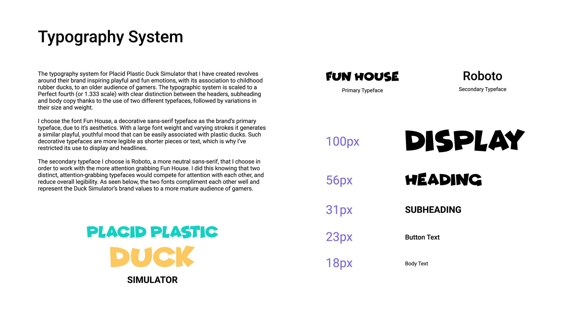
The typography system for Placid Plastic Duck Simulator that I have created revolves around their brand inspiring playful and fun emotions, with its association to childhood rubber ducks, to an older audience of gamers. The typographic system is scaled to a Perfect fourth (or 1.333 scales) with a clear distinction between the headers, subheading and body copy thanks to the use of two different typefaces, followed by variations in their size and weight.
I chose the font Fun House, a decorative sans-serif typeface as the brand’s primary typeface, due to its aesthetics. With a large font-weight and varying strokes, it generates a similar playful, youthful mood that can be easily associated with plastic ducks. Such decorative typefaces are more legible as shorter pieces of text, which is why I’ve restricted their use to display and headlines.
The secondary typeface I chose is Roboto, a more neutral sans-serif, that I chose in order to work with the more attention-grabbing Fun House. I did this knowing that two distinct, attention-grabbing typefaces would compete for attention with each other, and reduce overall legibility. As seen below, the two fonts complement each other well and represent the Duck Simulator’s brand values to a more mature audience of gamers.

Reviews
0 reviews
You might also like

Smartwatch Design for Messenger App


Bridge: UI/UX Rebrand of a Blockchain SCM Product


Pulse Music App - Light/Dark Mode


Monetization Strategy


Designing A Better Co-Working Experience Through CJM


Design a Settings Page for Mobile
Visual Design Courses

UX Design Foundations


Introduction to Figma

Design Terminology
