TRBLBD - SpaceFolding Website


Reviews
6 reviews

Dayum! That Space Folding logotype is so spacey and crisp!
It was a pleasant experience scrolling from space down to the ground. Two things I think are worth considering:
- On desktop view, when the Team animation comes in, their photo cards look distorted, almost like an adult popping out of a can 😅 The mobile view handles it better by keeping them fixed from the start instead of skewed.
- Not sure if this is a bug, but when I reached the footer, the navigation was clear rather than blurred, which made the “reach us at info @ spacefolding.ai” text clash with the menu text.
Stellar work, Marko! 🚀

Bravo Marko! Stunning design and beautifully craftet website!
Love the bold visual direction and unique brand personality, it really stands out. With just a bit more content in the hero and small tweaks to polish the animation and footer contrast, this could feel truly world-class.

The images and colors are very impressive. I love it!

Marko, your site looks bold and memorable, just refine the hero content and smooth a few animations, and you’ve got something truly stellar!

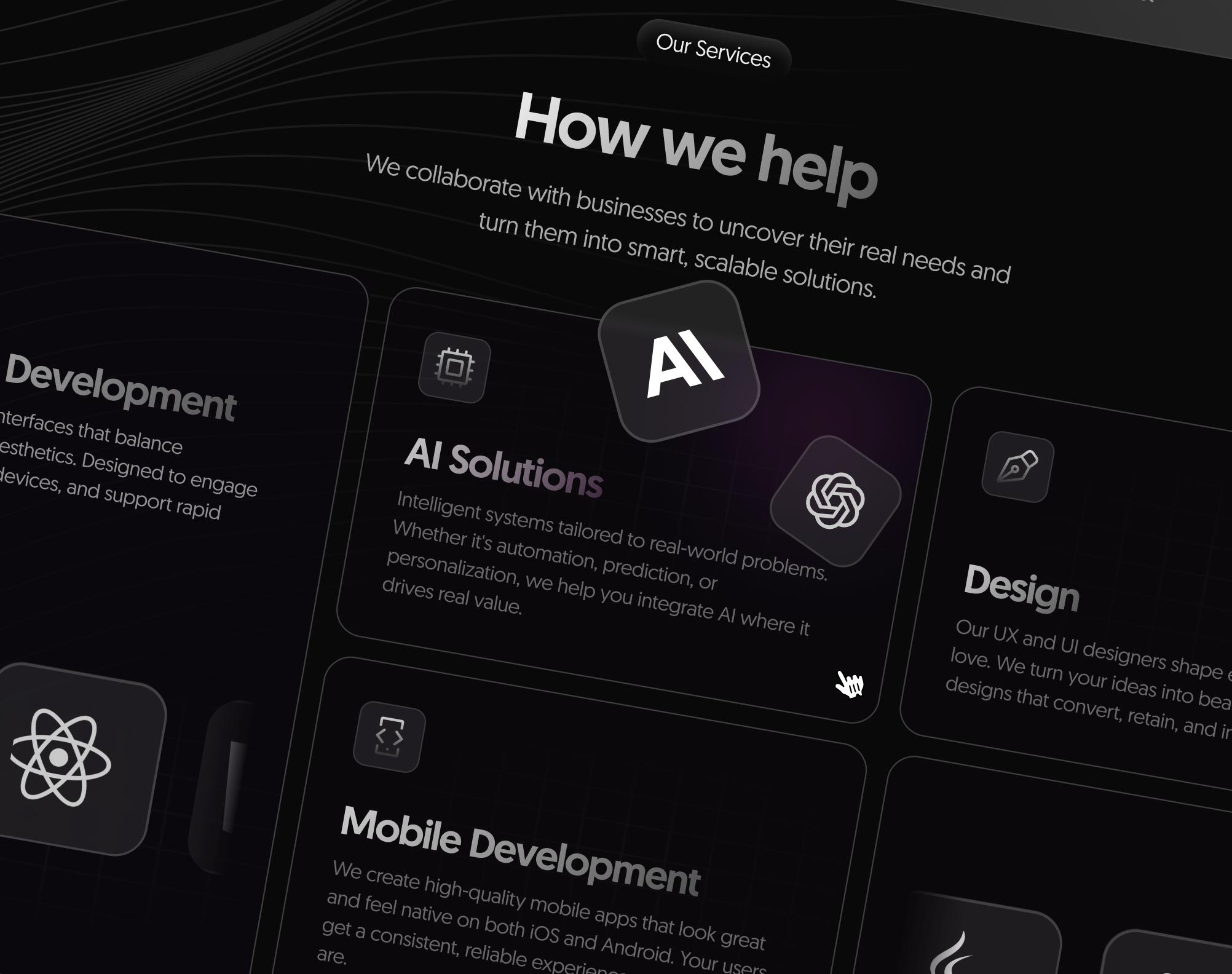
This TRBLBD SpaceFolding website looks very modern and visually interesting. The screens are clean and easy to follow, and the layout guides the user well.
The design feels creative and futuristic, and the interactive elements make it engaging.
Overall, it shows strong attention to detail and a clear sense of style. A next step could be testing the usability to make sure it is as easy to navigate as it looks.
You might also like

Notification microcopy - Project


El Mandoub-GovTech App


MalishaEdu Counselor Workspace


Goal Creation Flow


Portfolio website

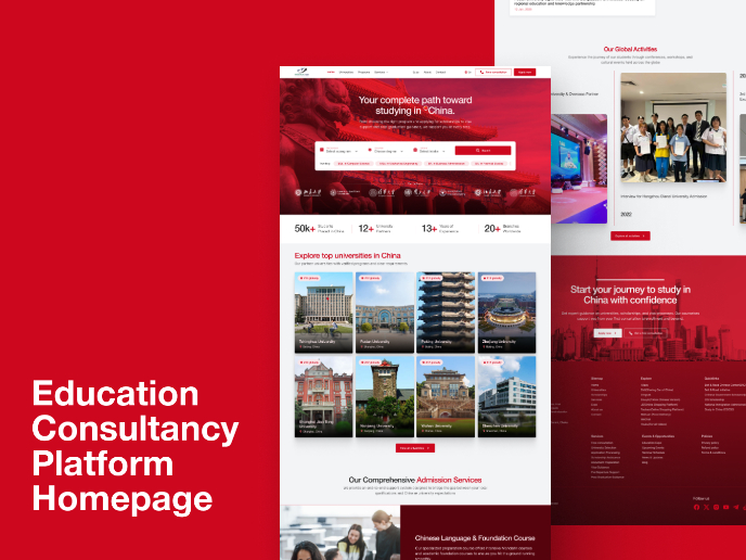
MalishaEdu - Website Design
Visual Design Courses

UX Design Foundations


Introduction to Figma

Design Terminology
