Color System for Toggl


I chose Toggl as the work management tool to implement this color system. I aim to enhance the overall user experience on Toggl, promoting productivity and satisfaction through thoughtful color choices.
My criteria for selecting colors:
- Foster a sense of professionalism, focus, and calmness, ensuring users feel confident and comfortable while using the platform.
- Present a visually and aesthetically pleasing interface that enhances user engagement, making the experience enjoyable and intuitive.
- Create a strong color contrast to ensure readability and visual clarity while complying with the WCAG guidelines to ensure that the platform is inclusive and usable for all individuals, including those with visual impairments.

Reviews
3 reviews

Hi Thy,
solid work on this. You’ve explained your rationale behind your color choices quite well. My personal perception is that your color choices are better than the official Toggl color choices. Here a few places to grow:
• Build out your neutral colors. I can see in your UI examples, you understand the importance of using more neutral colors. There’s the 60-30-10 axiom for color balance, and it looks like you understand that. Go ahead and define not just your white, but your other neutrals as well. You’ve got a black in your text that I don’t see in your palette. Give yourself more options than you think and spell them out. They’re going to be foundational for a lot of your UI. You’ll want to be able to distinguish between a neutral background and a neutral input field for example.
• You mentioned your primary colors being WCAG AAA. How do you figure that? Let us know your thinking for how those colors work together. Your whole color palette is solid, but the usage of one color with another affects accessibility more than the any one color itself. Explaining your thinking for how to use your selections in functional pairings or component use cases would be helpful.
Overall, I can tell you have a solid foundation for color theory and your UI game is pretty strong as well. Keep it up!

I like the pastel palette, very harmonious!
In your brief, you mention the "trustworthiness" of blue, which doesn't ring true. I know in color theory they attach emotions and meanings to color but I don't think the average user cares about that. Meta (Facebook) is one of the most untrustworthy companies on the planet. Their primary color? Blue.
I'd also avoid the use of true white. It, along with true black, is often difficult to read because it tends to "buzz" against other colors. It's especially difficult for people with dyslexia to read. I'd recommend using a light version of the primary color or even a light gray in place of white.

As an avid Toggl user, this could be a nice addition to their already strong, fired-up brand color, which sometimes stresses me out 😄 but that's what drew me in the first place to Toggl. With your color system, I think I can use it for more relaxing projects, such as designing a book cover for fun or even tracking my time when I read books.
Nice choice of colors!
Thy Nguyen
You might also like
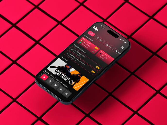
Blip - Esport app design (Light & Dark UI)


Reimagining Asana's Color System


Customer Journey Map for a Co-Working Space

Responsive Main Screen


Latios - Free Portfolio Template for UX/UI Designers

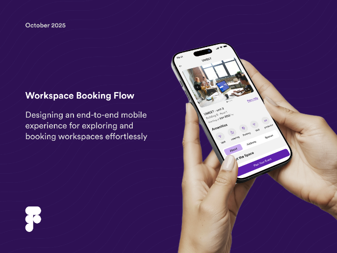
Workspace Booking Flow - UI/UX Design

Visual Design Courses

UX Design Foundations


Introduction to Figma

Design Terminology
