Theme colors

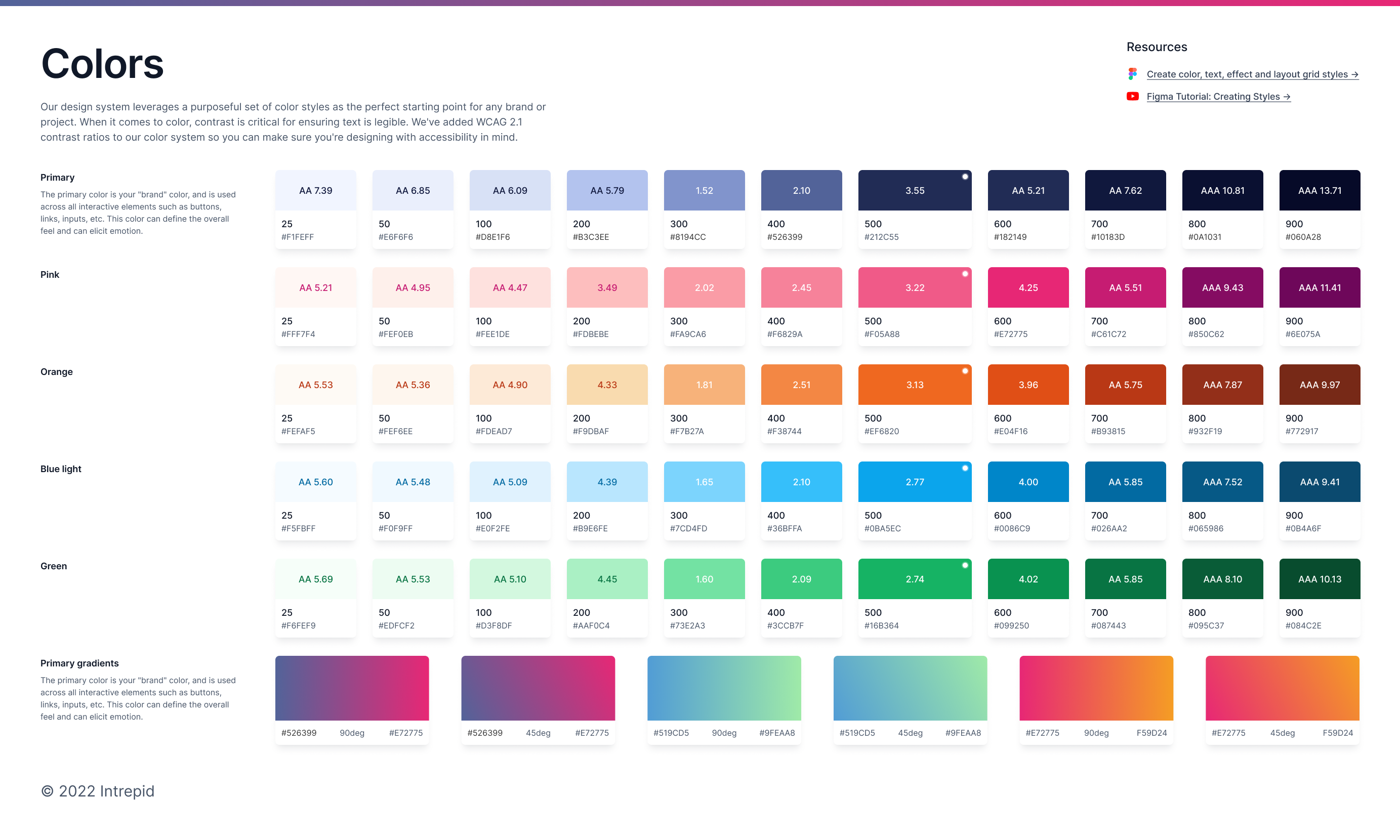
Our design system leverages a purposeful set of color styles as the perfect starting point for any brand or project. When it comes to color, contrast is critical for ensuring text is legible. We've added WCAG 2.1 contrast ratios to our color system so you can make sure you're designing with accessibility in mind.
Tools used
From brief

Topics
Share
Reviews
2 reviews

Thien, this color system is incredibly well thought-out! I love how you’ve structured everything—the usage descriptions for each color are super helpful, and having multiple shades for different scenarios makes this feel like a truly flexible system. The contrast ratios are a fantastic addition, too; it’s clear you prioritized accessibility, which is awesome. It reminds me of polished systems like Tailwind but with your thoughtful touch. This is such a practical and well-executed resource—great job! 👏🏻

I really like how this case study showcases a color system that is both visually appealing and anchored in accessibility standards. It’s great to see WCAG 2.1 contrast ratios called out directly—this makes it much easier to ensure designs are inclusive. The overall organization and presentation here remind me a bit of the Untitled UI design system, which I’m a big fan of. I appreciate the intentional approach to color choices and how the different tints and shades are clearly labeled, making it a solid resource for any brand or project looking for a well-structured, accessible palette.
Suggestions for improvement:
- Real-world examples: It might help to show actual screenshots or mockups demonstrating how these color choices work across various components or pages.
- Dark mode considerations: Including guidelines for dark mode or high-contrast themes would deepen the utility of this system and ensure consistency across different user experiences.
- Typography pairing: Providing a quick reference for which text styles pair best with each color swatch would offer designers a more comprehensive toolkit for creating cohesive layouts.
- Implementation tips: Brief notes on best practices—like how to maintain color contrast when overlaying text on images—could further round out this already strong foundation.
You might also like

Events Managment App


Customer Journey Map — Offsite Co-Working Experience


Mobile Onboarding: Casa di Pasta


Accessible Signup & Login Experience — Brainex


Accessible Signup Form


Accessible Signup Form

Visual Design Courses

UX Design Foundations


Introduction to Figma

Design Terminology
