Styler - Landing Page

To design the landing page, I began with research and inspiration gathering to understand the target audience and industry trends. Then, I created a wireframe to map out the layout and user flow. Using tools like Figma, I moved on to the UI design, focusing on visual hierarchy, branding, and clear call-to-action buttons. I tested the design for usability and responsiveness, making revisions based on feedback. The final result was a clean, engaging, and goal-oriented landing page ready for development.
Tools used
From brief

Topics
Share
Reviews
2 reviews

Hi, Shivani
Before we get into the specifics of this task, I just want to acknowledge something separately:
You’re absolutely on the right track by practicing with creative pieces that inspire you personally.
Keep it up! 👍
building that kind of habit is valuable!
One of the great qualities of a professional designer is visual awareness - constantly observing the work of others, studying trends, and staying curious about what’s happening in the industry.
Regular practice is essential. Andno matter your experience level.
Just like in any other field, design skills grow through repetition and experimentation.
Even replicating the work of others can be a great exercise.
It sharpens your technical abilities, deepens your understanding of design decisions, and helps shape your own expert point of view.
---
A designer’s role always balances two critical goals:
- Creating a smooth and intuitive experience for the user, and
- Supporting the business objectives of the client or project owner
Your work, your process, and your thinking contribute to both.
That’s why it’s so important to approach every part of the brief with clarity, care, and attention to detail.
---
So, we're back to the task.
This isn’t just about creating a Hero screen.
What you’re building is a landing page.
So in this case it must be your opportunity to demonstrate several key areas of design competence:
- Your understanding of functionality and user flow
- Your ability to create clear visual and written communication with your audience
- Your command of color, typography, and composition
- And finally, your skill in presenting and standing behind your design decisions
Wish you the best in your practice and wins!

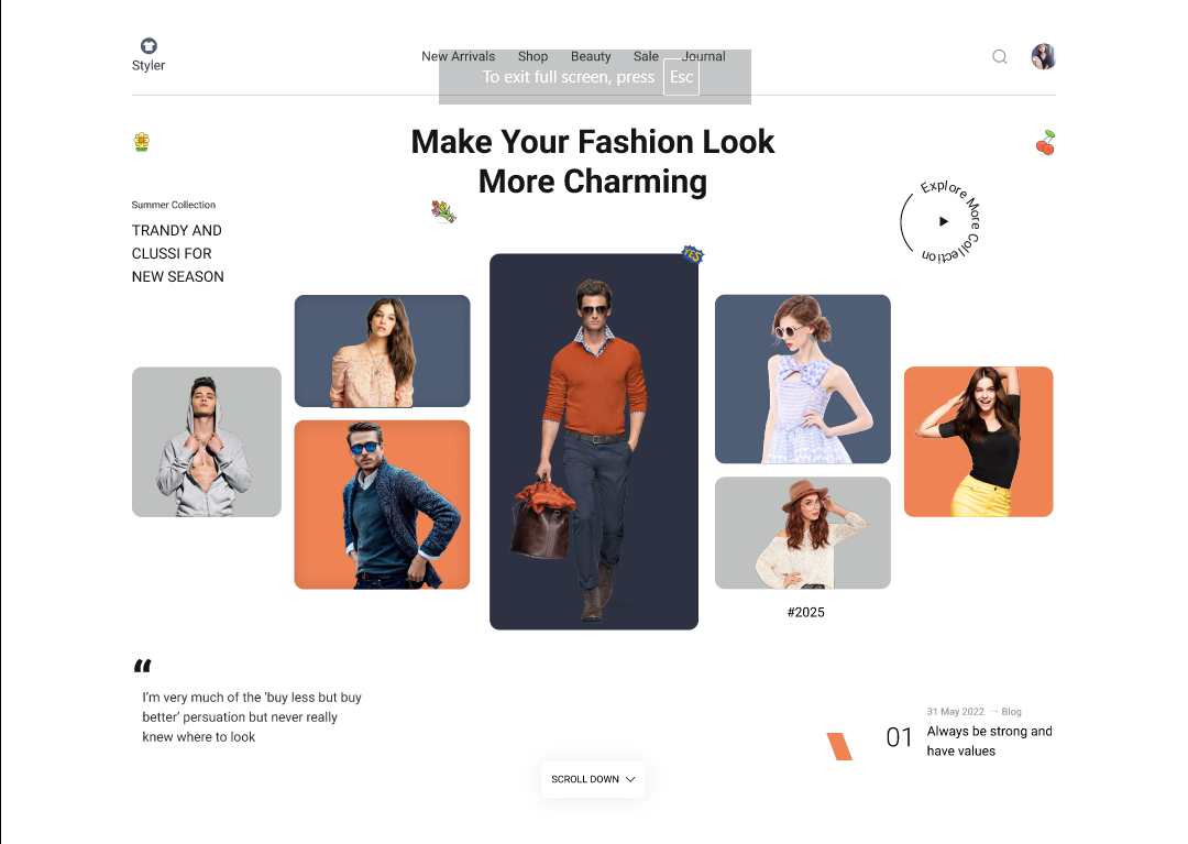
You’ve made a strong visual start here! The design definitely grabs attention with its boldness and a nice sense of energy. But right now, it leans a bit too far into “looking good” without backing that up with solid usability or structure. And that’s something to really focus on as you continue building your UX skills. A design can be beautiful, but if users are confused or unsure of what to do next, that beauty becomes a barrier.
Let’s talk CTAs. “Scroll down” isn’t doing enough. It’s passive, vague, and doesn’t give the user any real motivation. A call-to-action should drive interaction. Something like “Shop the Collection,” “Discover the Drop,” or “Start Your Style Journey” gives people a reason to move forward. Pair it with a directional arrow or hover animation to visually reinforce that guidance. Motion can be subtle but still super effective.
That circular “Explore More Collection” button on the side is also a UX red flag. It’s visually interesting, sure, but functionally weak. It feels more like decoration than a clear interaction point. For primary actions like this, use patterns people recognize. Rectangular buttons with subtle hover effects are familiar, accessible, and effective. Save playful or experimental interactions for secondary moments - microinteractions, icon hovers, or loading states, but not the main flow.
The tiny fruit illustrations feel like clip art that is out of place. Only keep brand elements if they serve a purpose. Are they playful? Eco? Part of a pattern? If they’re just floating decorations, they might be just noise.
More broadly, these types of visually rich, editorial layouts need a solid visual hierarchy to work. Without it, things get noisy fast. Think of it like organizing a magazine spread: you need anchors. One or two strong focal points. Supporting content. Clean alignment. Consistent spacing.
Right now, it feels like everything has equal visual weight, which makes it hard to know where to look first. The grid should do some of the heavy lifting here, anchor the main action, group related elements together, and create a clear flow through the content.
And finally, zoom out and ask yourself: what’s the user’s goal here? Can they reach it quickly and intuitively? What story are we telling, and are we telling it consistently?
You’re definitely close. There’s energy and a good eye here, now it’s just about tightening up the structure and grounding it in clarity and purpose. Happy to help if you want to mock up a wireframe or restructure the layout to bring more usability into it.
You might also like
Accessible Signup Form

Entrant - Analytical Dashboard

Transit Cairo — Digital Mobility Redefined

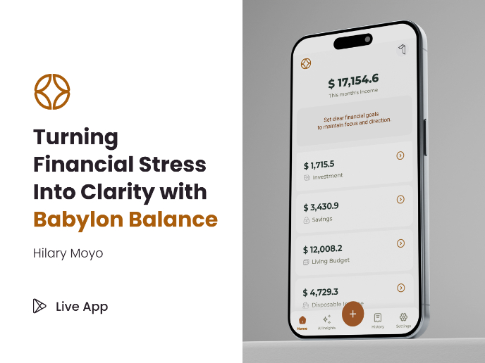
Babylon Balance - Designing Financial Clarity Through Constraint

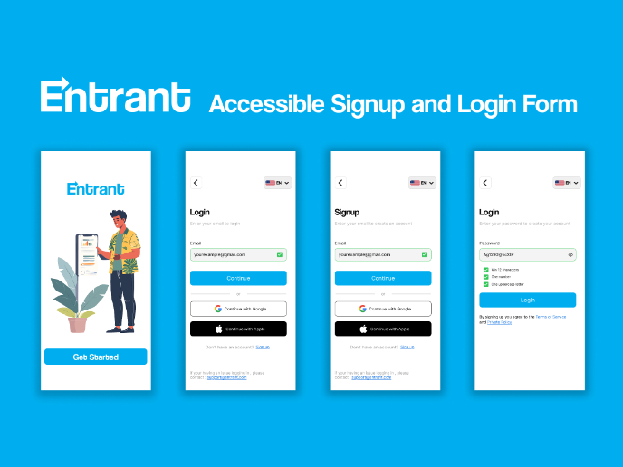
Entrant Accessible Signup and Login Forms
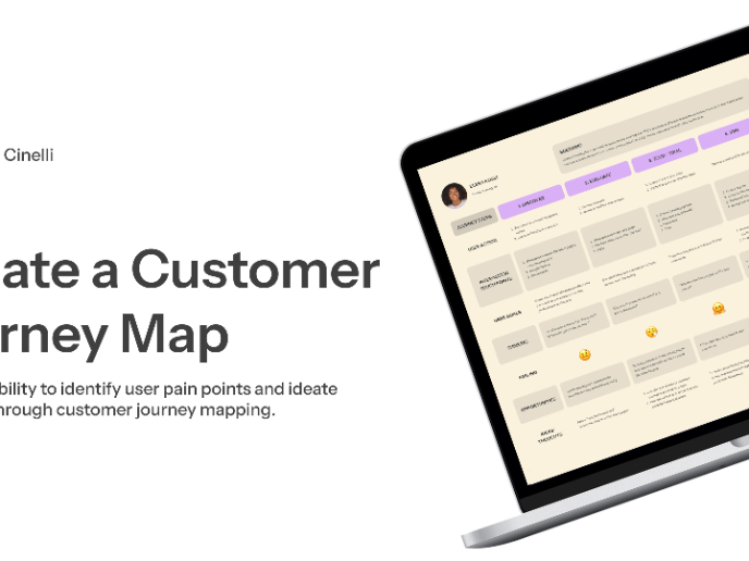
CJM x Mindspace case study - Ester Cinelli

Content Strategy Courses

UX Writing


Common Design Patterns


Building Content Design Systems
