Split It Case study 🤑


At-a-Glance 👀
Split It is my first UX case study. I handled the entire UX and UI design process from start to finish, allowing me to develop and refine my skills in creating user-centered solutions. This project was an incredible learning experience and a great step in my design journey!
Problem
Current methods of splitting bills often lack flexibility, making it difficult to distribute expenses fairly within a group. Users desire a unified platform to easily track and manage all shared expenses, accommodating varied contribution preferences and enhancing transparency.
- lack of flexibility
- difficult to distribute expenses fairly and quickly
- track and manage all shared expenses
- difficult to split the bill unevenly
Opportunity
Build user friendly app with core features as its splitting bill among a group and expense tracking. Add nice to have features like bill uploading with camera or currency conversion.
Process
I followed **the Double Diamond framework** to guide my design process.
1. Discover:
I started by researching the problem space, conducting user research, and analyzing competitor apps to identify the pain points people face when managing shared expenses.
2. Define:
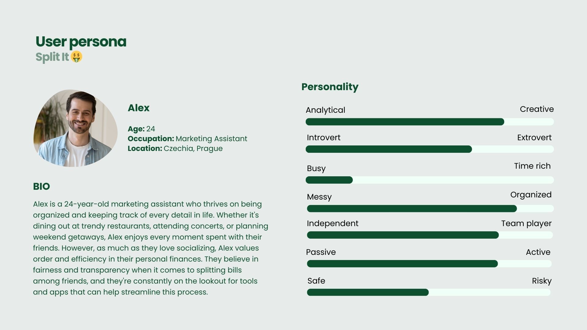
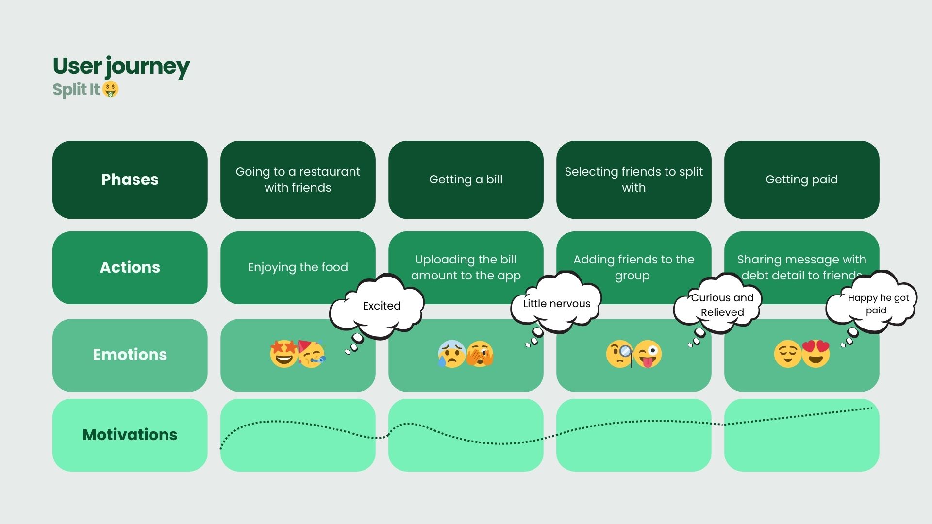
Next, I used the insights from research to define clear user needs and created sketches, user stories and user journey to guide the app's functionality. This phase helped me focus on the most important problems to solve.
3. Develop:
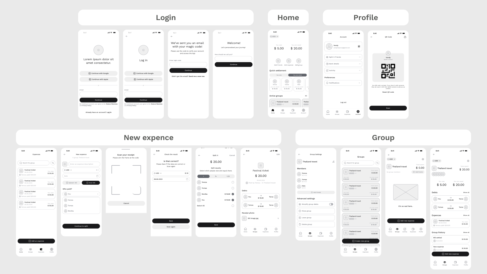
I then generated multiple ideas, sketched rough concepts, and explored various solutions for key app features like expense tracking, adding friends, and splitting bills. I used wireframes and flowcharts to visualize these ideas.
4. Deliver:
In this phase, I refined the best solutions, created high-fidelity prototypes, and conducted user testing with two friends. Their feedback on the wireframes helped me identify areas for improvement and ensure the design was intuitive and user-friendly. After incorporating their insights, I iterated on the designs to further polish the final product.
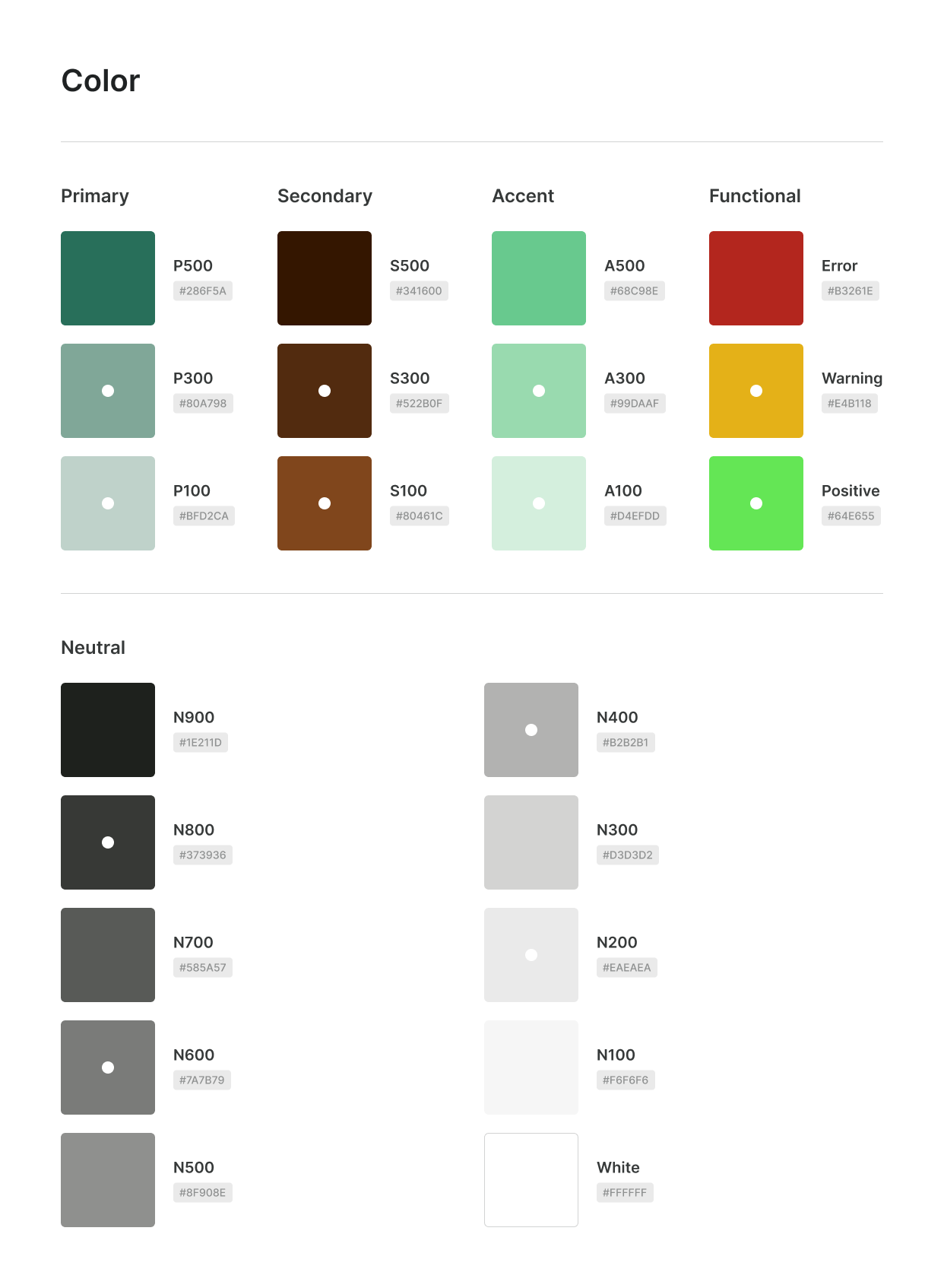
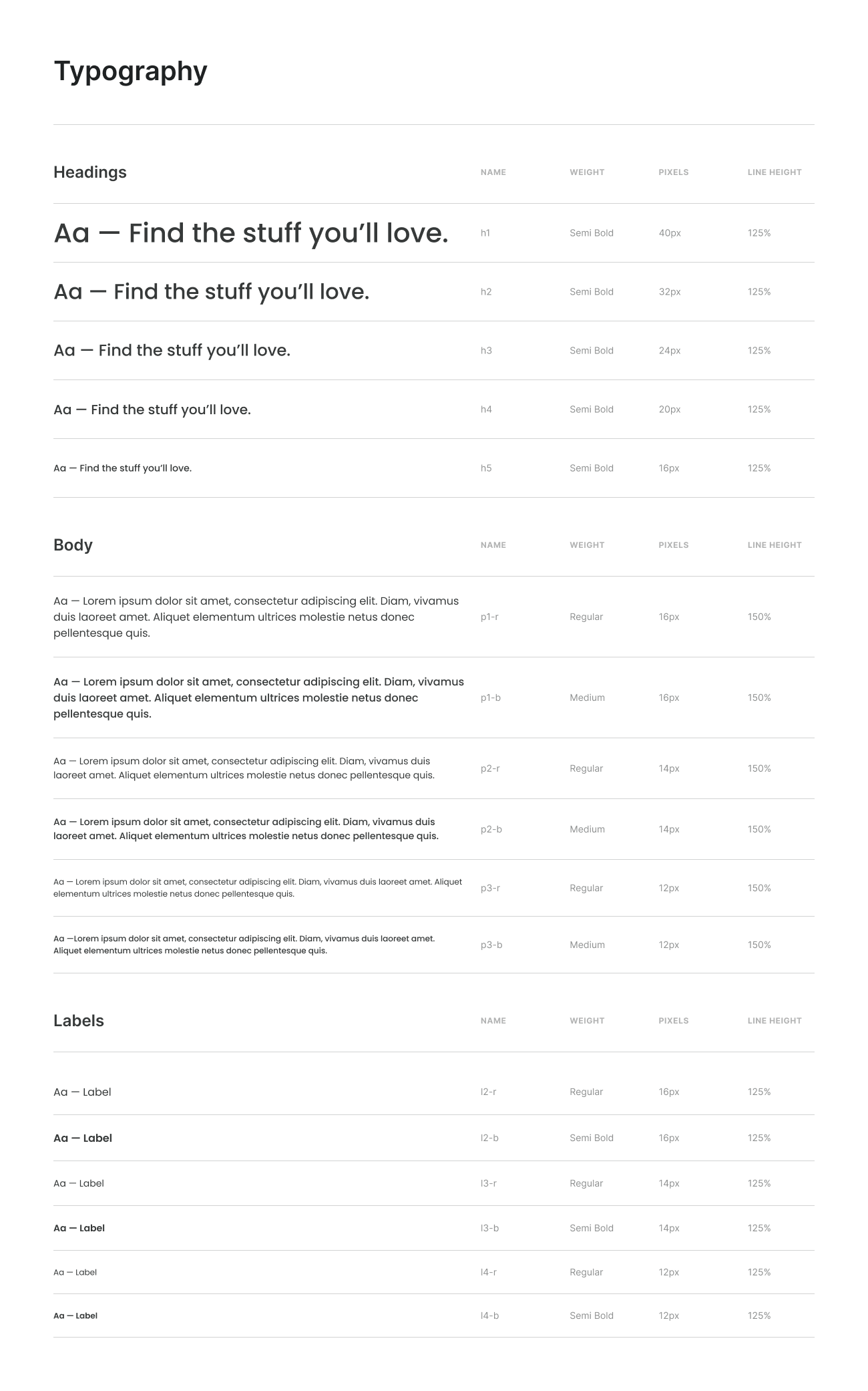
Color & Typography:
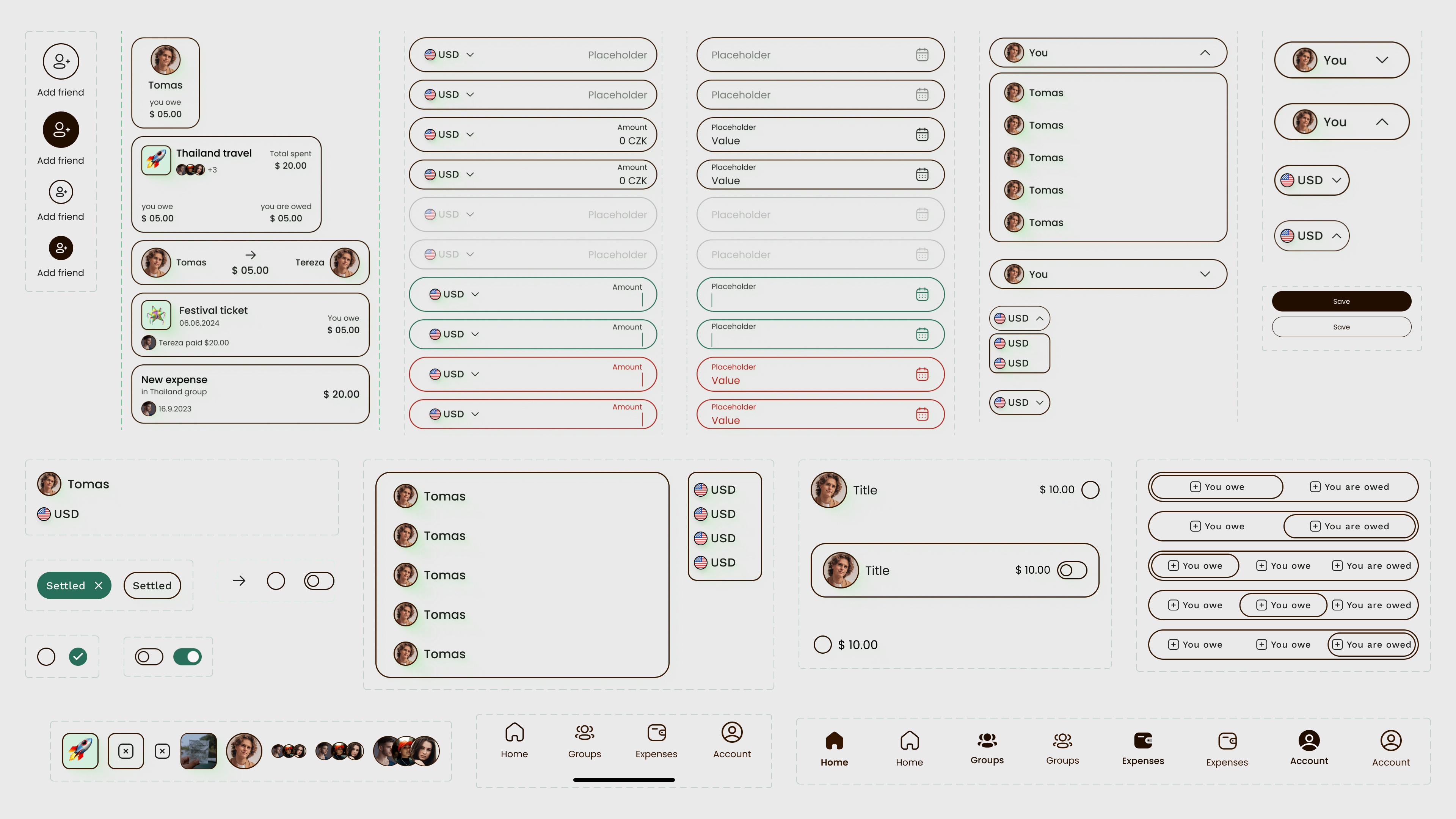
Components
Major Design Iterations 🔁
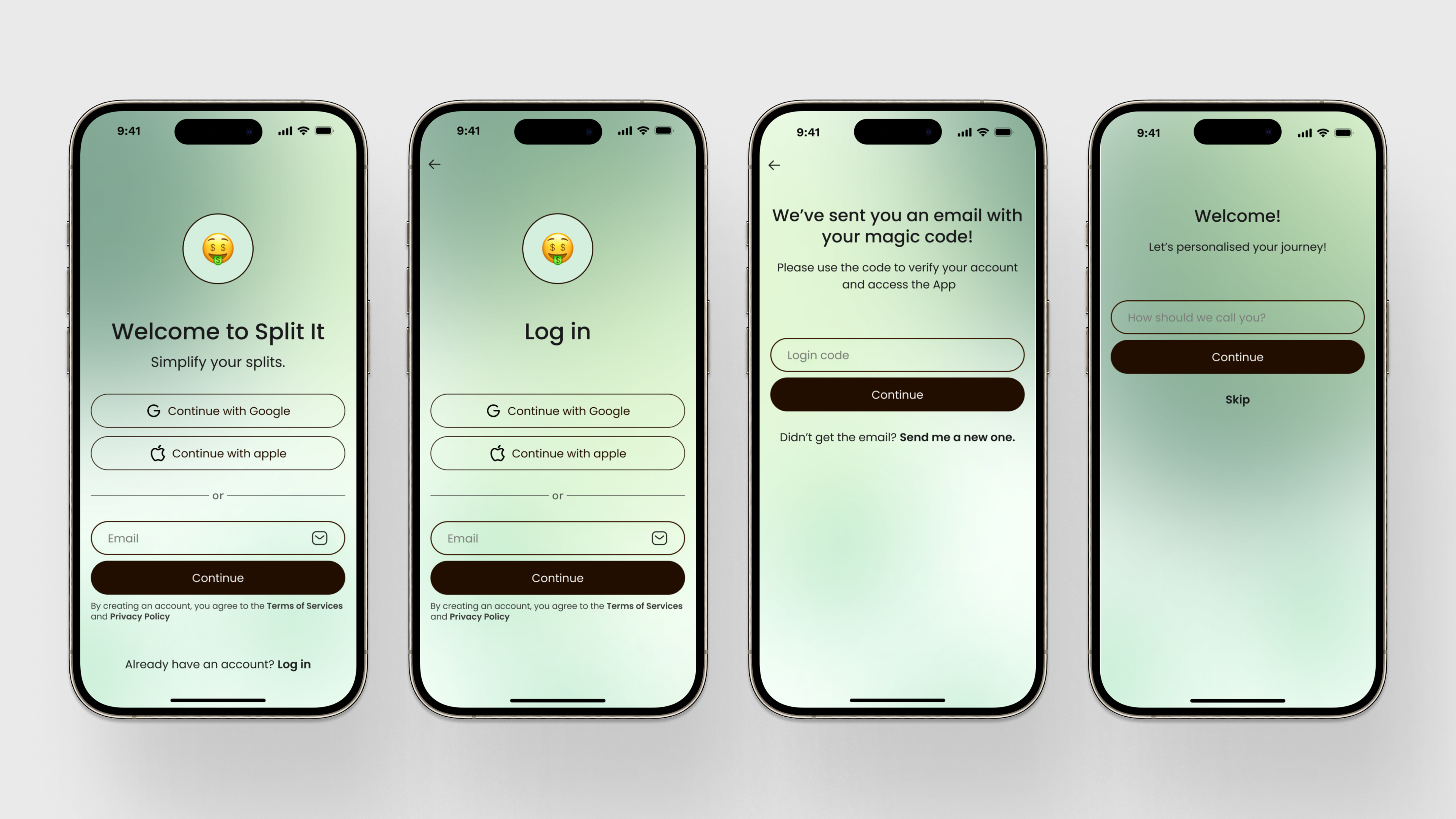
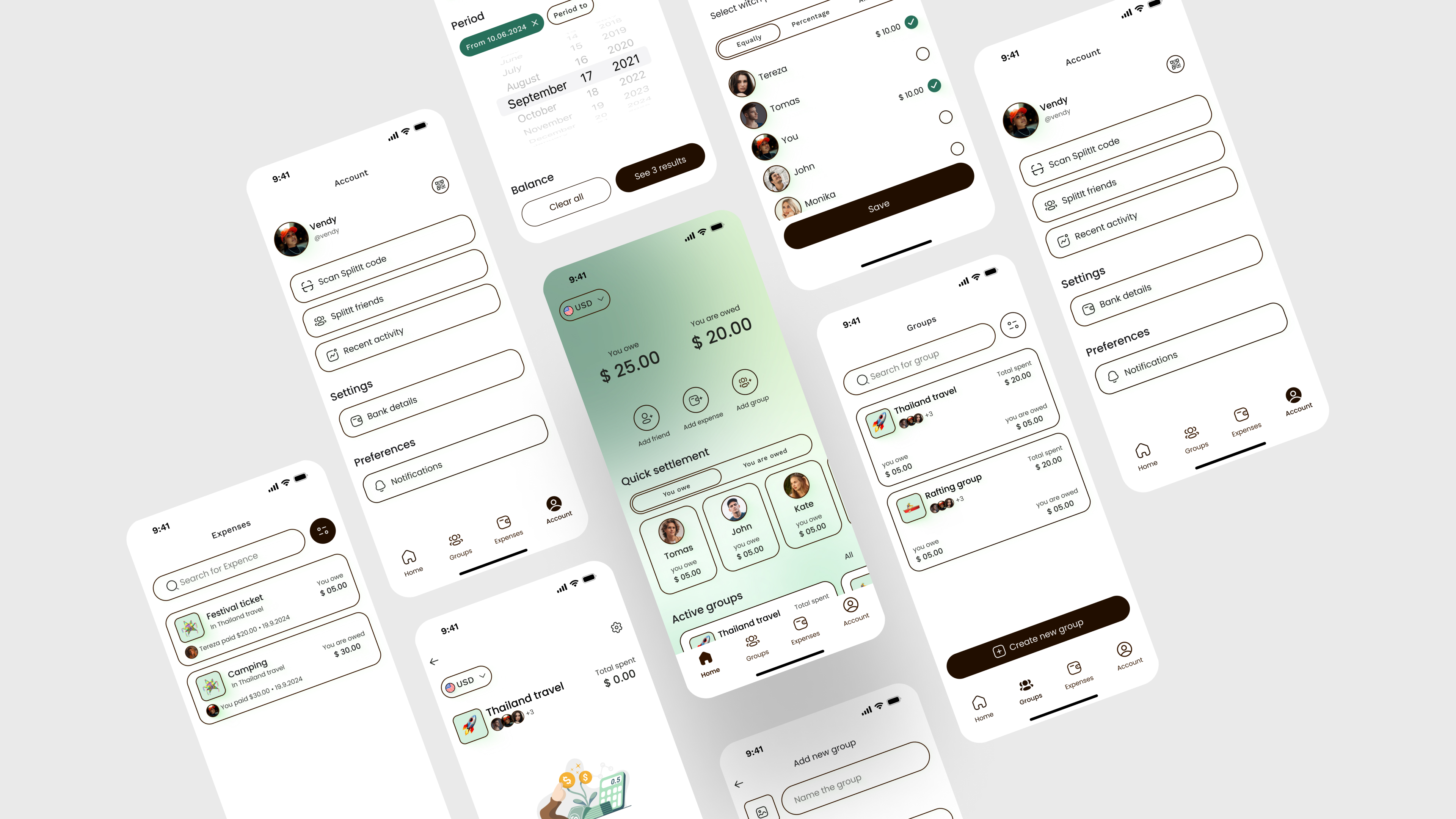
👇 Login
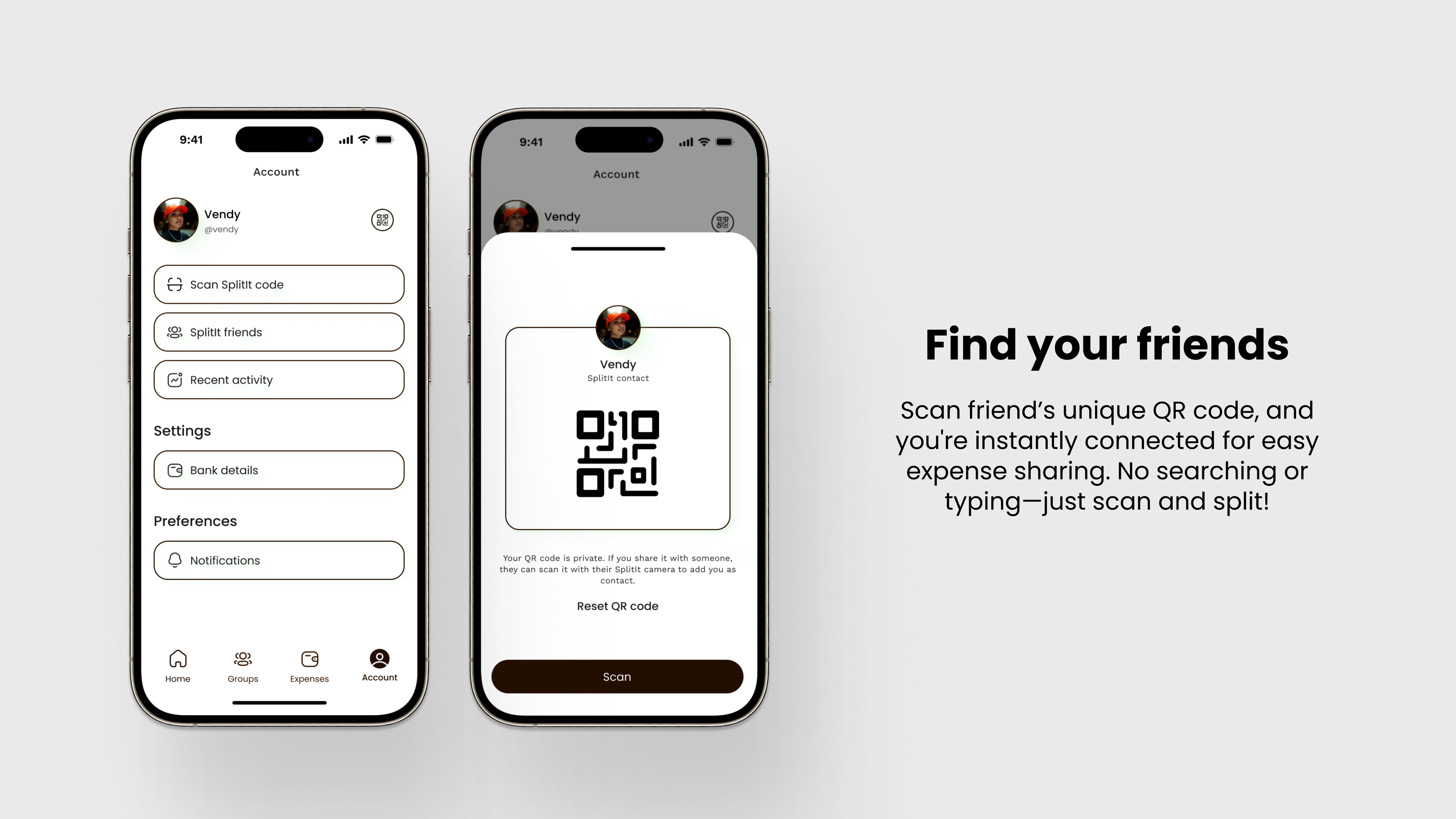
👇 Find friends
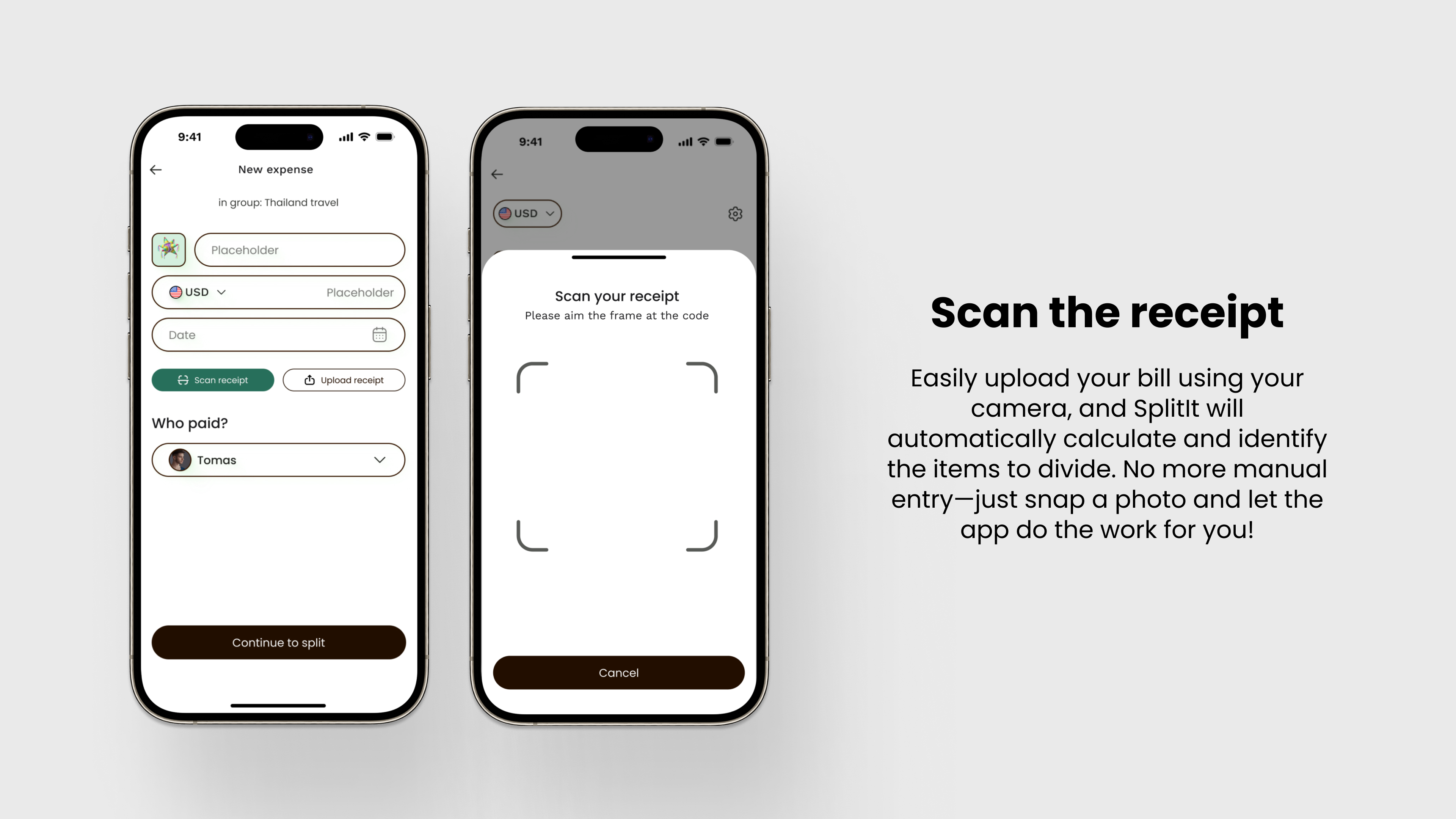
👇 Scan the receipt
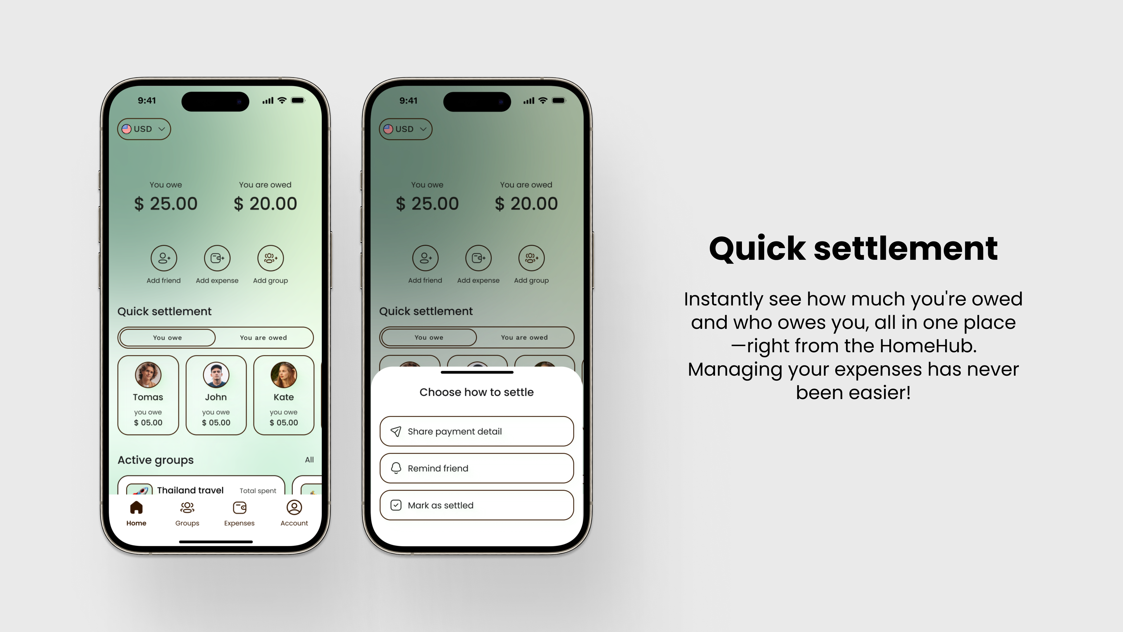
👇 Debts overview and quick settlement
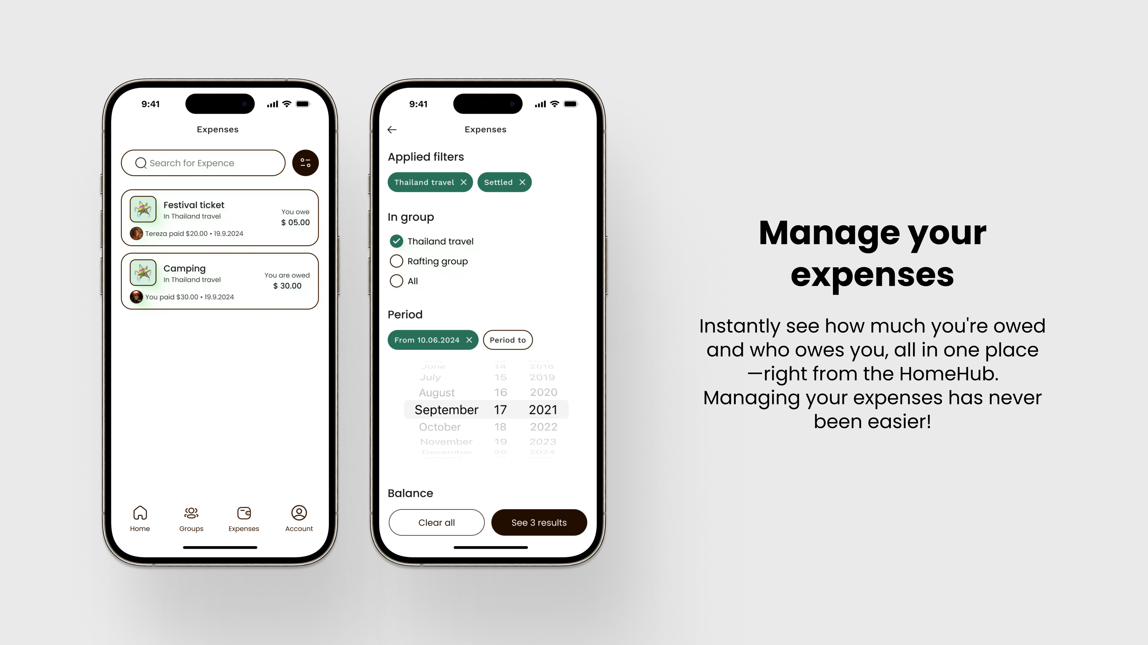
👇 Manage your expenses
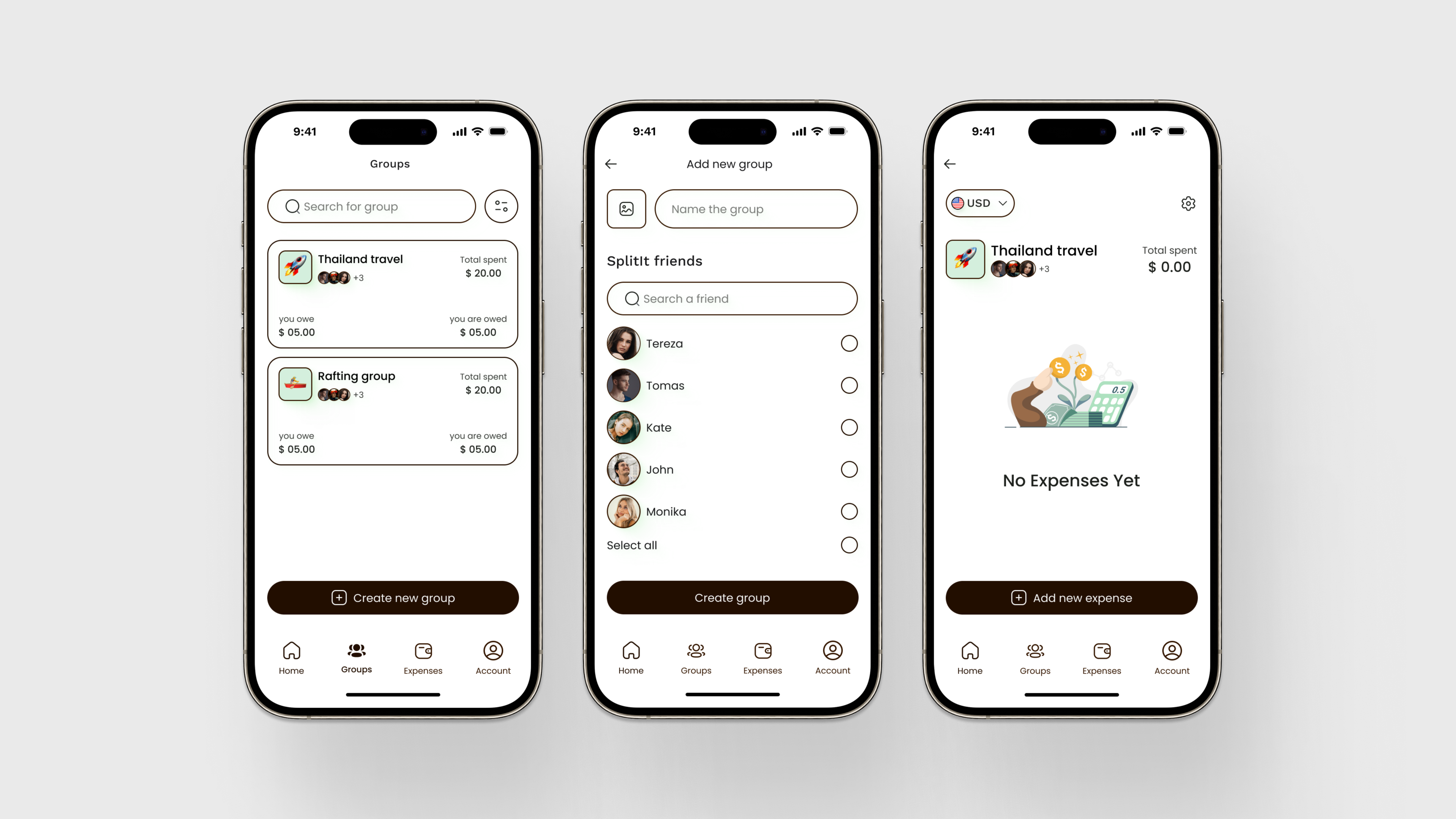
👇 Creating a group
Final design
Click to play with the prototype
Figma design
What I Learned 🌱
During my first UX case study for SplitIt, I gained valuable insights into the entire UX/UI design process. I learned how crucial thorough user research is to understanding real-world problems and how to translate those insights into actionable user stories. I also became more comfortable ideating multiple solutions, working through wireframes, and iterating designs to refine them.
This project helped me understand the importance of following a structured framework, like the Double Diamond, to keep the process focused and user-centered. Additionally, I improved my prototyping skills, learned how to balance creativity with functionality, and saw firsthand how vital testing and feedback are to creating a design that truly solves user problems.
Most importantly, I learned to approach problems methodically and adapt my design decisions based on user needs.
Reviews
1 review

Hi Vendula
From a product case study standpoint, the strength of “Split It” lies in clarity of problem framing. Expense-splitting tools operate in socially sensitive contexts, so friction and misunderstanding must be minimized. If your narrative clearly outlines the pain points before presenting solutions, the transformation feels credible.
What’s especially important in finance-adjacent apps is simplicity in interaction. Adding participants, dividing costs, and tracking balances should feel effortless. If the redesign decisions address confusion points or reduce manual effort, that reflects thoughtful UX refinement rather than surface-level iteration.
To elevate it further, I’d sharpen the measurable impact. Did the redesign improve task completion speed, reduce errors, or increase engagement? Tying design changes to behavioral or quantitative outcomes would strengthen the case study from well-designed to strategically validated. Overall, this feels directionally grounded with strong potential for clearer impact articulation.
You might also like

Improving Dating App Onboarding: A/B Test Design

FORM Checkout Flow - Mobile


A/B Test for Hinge's Onboarding Flow


Accessibility Asse


The Fitness Growth Engine

Uxcel Halloween Icon Pack

Popular Courses

UX Design Foundations


Introduction to Figma

Design Terminology
