Smartwatch Messenger Design

Scenario
You’re a UX/UI designer at a startup developing a messenger app. Your team decided to increase market share by developing a smartwatch version.
Design
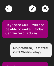
I decided to keep my designs simple and easy to understand. From the screens you can see i opted for high colour contrast speech boxes so you can easily identify each persons input.
I included the ability to both write messages and also use your voice to make the messaging faster and cater to those who have difficulties with writing.

Reviews
1 review

Thank you for your contribution! I completely understand the choice to include two actions: typing or using voice input. Here are a few suggestions:
- Given the Apple Watch's screen resolution (448 x 368 pixels) and size (44 x 38 mm), it’s very challenging to fit too many components on the screen. Since users can’t realistically type on such a small display, it might be better to remove the typing button and enlarge the microphone button instead. Placing it at the bottom-right could free up space for displaying useful information in the header.
- It’s smart not to include a profile picture—that helps save space on the screen. However, you could add the recipient’s name next to the back button at the top to clearly specify who the message is for.
- One small note: in most messaging apps, the user’s outgoing messages are often in a distinct color. To align with this pattern, you might consider reversing the current colors—using purple for the user’s messages and gray/white for the recipient’s.
In summary, it’s important to see the smartwatch as a complementary tool to the phone rather than a replacement due to its size limitations. Thanks again for your contribution!
You might also like

HealthFlow: Designing a Simple and Insightful Wellness Dashboard


Improving Dating App Onboarding: A/B Test Design

FORM Checkout Flow - Mobile


A/B Test for Hinge's Onboarding Flow


Accessibility Asse


The Fitness Growth Engine

Interaction Design Courses

UX Design Foundations


Introduction to Figma

Design Terminology
