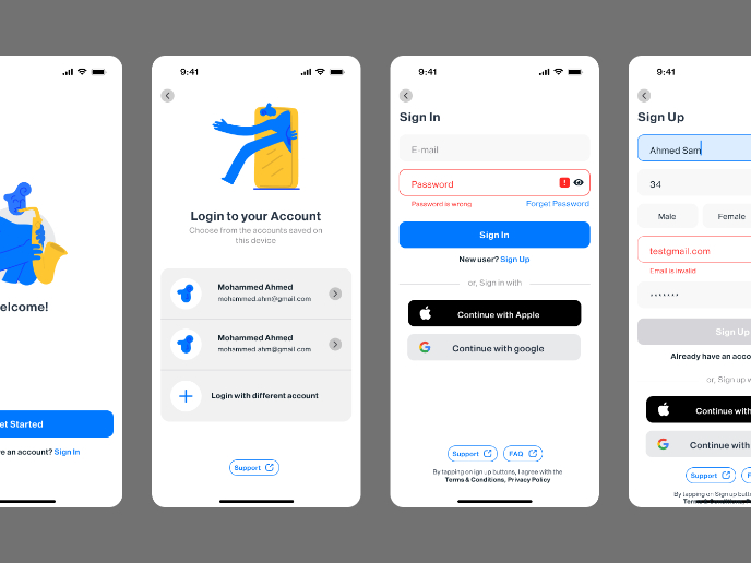
Sign up-Log in


I have designed the key Login and Signup pages, focusing on accessibility and user experience. I chose a blue color scheme to establish a sense of trust and reliability for users. For input fields, I implemented floating labels, as we learned in the course, to keep the form clean and easy to navigate.
To enhance usability, I ensured that password error messages are clearly displayed, helping users understand and correct mistakes easily. Additionally, I aimed for a minimal and uncluttered layout to reduce cognitive overload, especially for users who experience anxiety, ensuring a calm and stress-free interaction.
I carefully maintained proper contrast ratios to meet WCAG accessibility standards, making sure all text and elements are easily readable. The overall design is structured to be intuitive and inclusive, allowing all users to navigate the authentication process effortlessly.

Reviews
2 reviews

Hello Atefe mohammadi,
Your designs are looking great—clear and easy to understand! I have a couple of small UX suggestions that might help improve the experience even further:
- It would be better if the "Accept terms and privacy policy" checkbox wasn’t pre-selected. Allowing users to check it themselves ensures they actively agree.
- In the "Create Password" section, the info text could be in a slightly lighter shade instead of bold black. This would help differentiate it from the checkbox text below and improve contrast.
These are just small refinements, but implementing them could make the design even stronger. Overall, your UX/UI approach is working really well—keep up the great work! Wishing you continued success.

Hello Atefe, great to see your project. They are well-designed sign-in/sign-up flow with appropriate spacing & typography hierarchy. I have some recommendation that would help the project more fulfilled:
- I agreed with the previous feedback from Berivan about not set the "Accept terms and privacy policy" pre-selected. That could be a potential dark pattern.
- The color tone of the screen title is a bit different from the rest of font colors used, which may cause a bit of my curiosity
- Let's double check to make sure using consistent content copy throughout the screens. For example, some field heading is "Email"/"Email address", and a field heading of "password" with "p" is not capitalized.
Have a nice day! ;)
You might also like

Customer Journey Map for a Co-Working Space


Reimagining Asana's Color System


Latios - Free Portfolio Template for UX/UI Designers

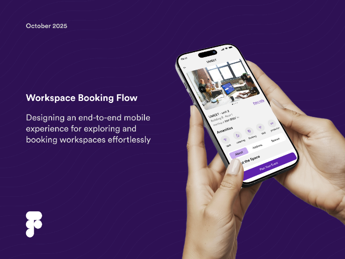
Workspace Booking Flow - UI/UX Design

Responsive Main Screen

Login/Sign up Form

Visual Design Courses

UX Design Foundations


Introduction to Figma

Design Terminology
