Side Menu UI Iteration for Dashboard

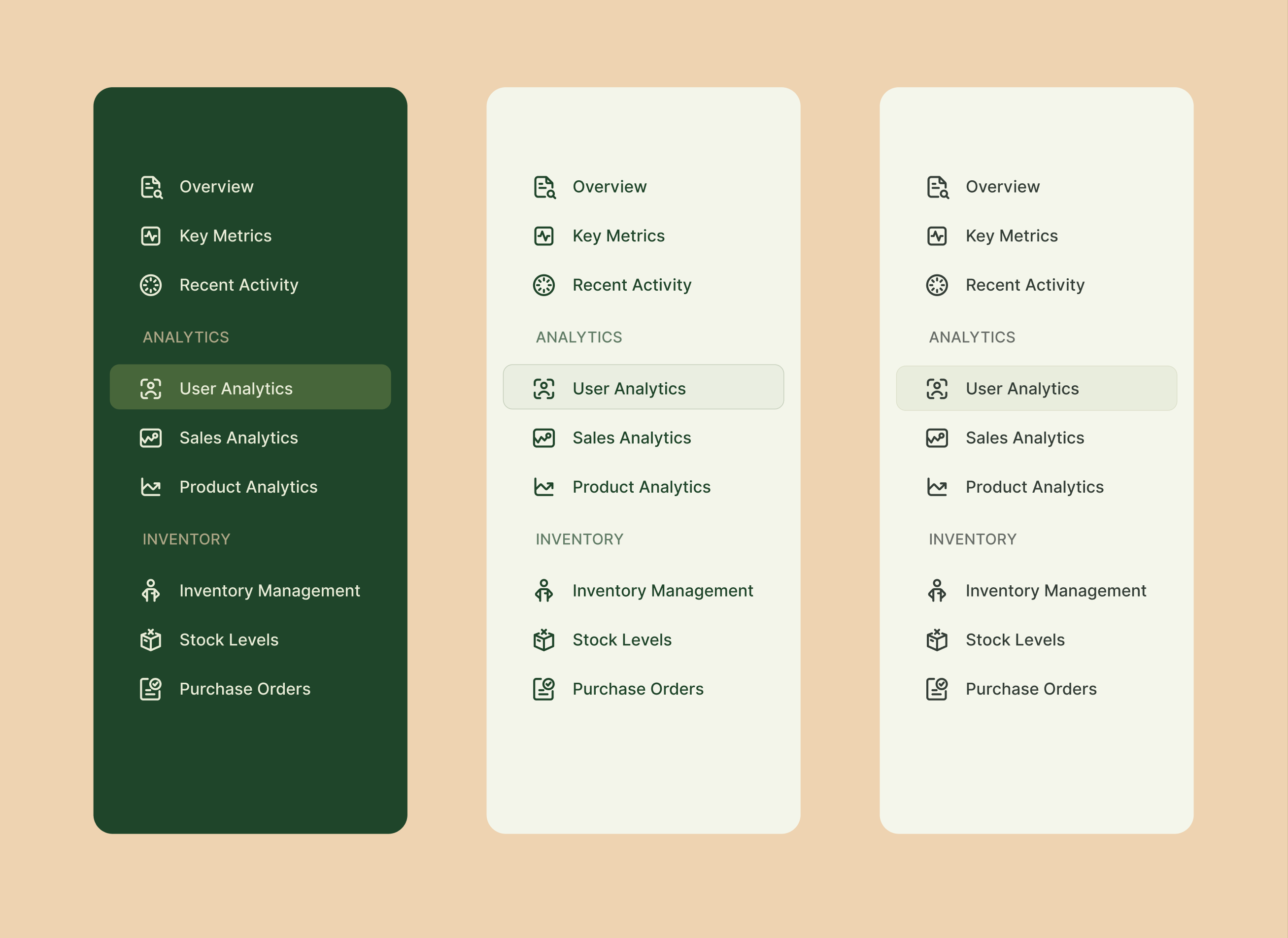
Exploring various options for the upcoming dashboard design. What do you think?
Reviews
2 reviews

The design is looking good! The side menu is clean and easy to use.
To improve, try making the icon sizes and spacing more consistent for a balanced look. Adding hover or active states for the menu items will help users see what’s selected. Also, make sure the text contrast is strong enough to be readable in all lighting.
Great work overall! With a few tweaks, this could be even better. Keep it up!
Thank you so much for the review

Not much to add on this one but personally I prefer the middle option. I don't think all the icon choices for: recent activity, inventory management and stock are very intuitive
Thank you for the review
5 Claps
Average 2.5 by 2 people
You might also like

Project
Improving Dating App Onboarding: A/B Test Design
This project explores how improving the onboarding experience of a dating app can increase profile completion and early user engagement. I d

Project
FORM Checkout Flow - Mobile

Try out the prototype here. Design Rationale Why mobile? Mobile accounts for the majority of e-commerce browsing, and premium furniture pur

Project
A/B Test for Hinge's Onboarding Flow

This project focuses on improving the onboarding experience of a dating app - Hinge, by addressing low profile completion rates. Since profi

Project
Accessibility Asse

For this project, the LearnLink website was selected, and the goal was to redesign the login and sign-up pages specifically, adapting them t

Project
The Fitness Growth Engine

This slide shows how user behavior translates into business success by connecting activation, habit formation, retention, and monetization i
Editors’ Choice
Project
Uxcel Halloween Icon Pack

🎃 Introducing the Uxcel Halloween Icon Pack! 🎃 This custom Halloween-themed icon set was created to enhance the seasonal user experience o
Popular Courses

Course
UX Design Foundations

Learn UX design fundamentals and principles that create better products. Build foundational knowledge in design concepts, visual fundamentals, and workflows.

Course
Introduction to Figma
Learn essential Figma tools like layers, styling, typography, and images. Master the basics to create clean, user-friendly designs

Course
Design Terminology

Learn UX terminology and key UX/UI terms that boost collaboration between designers, developers, and stakeholders for smoother, clearer communication.