Search & Booking Design For Entertaiment Platform

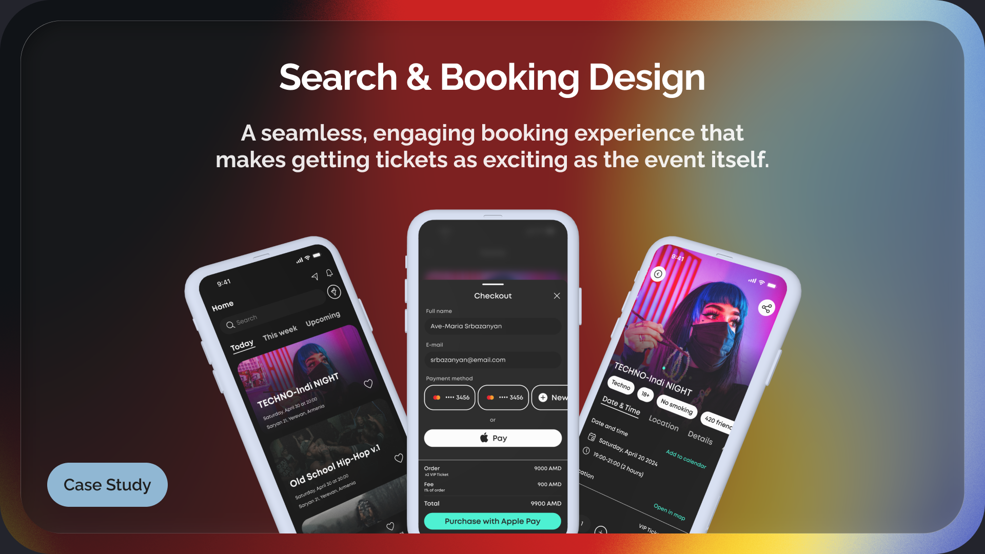
Booking a ticket should be as thrilling as the event itself: quick, effortless, and frustration-free. Yet, too often, users face clunky interfaces, confusing flows, and unnecessary friction.
We set out to change that!
This design reimagines the search and booking experience for an entertainment platform, making it intuitive, fast, and visually engaging. With a focus on clarity, modern aesthetics, and seamless interactions, we crafted a journey where users can discover, select, and book their next event without second-guessing a single step.
Reviews
5 reviews

Narek, love how smooth and clear the flow feels — a quick mockup of the booking journey would make the experience even easier to picture.

Everything looks very well put together! The design feels complete, and now it’s just about testing with users to see the impact it makes.

I really dig how this search and booking flow feels—smooth, clear, and tailored to what users need when they’re hunting for fun stuff to do. The layout just makes sense: spot a show, browse times, book it. Love how everything’s logical and streamlined without feeling boring.
To make it even better:
- Show it in action-a quick mockup or flow snapshot of the search-to-booking path would help people really feel how seamless it is.
- Call out the cool parts-if there’s anything like filters for date, genre, or location, name it and let us see how that feels.
- Let us in on the "why"-a sentence like “You can search, compare times, and book in under 60 seconds” adds real context to the experience.
Overall, it’s a smart and intuitive design that speaks the same language users do-just needs a bit more storytelling and visuals to bring that journey to life.
Stunning design! I love the visual effects you create in the entertainment platform. The colors are impressively crafted.
The purchased ticket is easy to see and use.
And to improve: would be helpful to present a wireframe illustrating how the searching and booking processes are designed to support users.

This search and booking flow really gets the essentials right—it’s smooth, intuitive, and guides users from finding shows to booking tickets without any fuss. The layout makes sense, and it’s clear this was designed for real people planning a night out. Everything feels streamlined but still has personality, so users won’t get lost or overwhelmed.
To make it even stronger, show the flow in action with a quick mockup or snapshot, and highlight any smart filters like date or genre so users see how flexible it is. A line about booking speed, like “Book in under a minute,” would give great context.
Overall, this is a modern, user-focused design that’s easy to use and visually appealing. Just add a bit more storytelling and visuals to really bring it to life. Keep it up—your focus on clarity and flow stands out!
You might also like
SiteScope - Progress Tracking App


FlexPay


Mobile Button System


CJM for Co-Working Space - WeWork


Ubani Design System


Accessible Signup Form for SaaS Platform
Popular Courses

UX Design Foundations


Introduction to Figma

Design Terminology
