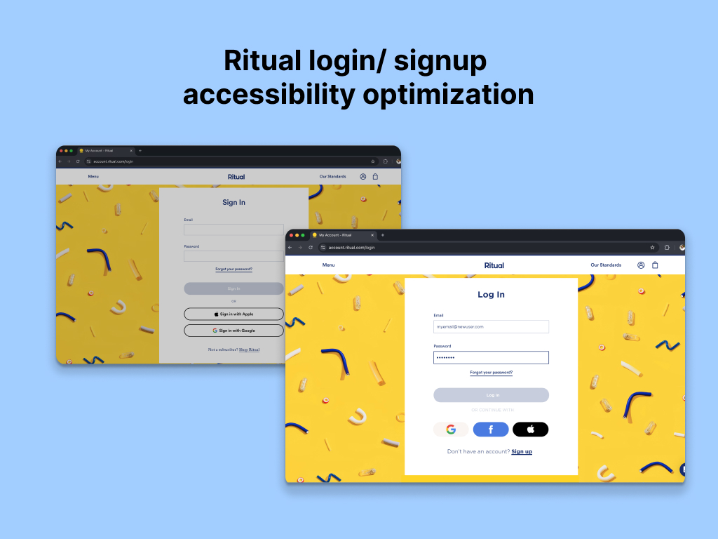
Ritual Login Accessibility Optimization

This project focused on optimizing the accessibility and user experience of the login and sign up pages for Ritual. I found a few accessibility issues in their design, that most likely impacted the experience for not only users with disabilities, but for the general public.
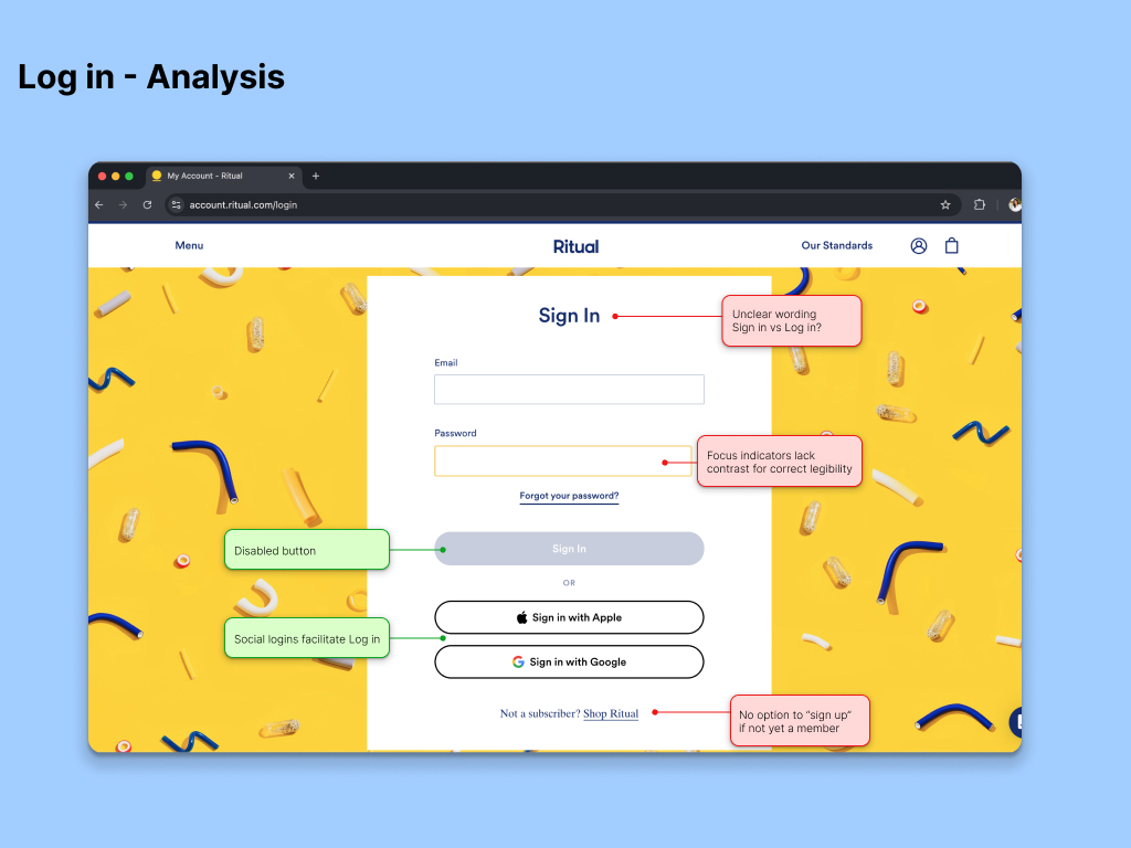
Key Issues in Log in Page:
- Accessibility errors: The page did not meet WCAG standards, with issues such as missing placeholder texts, insufficient color contrast of focus indicators, and unclear wording.
- Confusing wording: The page is called "Sign in" which and be confused with "Sign up". New users can get confused and abandon creating a new account if not familiar with the website.
- Unclear instructions or alternatives: Users with no account had no indication to create a new account if they found themselves at the "Log in" page.
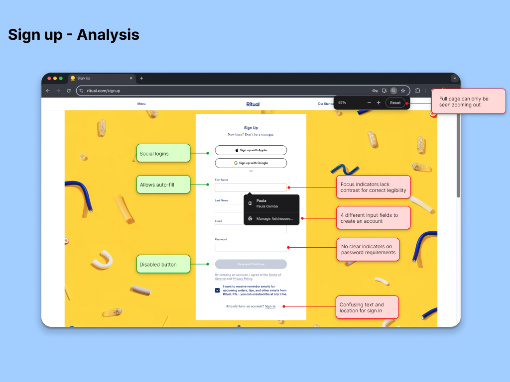
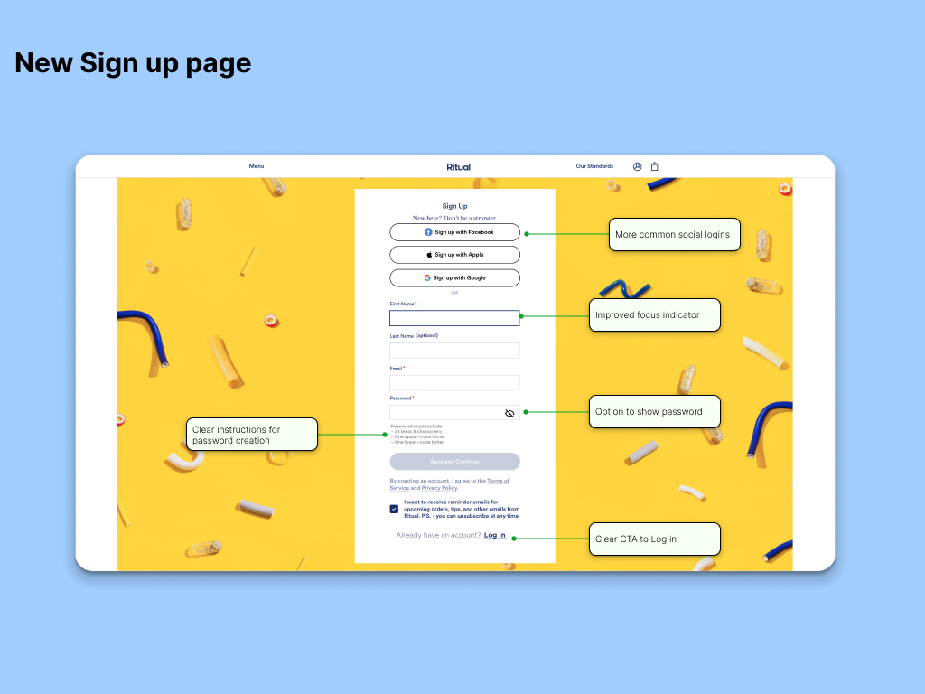
In addition to the issues found in the "Log in" page, the "Sign up" page had the following key issues:
- Unclear password requirements: The original password field had no instructions on how to set an acceptable password, or have the option to see the input.
- Too many input fields
Implemented Solutions:
- Increased contrast of labels and field borders to meet WCAG AA requirements.
- Changed the wording to make the difference clear between "Sign up" and "Log in" and avoid confusion or feelings of frustration
- Improved focus states by increasing color contrast, adding show password icon, and widening field borders.
- Added a real-time, updatable list for password requirements.
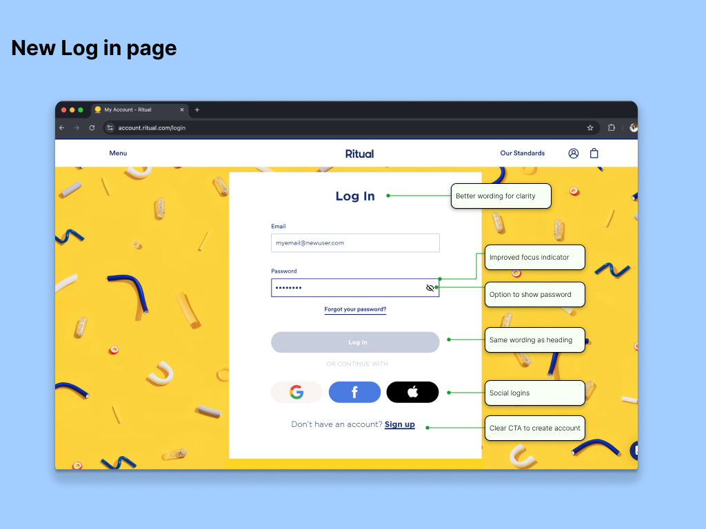
Conclusion:
By making simple yet effective changes, the Log In and Sign Up pages were made more accessible and user-friendly.
Tools used
From brief

Topics
Share
Reviews
1 review
Great work Maria! The only thing I would put more work in, is the spacing between the different modules, right now it seems to be pretty cramped up. Good luck!
5 Claps
Average 5.0 by 1 person
You might also like

Project
Improving Dating App Onboarding: A/B Test Design
This project explores how improving the onboarding experience of a dating app can increase profile completion and early user engagement. I d

Project
FORM Checkout Flow - Mobile

Try out the prototype here. Design Rationale Why mobile? Mobile accounts for the majority of e-commerce browsing, and premium furniture pur

Project
A/B Test for Hinge's Onboarding Flow

This project focuses on improving the onboarding experience of a dating app - Hinge, by addressing low profile completion rates. Since profi

Project
Accessibility Asse

For this project, the LearnLink website was selected, and the goal was to redesign the login and sign-up pages specifically, adapting them t

Project
The Fitness Growth Engine

This slide shows how user behavior translates into business success by connecting activation, habit formation, retention, and monetization i

Project
The Relational Workspace

Over four years, I led the design evolution of a high-stakes education platform, transforming a fragmented messaging app into a cohesive Stu
Visual Design Courses

Course
UX Design Foundations

Learn UX design fundamentals and principles that create better products. Build foundational knowledge in design concepts, visual fundamentals, and workflows.

Course
Introduction to Figma
Learn essential Figma tools like layers, styling, typography, and images. Master the basics to create clean, user-friendly designs

Course
Design Terminology

Learn UX terminology and key UX/UI terms that boost collaboration between designers, developers, and stakeholders for smoother, clearer communication.