Residents mobile and web design

The team at Residentes (a Mexican company making the residency search experience for medical doctors seamless) hired me for a challenging project to design and build their landing page on Framer.
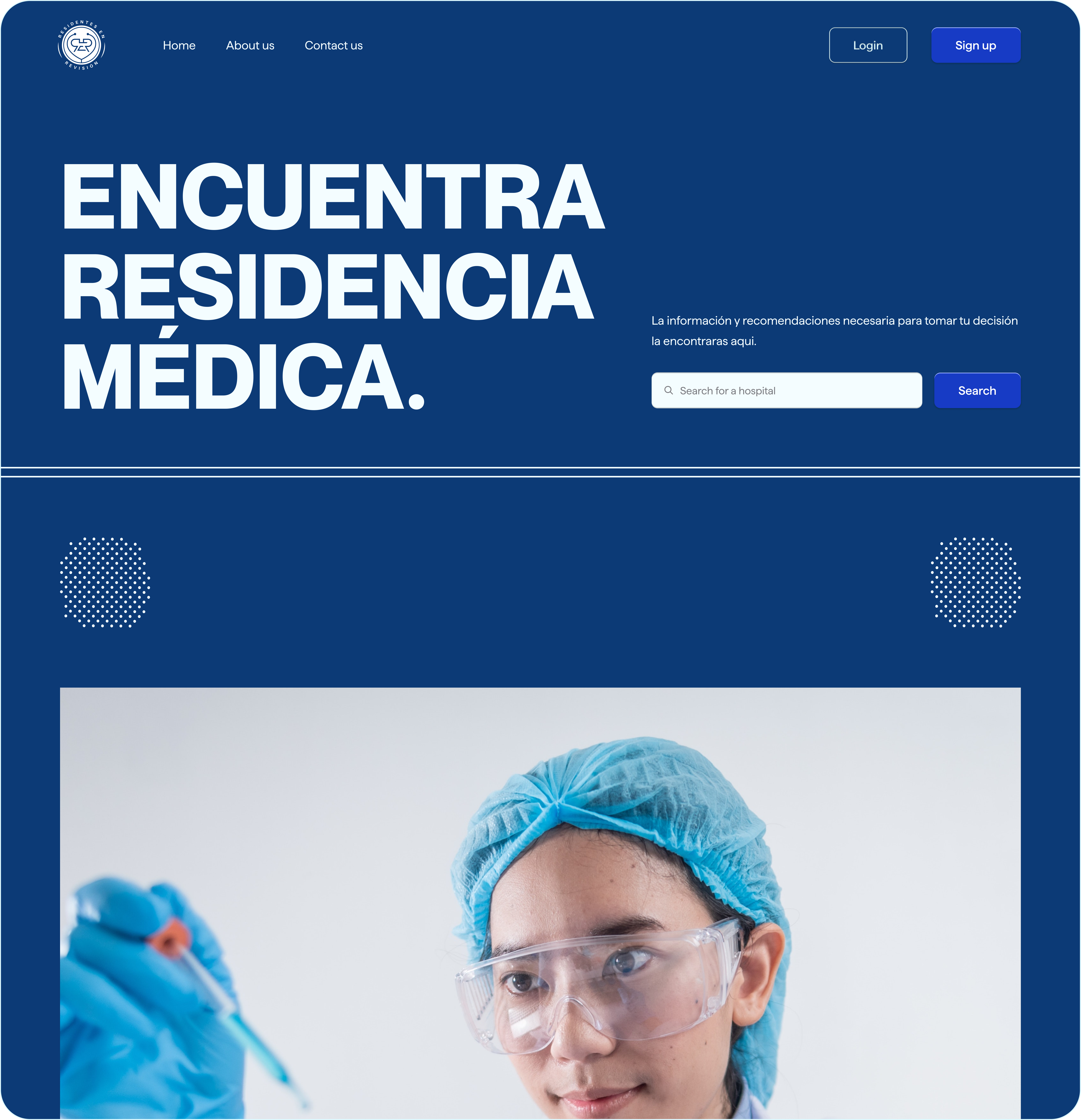
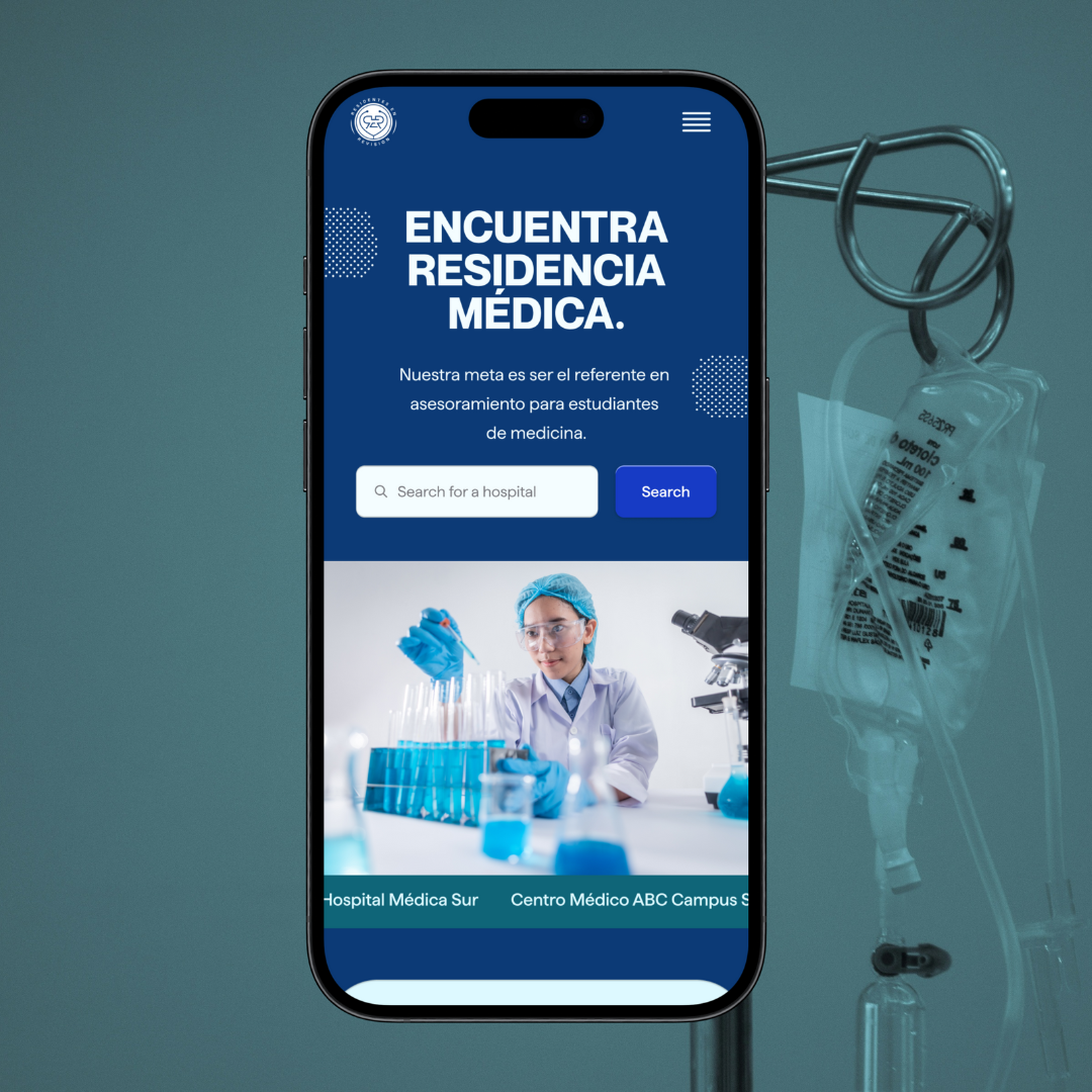
hero section concisely explaining what the website is about.

bento section explaining key features
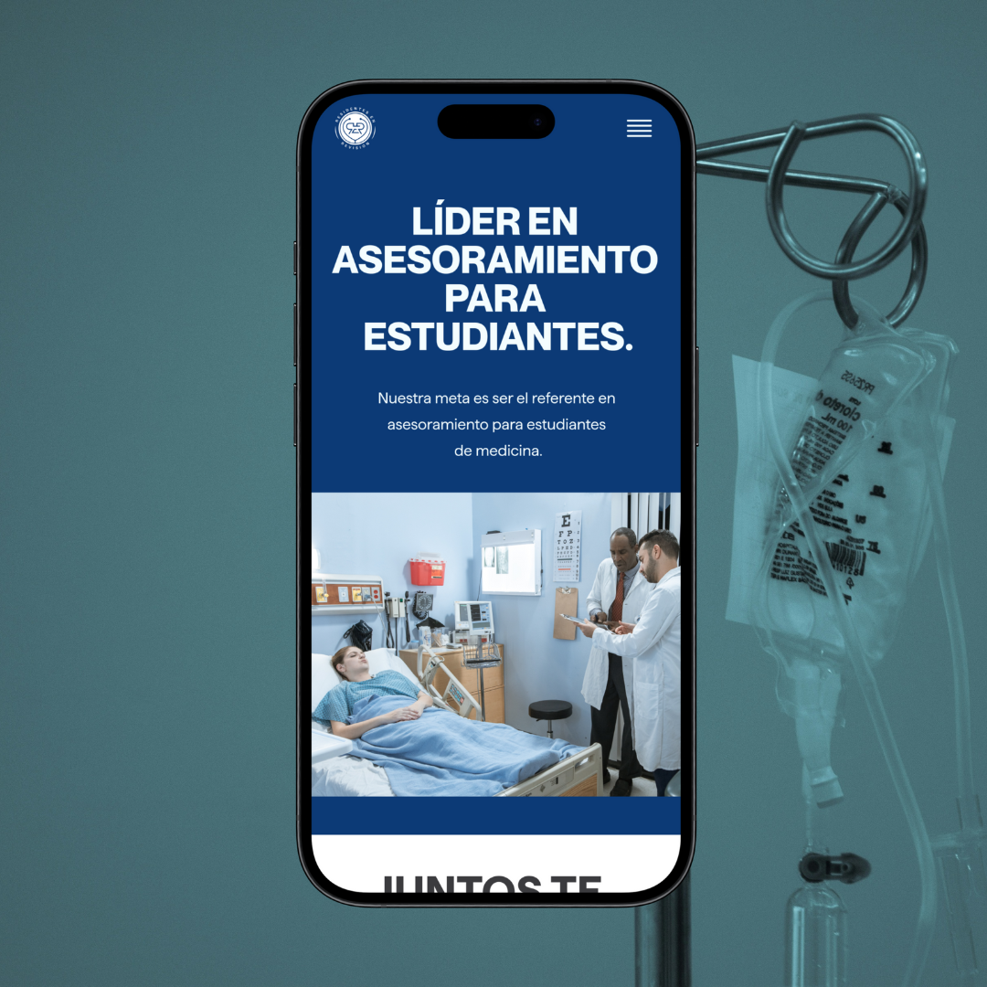
mobile web responsive view
Tools used
Share
Reviews
1 review

Judging from the single screen, your header section looks solid. However, since it’s for mobile, I’d suggest aligning your search input and CTA button vertically rather than horizontally, so they have the same width. This would make it easier to tap and more user-friendly. P.S. I noticed your link might not be working, or there’s some other issue—feel free to directly share your design decisions here! I will update the rating accordingly!
You might also like
Blip - Esport app design (Light & Dark UI)


Reimagining Asana's Color System


Customer Journey Map for a Co-Working Space

Responsive Main Screen


Latios - Free Portfolio Template for UX/UI Designers

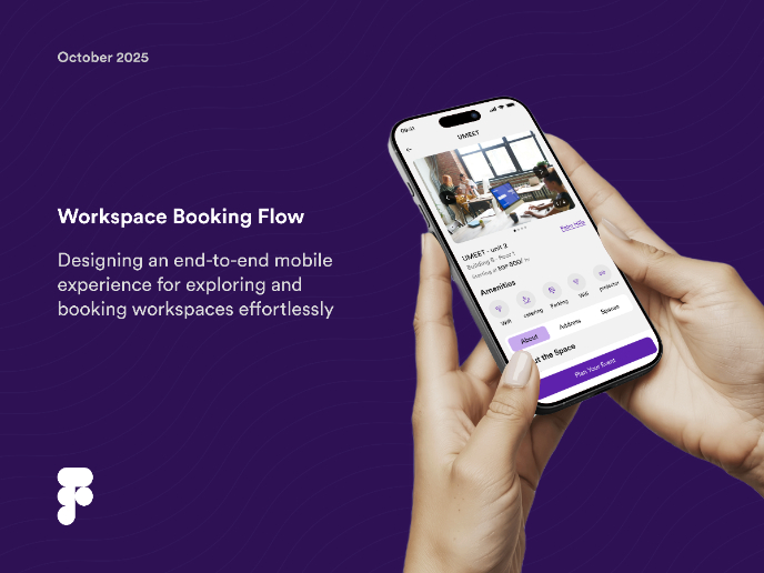
Workspace Booking Flow - UI/UX Design

Popular Courses

UX Design Foundations


Introduction to Figma

Design Terminology
